22 Apr CSS Grids
CSS Grid is a modern, two-dimensional layout system in CSS that lets you arrange elements into rows and columns with precise control, making complex web layouts easier and more responsive than older methods like floats or tables. It is especially useful when you need both horizontal and vertical alignment in a structured way.
A Grid layout is built from two key components and always consists of:
- Grid Container: The parent element where display: grid or display: inline-grid is applied. This defines the grid context and enables grid-specific properties like grid-template-columns, grid-template-rows, and gap.
- Grid Items: The direct child elements of the grid container. These automatically become grid items and can be positioned explicitly using properties like grid-column, grid-row, or implicitly by the grid’s auto-placement rules.
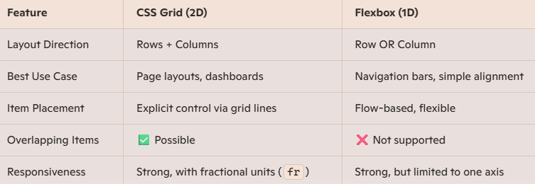
CSS Flexbox vs Grid
In this lesson, we will understand:
- CSS Grid Container
- CSS Grid Template – Columns
- CSS Grid Template – Rows
- CSS Grid – Grid Gaps
- CSS Grid justify-content property
- CSS Grid align-content property
If you liked the tutorial, spread the word and share the link and our website, Studyopedia, with others.
Read More:
No Comments