24 Nov CSS – Animations
In CSS, we can easily perform animations on an element. Animation in this context means changing the style of an element. Remember, for Animations in CSS, we do not need Flash or JavaScript.
What is the CSS @keyframes Rule?
For animations in CSS, we use the concept of @keyframes. The @keyframes is a rule wherein you need to specify the CSS styles. Bind the animation to an element for it to work successfully.
Use the animation-name property to set the name of the @keyframes animation. The duration of the animation is set using the animation-duration property. Similarly, we have the following properties that will help you in performing the task of animations on a web page:
- animation: Shorthand property that combines all animation-related settings (name, duration, timing, etc.). It lets you define multiple animations in one declaration.
- animation-name: Specifies the name of the
@keyframesanimation to apply. Without a valid keyframe name, no animation runs. - animation-duration: Defines how long one cycle of the animation takes. Values are set in seconds (
s) or milliseconds (ms). - animation-delay: Sets a delay before the animation starts running. Useful for staggering or sequencing multiple animations.
- animation-iteration-count: Determines how many times the animation repeats. You can use a number or
infinitefor endless looping. - animation-direction: Controls whether the animation runs forward, backward, or alternates. Values include
normal,reverse,alternate, andalternate-reverse. - animation-timing-function: Defines the speed curve of the animation. Common values are
ease,linear,ease-in,ease-out, andcubic-bezier(). - animation-fill-mode: Specifies how styles are applied before and after animation execution. Options include
none,forwards,backwards, andboth.
Let us now see the following animation examples:
- Change the background color
- Change the background color multiple times
- Animate and move the rectangular div
- Play animation in reverse order
- Specify the number of times an animation is played
CSS Animations Example – Change the background color
In this example, we will set animation. We have set the animation-duration property below to set the duration of the animation. The default is 0 seconds i.e., no animation. The from and to keywords are used in the below example to set the beginning and end.
Let us now see an example to change the background color:
<!DOCTYPE html>
<html>
<head>
<style>
div {
width: 150px;
height: 150px;
background-color: blue;
color: white;
border: 2px solid black;
animation-name: demo;
animation-duration: 3s;
}
@keyframes demo {
from {background-color: blue;}
to {background-color: green;}
}
</style>
</head>
<body>
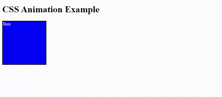
<h1>CSS Animation Example</h1>
<div>Box</div>
</body>
</html>
Output
After 3 seconds, the above div will animate and the color will change:
Change the background color multiple times
In this example, we will change the background color of a div on a web page multiple times. The color will change and using the animation-duration property the total duration of the animation is set. Let us now see an example:
<!DOCTYPE html>
<html>
<head>
<style>
div {
width: 150px;
height: 150px;
background-color: yellow;
color: white;
border: 2px solid black;
animation-name: demo;
animation-duration: 10s;
}
@keyframes demo {
0% {background-color: yellow;}
20% {background-color: blue;}
40% {background-color: green;}
60% {background-color: orange;}
80% {background-color: navy;}
100% {background-color: cyan;}
}
</style>
</head>
<body>
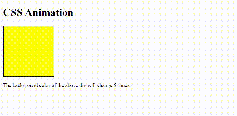
<h1>CSS Animation</h1>
<div></div>
<p>The background color of the above div will change 5 times.</p>
</body>
</html>
Output
First, the color changes to blue from yellow.
Then, the color changes to green from blue.
Then, the color changes to orange from green.
Then, the color changes to navy from orange.
Then, the color changes to cyan from navy:
Animate and move the rectangular div
In this example, we will move a rectangular div:
<!DOCTYPE html>
<html>
<head>
<style>
div {
width: 150px;
height: 150px;
background-color: yellow;
color: white;
border: 2px solid black;
position: relative;
animation-name: demo;
animation-duration: 4s;
}
@keyframes demo {
0% {background-color: yellow; left:0px; top:0px;}
15% {background-color: blue; left:50px; top:0px;}
30% {background-color: green; left:120px; top:0px;}
50% {background-color: orange; left:120px; top:120px;}
75% {background-color: orange; left:0px; top:120px;}
90% {background-color: black; left:0px; top:50px;}
100% {background-color: cyan; left:0px; top:0px;}
}
</style>
</head>
<body>
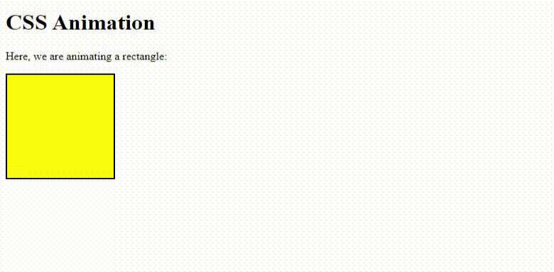
<h1>CSS Animation</h1>
<p>Here, we are animating a rectangle:</p>
<div></div>
</body>
</html>
Output
After a second, the box will animate:
After a second, the box will animate again:
Play animation in reverse order
To play the animation in reverse order, we will use the animation-direction property. With this, we can play animation forwards and backward alternatively.
The following can be the values of the animation-direction property:
- normal: The animation is played forward i.e., the normal default way.
- reverse: The animation is played backward
- alternate: The animation is played forwards first, then backward
- alternate-reverse: The animation is played backward first, then forwards i.e., the reverse order.
Let us now see an example. We have used the animation property as well. This is a shorthand property for animation:
<!DOCTYPE html>
<html>
<head>
<style>
div {
width: 150px;
height: 150px;
background-color: yellow;
color: white;
border: 2px solid black;
position: relative;
animation: demo 4s 2;
animation-direction: alternate;
}
@keyframes demo {
0% {background-color: yellow; left:0px; top:0px;}
15% {background-color: blue; left:50px; top:0px;}
30% {background-color: green; left:120px; top:0px;}
50% {background-color: orange; left:120px; top:120px;}
75% {background-color: orange; left:0px; top:120px;}
90% {background-color: black; left:0px; top:50px;}
100% {background-color: cyan; left:0px; top:0px;}
}
</style>
</head>
<body>
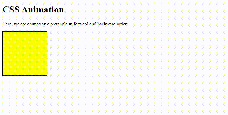
<h1>CSS Animation</h1>
<p>Here, we are animating a rectangle in forward and backward order:</p>
<div></div>
</body>
</html>
Output
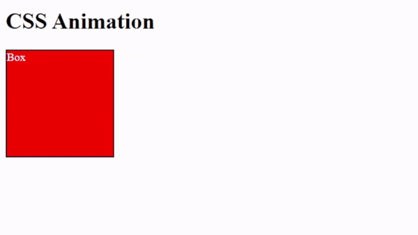
Specify the number of times an animation is played in CSS
To specify the number of times an animation is played in CSS, use the animation-iteration-count property. Below, we are playing the animation twice using:
animation-iteration-count: 2;
Let us see an example:
<!-- Specify the number of times an animation is played in CSS -->
<!-- animation-iteration-count -->
<!DOCTYPE html>
<html>
   <head>
       <title>HTML and CSS Example</title>
       <style>
       div {
        width: 150px;
        height: 150px;
        position: relative;
        background-color: red;
        color:white;
        border: 2px solid black;
        animation: demo 5s;
        animation-iteration-count: 2;
       }

       @keyframes demo {
         0% {background-color: red; left: 0px; top: 0px;}
         15% {background-color: blue;left: 50px; top: 0px;}
         30% {background-color: green;left: 100px; top: 0px;}
         50% {background-color: orange;left: 100px; top: 100px;}
         75% {background-color: white; left: 0px; top: 100px;}
         90%  {background-color: rgb(184, 184, 41);left: 0px; top: 50px;}
         100% {background-color: yellow;left: 0px; top: 0px;}
       }
       </style>
   </head>
<body>
<h1>CSS Animation</h1>
<div>Box</div>
</body>
</html>
Output
If you liked the tutorial, spread the word and share the link and our website Studyopedia with others.
Read More:
No Comments