23 Nov CSS – 3D Transform
For the 3D Transformation of elements on a web page, you can use the transform property in CSS. The transform property is used with some methods to accomplish the task. Let us see the methods with examples:
- rotateX(): Rotate an element around the X-axis
- rotateY(): Rotate an element around the Y-axis
- rotateZ(): Rotate an element around the Z-axis
- rotate3d(): Set the 3D rotation of an element
- scale3d(): Set the 3D scaling of an element
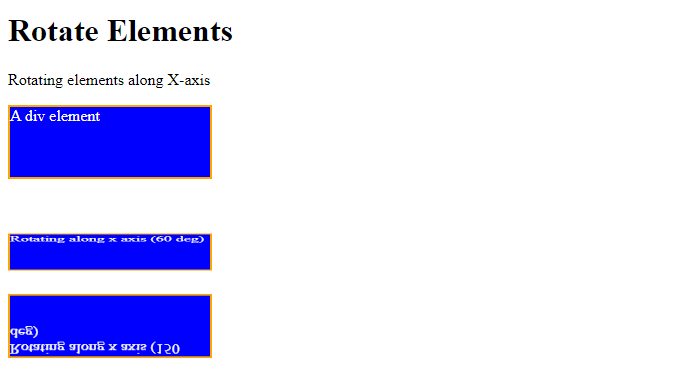
Rotate an element around the X-axis
To rotate an element around the X-axis, use the rotateX() method in CSS. Set the angle of rotation as a parameter of the method. Let us now see an example:
<!DOCTYPE html>
<html>
<head>
<style>
div {
  width: 200px;
  height: 70px;
  background-color: blue;
  color: white;
  border: 2px solid orange;
}

div#demo1 {
  transform: rotateX(60deg);
}

div#demo2 {
  transform: rotateX(150deg);
}
</style>
</head>
<body>

<h1>Rotate Elements</h1>

<p>Rotating elements along X-axis</p>

<div>
A div element
</div><br><br>

<div id="demo1">
Rotating along x axis (60 deg)
</div>

<div id="demo2">
Rotating along x axis (150 deg)
</div>

</body>
</html>
Output
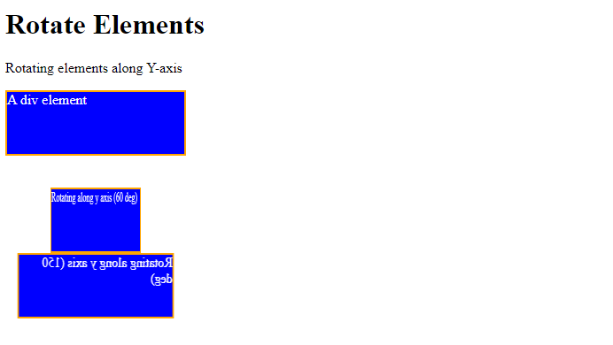
Rotate an element around the Y-axis
To rotate an element around the Y-axis, use the rotateY() method in CSS. Set the angle of rotation as a parameter of the method. Let us now see an example:
<!DOCTYPE html>
<html>
<head>
<style>
div {
  width: 200px;
  height: 70px;
  background-color: blue;
  color: white;
  border: 2px solid orange;
}

div#demo1 {
  transform: rotateY(60deg);
}

div#demo2 {
  transform: rotateY(150deg);
}
</style>
</head>
<body>

<h1>Rotate Elements</h1>

<p>Rotating elements along Y-axis</p>

<div>
A div element
</div><br><br>

<div id="demo1">
Rotating along y axis (60 deg)
</div>

<div id="demo2">
Rotating along y axis (150 deg)
</div>

</body>
</html>
Output
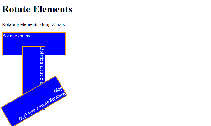
Rotate an element around the Z-axis
To rotate an element around the Z-axis, use the rotateZ() method in CSS. Set the angle of rotation as a parameter of the method. Let us now see an example:
<!DOCTYPE html>
<html>
<head>
<style>
div {
  width: 200px;
  height: 70px;
  background-color: blue;
  color: white;
  border: 2px solid orange;
}

div#demo1 {
  transform: rotateZ(90deg);
}

div#demo2 {
  transform: rotateZ(150deg);
}
</style>
</head>
<body>

<h1>Rotate Elements</h1>

<p>Rotating elements along Z-axis</p>

<div>
A div element
</div><br><br>

<div id="demo1">
Rotating along z axis (60 deg)
</div>

<div id="demo2">
Rotating along z axis (150 deg)
</div>

</body>
</html>
Output
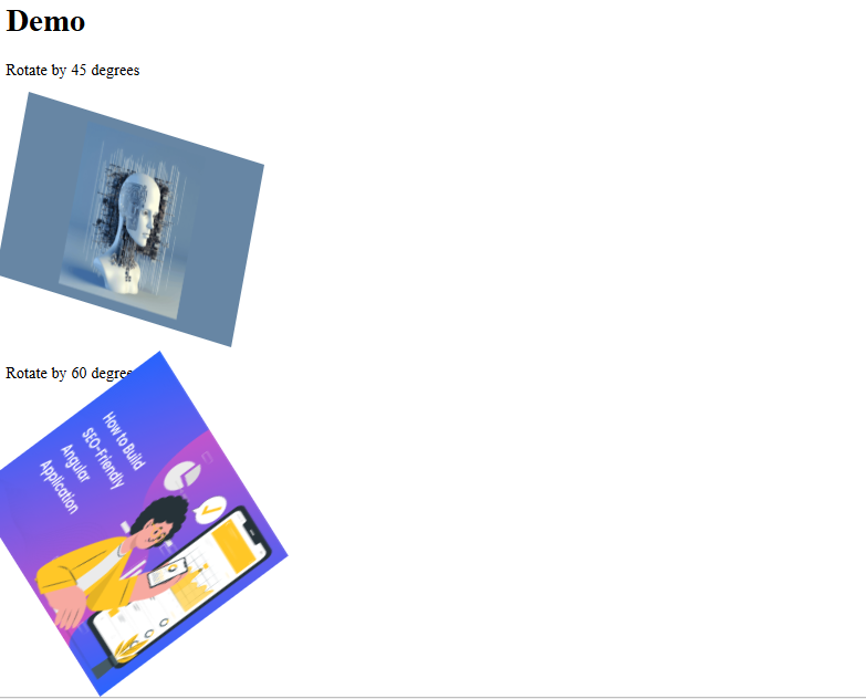
Set the 3D rotation of an element
The rotate3d() method of the transform property is used to set the 3D rotation of an element. Let us see an example:
<!-- Set the 3D rotation of an element with CSS -->
<!-- rotate3d() method of the transform property -->
<!DOCTYPE html>
<html>
   <head>
       <title>HTML and CSS Example</title>
       <style>
       .img1 {
        transform: rotate3d(6, 2, 2, 45deg);
       }
       .img2 {
         transform: rotate3d(1, 2, 5, 60deg);
       }
       </style>
   </head>
<body>
<h1>Demo</h1>
<p>Rotate by 45 degrees</p>
<img class="img1" src="https://studyopedia.com/wp-content/uploads/2023/06/Deploy-Machine-Learning-Model-300x169.png" alt="Deploy Machine Learning" width="250" height="250">
<p>Rotate by 60 degrees</p>
<img class="img2" src="https://studyopedia.com/wp-content/uploads/2022/12/SEO-friendly-Angular-application-300x169.png" alt="Seo Tutorial" width="250" height="250">
</div>
</body>
</html>
Output
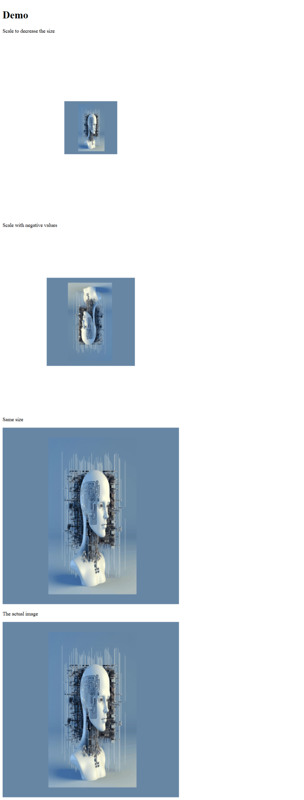
Set the 3D scaling of an element
The scale3d() method of the transform property is used to set the 3D scaling of an element. Let us see an example:
<!-- Set the 3D scaling of an element with CSS -->
<!-- scale3d() method of the transform property -->
<!DOCTYPE html>
<html>
   <head>
       <title>HTML and CSS Example</title>
       <style>
       .img1 {
        transform: scale3d(0.3, 0.3, 0.3);
       }
       .img2 {
         transform: scale3d(-0.5, -0.5, -0.5);
       }
        .img3 {
         transform: scale3d(1, 1, 1);
       }
       </style>
   </head>
<body>
<h1>Demo</h1>
<p>Scale to decrease the size</p>
<img class="img1" src="https://studyopedia.com/wp-content/uploads/2023/06/Deploy-Machine-Learning-Model.png" alt="Deploy Machine Learning" width="550" height="550">
<p>Scale with negative values</p>
<img class="img2" src="https://studyopedia.com/wp-content/uploads/2023/06/Deploy-Machine-Learning-Model.png" alt="Deploy Machine Learning" width="550" height="550">
<p>Same size</p>
<img class="img3" src="https://studyopedia.com/wp-content/uploads/2023/06/Deploy-Machine-Learning-Model.png" alt="Deploy Machine Learning" width="550" height="550">
<p>The actual image</p>
<img src="https://studyopedia.com/wp-content/uploads/2023/06/Deploy-Machine-Learning-Model.png" alt="Deploy Machine Learning" width="550" height="550">
</body>
</html>
Output
If you liked the tutorial, spread the word and share the link and our website, Studyopedia, with others.
Read More:
No Comments