24 Nov CSS – Position
The positions in the CSS as the name suggests set the positioning method for an element on a web page. To set positions, the positions property is used in CSS. The positions property is placed first and then the top, bottom, left, and right properties are used on a web page in CSS.
The following are the different values for positioning:
- The relative positioning in CSS
- The absolute positioning in CSS
- The fixed positioning in CSS
- The sticky positioning in CSS
- The static positioning in CSS
Let us learn the values one by one with examples, beginning with relative.
The relative positioning in CSS
To position an element relative to its normal position, use the position: relative; property in CSS. The relative position property is placed first and then the top, bottom, left, and right properties are used on a web page for adjustment.
Let us see an example to implement relative positioning:
<!DOCTYPE html>
<html>
<head>
<style>
div.demo {
position: relative;
left: 20px;
background-color: orange;
color: white;
border: 2px solid red;
}
</style>
</head>
<body>
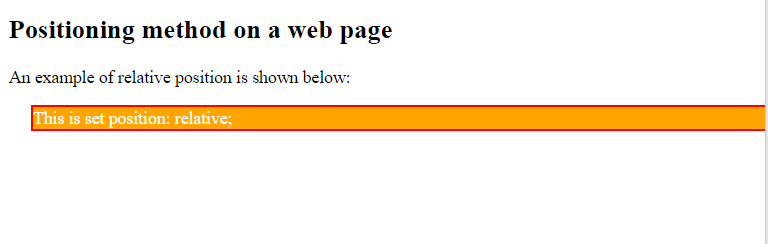
<h2>Positioning method on a web page</h2>
<p>An example of relative position is shown below:</p>
<div class="demo">
This is set position: relative;
</div>
</body>
</html>
Output
The absolute positioning in CSS
To position an element relative to the 1st parent element, i.e., the nearest ancestor, use the position: absolute; property in CSS.
When you set an element to position: absolute;, it is removed from the normal document flow. That means other elements act as if they don’t exist. But where does it go?
- By default, it positions itself relative to the nearest ancestor that has a positioning context (
relative,absolute,fixed, orsticky). - If no ancestor has positioning set, it positions itself relative to the entire page (the
<html>element).
Note:
- Absolute positioning always looks for the nearest ancestor with a positioning context.
- If you don’t set
position: relative;(or another positioning) on the parent, the child will instead position itself relative to the entire page.
Let us see an example to implement absolute positioning in CSS. In this example, the nearest ancestor is the div with position:relative. In this example:
- The parent div has
position: relative;. - The child div has
position: absolute;. - The child’s
top: 110px; right: 0;is calculated inside the parent box, not the whole page.
Let us see the example now:
<!DOCTYPE html>
<html>
<head>
<style>
div.relative {
position: relative;
background-color: orange;
color: white;
border: 5px solid red;
}
div.absolute {
position: absolute;
top: 110px;
right: 0;
background-color: blue;
color: white;
border: 5px solid green;
}
</style>
</head>
<body>
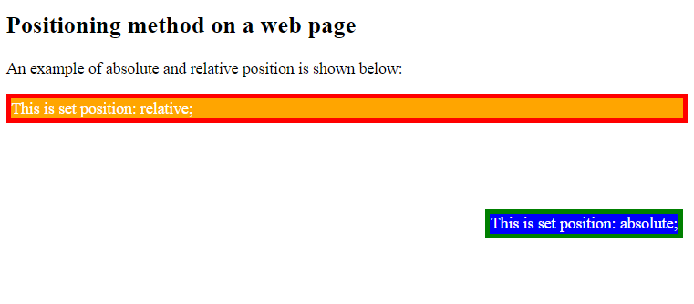
<h2>Positioning method on a web page</h2>
<p>An example of absolute and relative position is shown below:</p>
<div class="relative">This is set position: relative;
<div class="absolute">This is set position: absolute;</div>
</div>
</body>
</html>
Output
The fixed positioning in CSS
To position an element to be fixed on a web page, use the position: fixed; property in CSS. The fixed position property is placed first and then the top, bottom, left, and right properties are used on a web page for positioning the element.
Let us see an example to implement fix positioning in CSS:
<!DOCTYPE html>
<html>
<head>
<style>
div.demo {
position: fixed;
bottom: 0;
right: 0;
background-color: orange;
color: white;
border: 2px solid red;
}
</style>
</head>
<body>
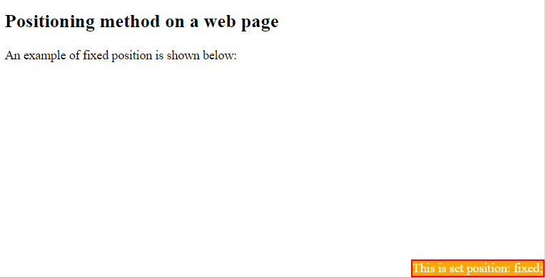
<h2>Positioning method on a web page</h2>
<p>An example of fixed position is shown below:</p>
<div class="demo">
This is set position: fixed;
</div>
</body>
</html>
Output
The sticky positioning in CSS
An element with position: sticky; behaves like relative until you scroll past a certain point.
Once the scroll reaches the threshold (defined by top, left, right, or bottom), the element “sticks” in place like fixed.
To stick the header to the top of the viewport (like a menu) when scrolling, use top: 0 with position:sticky. This menu will stay at the top-right corner while you scroll, but only inside its parent container. If you want it to stay visible always, regardless of parent boundaries, use position: fixed; instead.
To set sticky positioning, use:
position: sticky ;
Let us now see an example to implement sticky positioning on a web page:
<!DOCTYPE html>
<html>
<head>
<style>
div {
  background-color: blue;
  color: white;
  width: 200px;
  height: 70px;
  opacity: 0.8;
  position:sticky;
  top:0;
}
</style>
</head>
<body>

<h2>Understanding Positions</h2>

<div>
   Header sticks when scrolling.
</div>
<p>Lorem ipsum dolor sit amet, consectetur adipiscing elit. Aliquam non ipsum in augue condimentum porttitor placerat at ante. Integer a pellentesque urna, ac malesuada ante. Nunc libero risus, ultricies at varius vitae, fermentum vel eros. Nullam non elit arcu. Nullam rutrum elit ullamcorper sem tempor molestie. Ut vitae gravida ipsum. Phasellus justo tellus, cursus ac rhoncus nec, varius id mauris. Nullam et enim justo. Nullam est ex, pretium a urna nec, sagittis rhoncus lacus. Nam eget massa convallis, maximus arcu ut, rhoncus felis. Vivamus molestie dolor quis turpis eleifend, quis porta quam molestie. Duis bibendum laoreet ante vel posuere.<p>
<p>
Ut dictum ante vel accumsan ultrices. Cras porta at magna non hendrerit. Pellentesque volutpat tortor id ultrices tempor. Nam feugiat turpis et blandit rutrum. Praesent id nibh egestas, porta metus sed, luctus neque. Morbi vitae enim quis leo hendrerit cursus. In hac habitasse platea dictumst.</p>
<p>
Ut venenatis nulla vel justo aliquam placerat. Morbi eleifend nulla eget ultrices malesuada. Sed iaculis tempor tellus, nec efficitur sem ultricies nec. Nullam mi ex, viverra maximus laoreet gravida, bibendum ut massa. Aliquam pulvinar elit ut ultrices sagittis. Maecenas purus eros, lobortis sed tincidunt non, semper ac massa. Mauris tempus semper viverra. In malesuada, ipsum vitae aliquam dapibus, nibh nibh accumsan ipsum, et tempor tortor risus et mauris. Vestibulum elementum a ligula non congue. Nam ante odio, suscipit et imperdiet at, elementum ac tortor. Quisque non porta ligula. In gravida blandit porta. Suspendisse vulputate risus quis magna tincidunt fermentum. Maecenas elementum vitae tortor in maximus. Mauris non nulla sem. Maecenas sapien odio, vestibulum vel lacus a, imperdiet placerat nulla.</p>
<p>
Suspendisse nec neque justo. Curabitur congue placerat turpis eget tempor. Sed non volutpat ligula. Sed odio nibh, dictum in ultrices at, hendrerit eu tellus. Nulla lacus magna, placerat sed dolor non, pharetra rutrum mi. Vestibulum eu porta metus. In pharetra id metus ac hendrerit. Phasellus sit amet metus pellentesque, maximus mauris eget, cursus lorem. Curabitur a libero cursus, bibendum justo vitae, euismod erat. Donec lorem enim, consequat ut cursus a, dictum et neque. Pellentesque consequat, mauris non tempus ultricies, tellus odio tristique lorem, at interdum quam magna pulvinar tortor. Nullam velit elit, scelerisque id magna eu, fringilla viverra metus. Sed turpis sapien, pulvinar eu quam nec, feugiat gravida eros. Donec luctus semper mi lacinia malesuada. Duis non orci sapien.</p>
</body>
</html>
Output
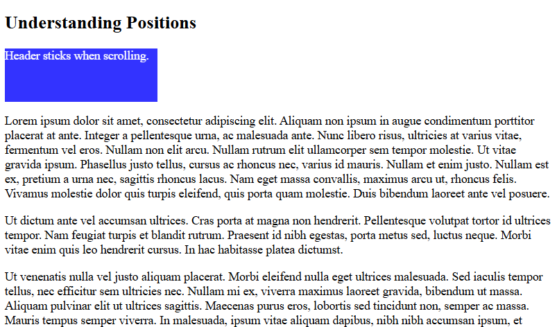
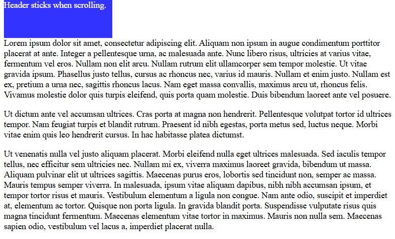
Scroll the page, and you can see the blue header sticks to the top of the web page:
The static positioning in CSS
The default positioning for elements on a web page is static. That means an HTML element set static is positioned according to the normal flow of the web page. To set static positioning, use:
position: static;
Let us now see an example to implement static positioning on a web page:
<!DOCTYPE html>
<html>
<head>
<style>
div.demo {
position: static;
background-color: orange;
color: white;
border: 2px solid red;
}
</style>
</head>
<body>
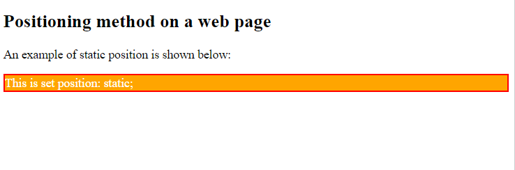
<h2>Positioning method on a web page</h2>
<p>An example of static position is shown below:</p>
<div class="demo">
This is set position: static;
</div>
</body>
</html>
Output
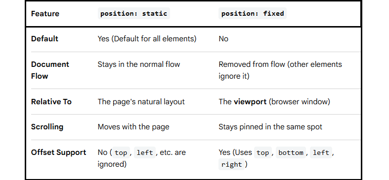
position: static vs position: fixed in CSS
If you liked the tutorial, spread the word and share the link and our website, Studyopedia, with others.
Read More:
No Comments