24 Nov CSS – Transitions
If you want to change the property values on a web page, use the Transitions in CSS. Through this, easily change the element from one style to another. To set a transition effect, set the property for which you want to add an effect and the duration of the effect using the transition property, for example, transition for height:
height: 100px;
transition: height 3s;
Let us see some examples:
- Set the transition for a property
- Set the transition for multiple properties
- Delay the Transition
- Multiple Transition Properties in CSS
- Set the speed curve of the transition effect with CSS
Set the transition for a property
Let us now see the complete example to set the transition effect and change the height of a div on hover. We will set the transition for a single property height using the transition property. Here, we have set the transition-property and transation-duration using the transition shorthand property:
transition: height 5s;
Let us see the example:
<!DOCTYPE html>
<html>
<head>
<style>
div {
  width: 150px;
  height: 150px;
  background: red;
  border: 2px solid black;
  transition: height 5s;
}

div:hover {
  height: 250px;
}
</style>
</head>
<body>

<h1>CSS Transition</h1>

<p>Hover over the below div and set the transition:</p>
<div></div>

</body>
</html>
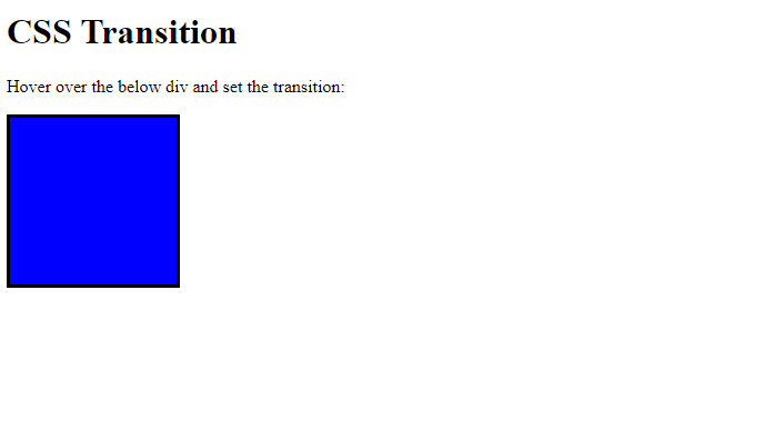
Output
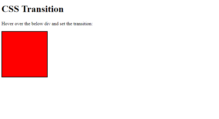
Now, hover over the box and the height will increase:
Set the transition for multiple properties
In this example, we will set the transition for more than one property, i.e., height and width, here using the transition property. Here, we have set the transition-property and transation-duration using the transition shorthand property:
transition: width 3s, height 5s;
<!DOCTYPE html>
<html>
<head>
<style>
div {
width: 150px;
height: 150px;
background: red;
border: 2px solid black;
transition: width 3s, height 5s;
}
div:hover {
height: 250px;
width: 250px;
}
</style>
</head>
<body>
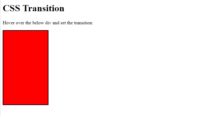
<h1>CSS Transition</h1>
<p>Hover over the below div and set the transition:</p>
<div></div>
</body>
</html>
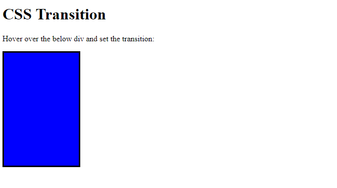
Output
Now, hover over the box. The height, as well as width, will increase i.e. transition:
Delay the Transition
We can easily delay the transition using the transition-delay property. Let us see an example. Here, we will set the delay to 3 seconds:
<!DOCTYPE html>
<html>
<head>
<style>
div {
width: 150px;
height: 150px;
background: blue;
border: 3px solid black;
transition: height 5s;
transition-delay: 3s;
}
div:hover {
height: 250px;
}
</style>
</head>
<body>
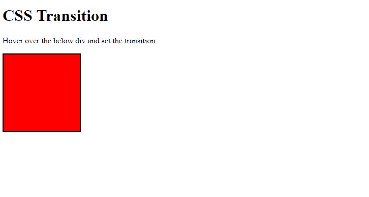
<h1>CSS Transition</h1>
<p>Hover over the below div and set the transition:</p>
<div></div>
</body>
</html>
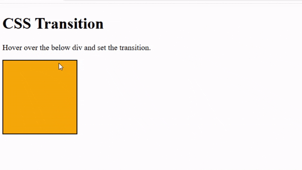
Output
Hover over and after 3 seconds, the transition effect will be visible:
Multiple Transition Properties in CSS
We saw some transition properties in the above example. Let us now see some other properties as well:
- transition-property: Specifies which CSS property will change smoothly (e.g.,
color,width). Without it, no transition effect is applied. - transition-duration: Defines how long the transition takes to complete. A longer duration makes the change appear slower.
- transition-timing-function: Controls the speed curve of the transition (ease, linear, ease-in-out). It determines how the animation accelerates or decelerates.
- transition-delay: Sets a wait time before the transition starts. Useful for staggering or sequencing multiple effects.
Let us see an example:
<!-- Set the transition properties in CSS -->
<!-- transition-property -->
<!-- transition-duration -->
<!-- transition-timing-function -->
<!-- transition-delay -->
<!DOCTYPE html>
<html>
<head>
<title>HTML and CSS Example</title>
<style>
div {
width: 150px;
height: 150px;
background: orange;
border: 2px solid black;
transition-property: width;
transition-duration: 3s;
transition-delay: 2s;
transition-timing-function: linear;
}
div:hover {
width: 300px;
}
</style>
</head>
<body>
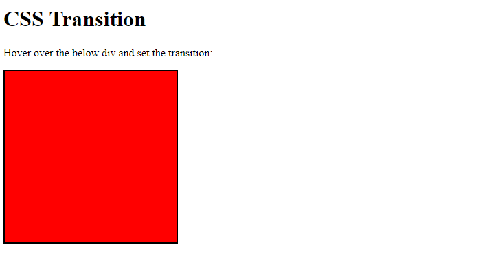
<h1>CSS Transition</h1>
<p>Hover over the below div and set the transition.</p>
<div></div>
</body>
</html>
Output
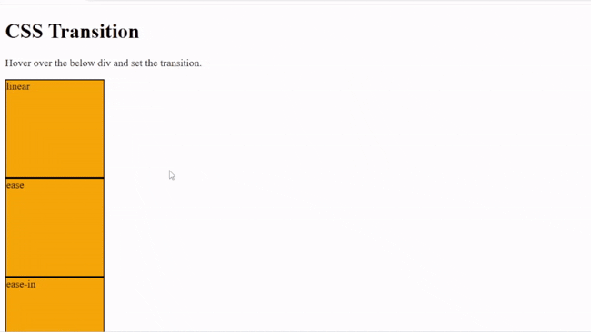
Set the speed curve of the transition effect with CSS
Use the transition-timing-function to set the speed curve, i.e., control the speed curve of the transition:
- ease: Starts slow, speeds up in the middle, then slows down at the end.
- linear: Moves at a constant speed from start to finish.
- ease-in: Begins slowly, then accelerates toward the end.
- ease-out: Starts quickly, then decelerates toward the end.
- ease-in-out: Combines ease-in and ease-out: slow start, fast middle, slow finish.
It determines how the animation accelerates or decelerates. Let us see an example:
<!-- Specify the speed curve of the transition effect -->
<!-- transition-timing-function -->
<!DOCTYPE html>
<html>
   <head>
       <title>HTML and CSS Example</title>
       <style>
       div {
          width: 150px;
          height: 150px;
          background: orange;
          border: 2px solid black;
          transition: width 5s;
        }

        #one {
          transition-timing-function: linear;
        }
        #two {
          transition-timing-function: ease;
        }
        #three {
          transition-timing-function: ease-in;
        }
        #four {
          transition-timing-function: ease-out;
        }#five {
          transition-timing-function: ease-in-out;
        }
        div:hover {
          width: 300px;
        }
       </style>
   </head>
<body>
<h1>CSS Transition</h1>
<p>Hover over the below div and set the transition.</p>
<div id="one">linear</div>
<div id="two">ease</div>
<div id="three">ease-in</div>
<div id="four">ease-out</div>
<div id="five">ease-in-out</div>
</body>
</html>
Output
If you liked the tutorial, spread the word and share the link and our website, Studyopedia, with others.
Read More:
No Comments