22 Apr CSS – Image Shapes
Set any image as a circle, ellipse, polygon, etc. with CSS. For that, we will use the clip-path property. With that, the shape-outside property helps in controlling the text.
The clip-path defines which part of an element is visible, shape-outside controls how text wraps around floated elements, and circle() is a function used with both to create circular shapes. Together, they allow you to clip elements into circles or make text flow around circular boundaries.
In this lesson, we will discuss:
- The clip-path property
- The shape-outside property
- The circle() function
The clip-path property
The clip-path property defines a clipping region for an element. Anything outside the region is hidden. Often applied to images or divs to create non-rectangular shapes.
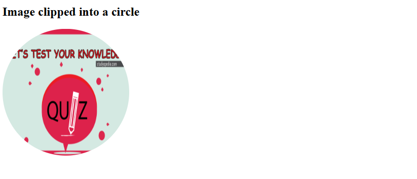
Let us see an example. Here, the image is clipped into a perfect circle using clip-path: circle():
<!DOCTYPE html>
<html>
<head>
  <title>Clip Path Circle Example</title>
  <style>
    img {
      width: 250px;
      height: 250px;
      clip-path: circle(50%);
    }
  </style>
</head>
<body>
  <h2>Image clipped into a circle</h2>
  <img src="https://studyopedia.com/wp-content/uploads/2017/02/Studyopedia-Quizzes.png" alt="Quizzes">
</body>
</html>
Output
The shape-outside property
The shape-outside property defines the shape around which inline content (like text) wraps when an element is floated. Works only on floated elements (float: left/right).
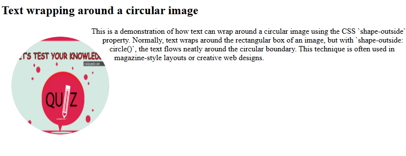
Let us see an example. Here, the image is floated left, clipped into a circle, and text flows around the circular boundary:
<!DOCTYPE html>
<html>
<head>
  <title>Shape Outside Circle Example</title>
  <style>
    .circle-img {
      float: left;
      width: 200px;
      height: 200px;
      margin: 20px;
      shape-outside: circle(50%);
      clip-path: circle(50%);
    }
    .circle-img img {
      width: 100%;
      height: 100%;
      border-radius: 50%; /* optional, for smooth edges */
    }
  </style>
</head>
<body>
  <h2>Text wrapping around a circular image</h2>
  <div class="circle-img">
    <img src="https://studyopedia.com/wp-content/uploads/2017/02/Studyopedia-Quizzes.png" alt="Quizzes">
  </div>
  <p>
    This is a demonstration of how text can wrap around a circular image using
    the CSS `shape-outside` property. Normally, text wraps around the rectangular
    box of an image, but with `shape-outside: circle()`, the text flows neatly
    around the circular boundary. This technique is often used in magazine-style
    layouts or creative web designs.
  </p>
</body>
</html>
Output
The circle() function
The circle() function defines a circle shape with a radius and position. Used with both clip-path and shape-outside.
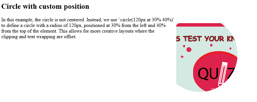
Let us see an example. Here, the circle is shifted inside the element, showing how you can control the position of the circle:
<!DOCTYPE html>
<html>
<head>
  <title>Circle Position Example</title>
  <style>
    .circle-shape {
      float: right;
      width: 250px;
      height: 250px;
      margin: 20px;
      background: url('https://studyopedia.com/wp-content/uploads/2017/02/Studyopedia-Quizzes.png') no-repeat center/cover;
      clip-path: circle(120px at 30% 40%);
      shape-outside: circle(120px at 30% 40%);
    }
  </style>
</head>
<body>
  <h2>Circle with custom position</h2>
  <div class="circle-shape"></div>
  <p>
    In this example, the circle is not centered. Instead, we use
    `circle(120px at 30% 40%)` to define a circle with a radius of 120px,
    positioned at 30% from the left and 40% from the top of the element.
    This allows for more creative layouts where the clipping and text wrapping
    are offset.
  </p>
</body>
</html>
Output
If you liked the tutorial, spread the word and share the link and our website, Studyopedia, with others.
Read More:
No Comments