22 Apr CSS Grid Template – Columns
Inside a grid container, you specify how many columns and rows the grid will have, along with their sizes.
To achieve this, two key properties are used:
- grid-template-columns → Defines the number of columns and their widths.
- grid-template-rows → Defines the number of rows and their heights.
Together, these properties establish the overall structure of the grid layout, giving you precise control over both dimensions.
In this lesson, we will understand the grid-template-columns property with the values:
- auto
- fr
- repeat()
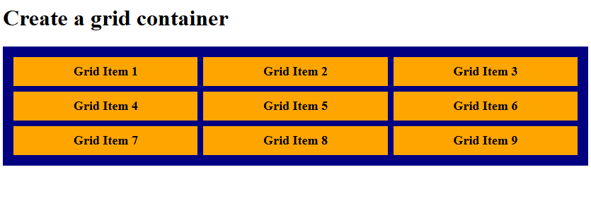
Grid Template Columns with auto value
Let us see an example:
<!DOCTYPE html>
<html>
<head>
<style>
.container {
  display: grid;
  grid-template-columns: auto auto auto;
  background-color: navy;
  padding: 15px;
  gap: 8px;
}

.container div {
  background-color: orange;
  padding: 10px;
  font-size: 18px;
  font-weight: bold;
  text-align: center;
}
</style>
</head>
<body>

<h1>Create a grid container</h1>

<div class="container">
  <div>Grid Item 1</div>
  <div>Grid Item 2</div>
  <div>Grid Item 3</div>
  <div>Grid Item 4</div>
  <div>Grid Item 5</div>
  <div>Grid Item 6</div>
  <div>Grid Item 7</div>
  <div>Grid Item 8</div>
  <div>Grid Item 9</div>
</div>

</body>
</html>
Output
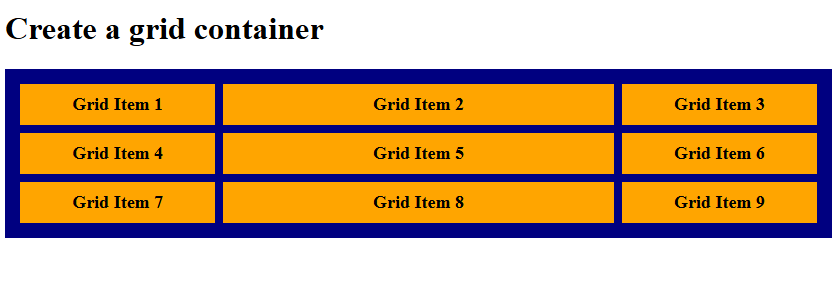
Grid Template Columns with fr value
The fr unit represents a fraction of the available space in a grid container.
- It automatically divides the free space into proportional parts.
- 1fr means one share of the space, while 2fr means two shares—twice as much as 1fr.
Let us see an example:
<!DOCTYPE html>
<html>
<head>
<style>
.container {
  display: grid;
  grid-template-columns: 1fr 2fr 1fr;
  background-color: navy;
  padding: 15px;
  gap: 8px;
}

.container div {
  background-color: orange;
  padding: 10px;
  font-size: 18px;
  font-weight: bold;
  text-align: center;
}
</style>
</head>
<body>

<h1>Create a grid container</h1>

<div class="container">
  <div>Grid Item 1</div>
  <div>Grid Item 2</div>
  <div>Grid Item 3</div>
  <div>Grid Item 4</div>
  <div>Grid Item 5</div>
  <div>Grid Item 6</div>
  <div>Grid Item 7</div>
  <div>Grid Item 8</div>
  <div>Grid Item 9</div>
</div>

</body>
</html>
Output
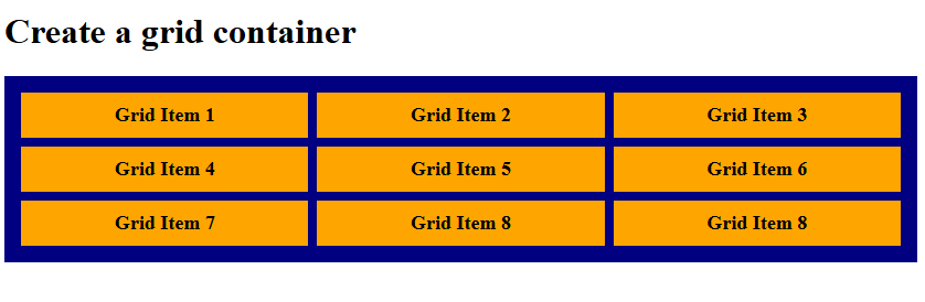
Grid Template Columns with repeat() value
The repeat() function in CSS simplifies grid definitions by allowing you to repeat column or row patterns.
- Instead of writing the same size multiple times, you can use repeat() to generate them automatically.
- It takes two arguments: the number of repetitions and the track size(s) to be repeated.
Let us see an example:
<!DOCTYPE html>
<html>
<head>
<style>
.container {
  display: grid;
  grid-template-columns: repeat(3, 1fr);
  background-color: navy;
  padding: 15px;
  gap: 8px;
}

.container div {
  background-color: orange;
  padding: 10px;
  font-size: 18px;
  font-weight: bold;
  text-align: center;
}
</style>
</head>
<body>

<h1>Create a grid container</h1>

<div class="container">
  <div>Grid Item 1</div>
  <div>Grid Item 2</div>
  <div>Grid Item 3</div>
  <div>Grid Item 4</div>
  <div>Grid Item 5</div>
  <div>Grid Item 6</div>
  <div>Grid Item 7</div>
  <div>Grid Item 8</div>
  <div>Grid Item 8</div>
</div>

</body>
</html>
Output
If you liked the tutorial, spread the word and share the link and our website, Studyopedia, with others.
Read More:
No Comments