02 Apr CSS Flexbox justify-content Property
The justify-content property in CSS Flexbox controls how flex items are aligned along the main axis (usually horizontal) when extra space is available. It distributes space between and around items, letting you control whether they cluster at the start, end, center, or spread evenly.
The following are the values of the justify-content property:
- flex-start: Items aligned at the start of the container.
- flex-end: Items aligned at the end of the container.
- center: Items centered along the main axis.
- space-between: Items evenly distributed; first at start, last at end, equal gaps between.
- space-around: Items evenly distributed with equal space around each item.
- space-evenly: Items evenly distributed with equal spacing between all items and edges.
Let us understand them one by one.
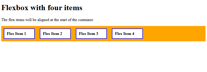
justify-content: flex-start
Use the justify-content property with the value flex-start to align items at the start of the container. Let us see an example:
<!DOCTYPE html>
<html>
<head>
<style>
.container {
  display: flex;
  justify-content: flex-start;
  background-color: orange;
}

.container div {
  width: 100px;
  background-color: white;
  border: 2px solid blue;
  margin: 10px;
  padding: 10px;
  font-weight: bold;
}
</style>
</head>
<body>
<h1>Flexbox with four items</h1>
<p>The flex items will be aligned at the start of the container:</p>
<div class="container">
  <div>Flex Item 1</div>
  <div>Flex Item 2</div>
  <div>Flex Item 3</div>
  <div>Flex Item 4</div>
</div>
</body>
</html>
Output
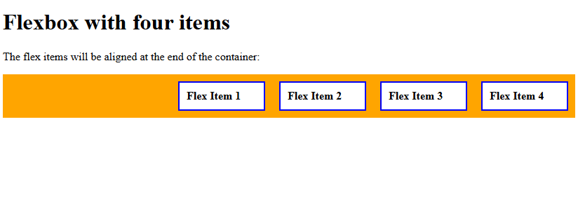
justify-content: flex-end
Use the justify-content property with the value flex-end to align items at the end of the container. Let us see an example:
<!DOCTYPE html>
<html>
<head>
<style>
.container {
  display: flex;
  justify-content: flex-end;
  background-color: orange;
}

.container div {
  width: 100px;
  background-color: white;
  border: 2px solid blue;
  margin: 10px;
  padding: 10px;
  font-weight: bold;
}
</style>
</head>
<body>
<h1>Flexbox with four items</h1>
<p>The flex items will be aligned at the end of the container:</p>
<div class="container">
  <div>Flex Item 1</div>
  <div>Flex Item 2</div>
  <div>Flex Item 3</div>
  <div>Flex Item 4</div>
</div>
</body>
</html>
Output
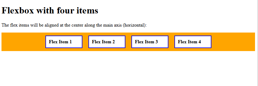
justify-content: center
Use the justify-content property with the value center to align the items in the center along the main axis (horizontal). Let us see an example:
<!DOCTYPE html>
<html>
<head>
<style>
.container {
  display: flex;
  justify-content: center;
  background-color: orange;
}

.container div {
  width: 100px;
  background-color: white;
  border: 2px solid blue;
  margin: 10px;
  padding: 10px;
  font-weight: bold;
}
</style>
</head>
<body>
<h1>Flexbox with four items</h1>
<p>The flex items will be aligned at the center along the main axis (horizontal):</p>
<div class="container">
  <div>Flex Item 1</div>
  <div>Flex Item 2</div>
  <div>Flex Item 3</div>
  <div>Flex Item 4</div>
</div>
</body>
</html>
Output
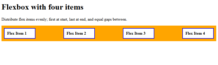
justify-content: space-between
Use the justify-content property with the value space-between to distribute items evenly; first at start, last at end, and equal gaps between.
Let us see an example:
<!DOCTYPE html>
<html>
<head>
<style>
.container {
  display: flex;
  justify-content: space-between;
  background-color: orange;
}

.container div {
  width: 100px;
  background-color: white;
  border: 2px solid blue;
  margin: 10px;
  padding: 10px;
  font-weight: bold;
}
</style>
</head>
<body>
<h1>Flexbox with four items</h1>
<p>Distribute flex items evenly; first at start, last at end, and equal gaps between.</p>
<div class="container">
  <div>Flex Item 1</div>
  <div>Flex Item 2</div>
  <div>Flex Item 3</div>
  <div>Flex Item 4</div>
</div>
</body>
</html>
Output
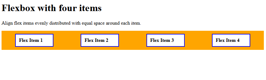
justify-content: space-around
Use the justify-content property with the value space-around to align items evenly distributed with equal space around each item.
Let us see an example:
<!DOCTYPE html>
<html>
<head>
<style>
.container {
  display: flex;
  justify-content: space-around;
  background-color: orange;
}

.container div {
  width: 100px;
  background-color: white;
  border: 2px solid blue;
  margin: 10px;
  padding: 10px;
  font-weight: bold;
}
</style>
</head>
<body>
<h1>Flexbox with four items</h1>
<p>Align flex items evenly distributed with equal space around each item.</p>
<div class="container">
  <div>Flex Item 1</div>
  <div>Flex Item 2</div>
  <div>Flex Item 3</div>
  <div>Flex Item 4</div>
</div>
</body>
</html>
Output
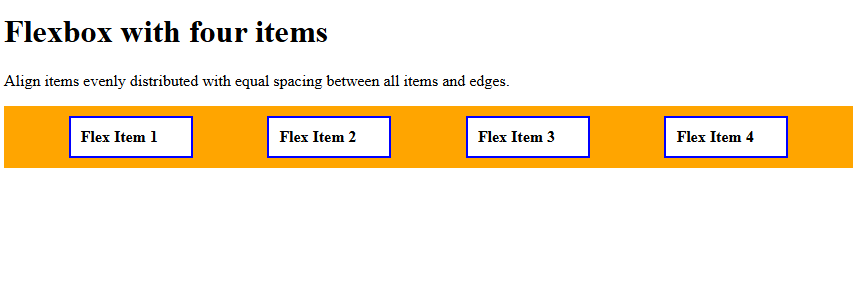
justify-content: space-evenly
Use the justify-content property with the value space-evenly to align items evenly distributed with equal spacing between all items and edges. Let us see an example:
<!DOCTYPE html>
<html>
<head>
<style>
.container {
  display: flex;
  justify-content: space-evenly;
  background-color: orange;
}

.container div {
  width: 100px;
  background-color: white;
  border: 2px solid blue;
  margin: 10px;
  padding: 10px;
  font-weight: bold;
}
</style>
</head>
<body>
<h1>Flexbox with four items</h1>
<p>Align items evenly distributed with equal spacing between all items and edges.</p>
<div class="container">
  <div>Flex Item 1</div>
  <div>Flex Item 2</div>
  <div>Flex Item 3</div>
  <div>Flex Item 4</div>
</div>
</body>
</html>
Output
If you liked the tutorial, spread the word and share the link and our website, Studyopedia, with others.
Read More:
No Comments