22 Apr CSS Gradients
Gradients are smooth transitions between two or more colors. Instead of a solid, single-color background, gradients blend colors together in a continuous way, creating depth, dimension, and visual interest.
In web design (especially CSS), gradients are commonly used for backgrounds, buttons, overlays, and artistic effects. Use the background-image property to set the gradient functions.
Types of Gradients
- Linear Gradient: Colors transition along a straight line (up, down, left, right, or diagonal). Example: linear-gradient(to right, red, blue) → red fades into blue horizontally.
- Radial Gradient: Colors spread outward from a central point, forming circles or ellipses. Example: radial-gradient(circle, yellow, green) → yellow in the center, green at the edges.
Let us understand them one by one:
CSS Linear Gradient
The linear gradient shows a smooth transition between colors along a straight line. The direction can go top → bottom, left → right, or diagonally. For linear gradient, the linear-gradient() method is used.
Transition style: Straight line (up, down, left, right, diagonal)
Let us now see two examples to understand linear gradient:
- Example 1: Set the direction of the linear gradient
- Example 2: Set the angle of the linear gradient
Example 1: Set the direction of the linear gradient
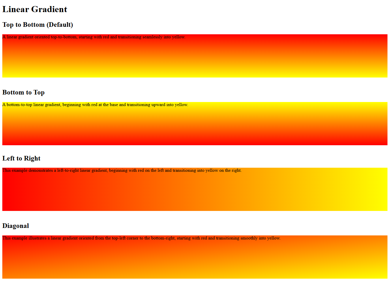
In this example, we have created four linear gradients. These four linear gradients show how direction changes the color flow. The to bottom gradient moves red to yellow vertically downward, while to top reverses it upward. The to right flows horizontally left to right, and to bottom right creates a diagonal blend across the box.
Let us see an example:
<!DOCTYPE html>
<html>
<head>
<style>
div {
  height: 150px;
}
#gradient1 {
  background-image: linear-gradient(to bottom, red, yellow);
}
#gradient2 {
  background-image: linear-gradient(to top, red, yellow);
}
#gradient3 {
  background-image: linear-gradient(to right, red, yellow);
}
#gradient4 {
  background-image: linear-gradient(to bottom right, red, yellow);
}
</style>
</head>
<body>

<h1>Linear Gradient</h1>
<h2>Top to Bottom (Default)</h2>
<div id="gradient1">A linear gradient oriented top-to-bottom, starting with red and transitioning seamlessly into yellow.</div><br>
<h2>Bottom to Top</h2>
<div id="gradient2">A bottom‑to‑top linear gradient, beginning with red at the base and transitioning upward into yellow.</div><br>
<h2>Left to Right</h2>
<div id="gradient3">This example demonstrates a left‑to‑right linear gradient, beginning with red on the left and transitioning into yellow on the right.</div><br>
<h2>Diagonal</h2>
<div id="gradient4">This example illustrates a linear gradient oriented from the top‑left corner to the bottom‑right, starting with red and transitioning smoothly into yellow.</div><br>

</body>
</html>
Output
Example 2: Set the angle of the linear gradient
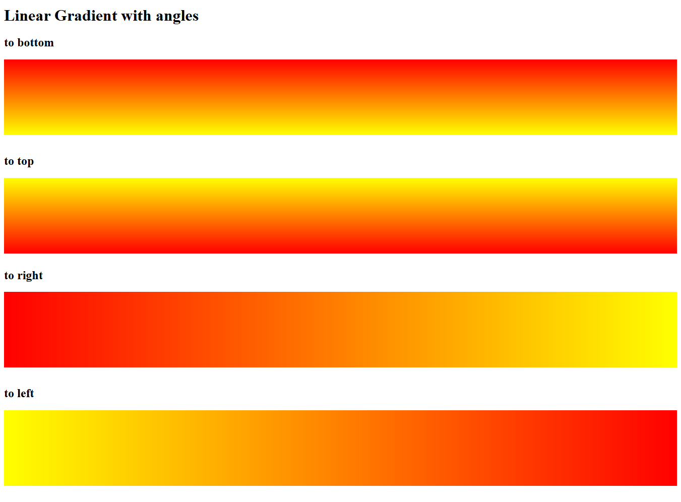
Instead of directions, like top, bottom, left, and right, we can also set angles using the angle parameter. Here,
- 0deg = to top
- 90deg = to right
- 180deg = to bottom
- 270deg = to left
Let us see an example:
<!DOCTYPE html>
<html>
<head>
<style>
div {
  height: 150px;
}
#gradient1 {
  background-image: linear-gradient(180deg, red, yellow);
}
#gradient2 {
  background-image: linear-gradient(0deg, red, yellow);
}
#gradient3 {
  background-image: linear-gradient(90deg, red, yellow);
}
#gradient4 {
  background-image: linear-gradient(270deg, red, yellow);
}
</style>
</head>
<body>

<h1>Linear Gradient with angles</h1>
<h2>to bottom</h2>
<div id="gradient1"></div><br>
<h2>to top</h2>
<div id="gradient2"></div><br>
<h2>to right</h2>
<div id="gradient3"></div><br>
<h2>to left</h2>
<div id="gradient4"></div><br>

</body>
</html>
Output
CSS Radial Gradient
In a radial gradient, the colors radiate outward from a central point. The shape is usually circular or elliptical. For linear gradient, the radial-gradient() method is used.
Transition style: Outward from center (circle/ellipse)
In CSS, a radial gradient creates a smooth transition of colors radiating outward from a central point, forming either a circle or an ellipse. It’s defined using the radial-gradient() function, where you specify the shape, position, and color stops.
Here is the syntax:
background-image: radial-gradient(shape size at position, color-stop1, color-stop2, ...);
Here:
- shape → circle or ellipse (default is ellipse).
- size → keywords like closest-side, farthest-side, closest-corner, farthest-corner.
- position → defines the gradient’s center (e.g., at center, at top left, or at 30% 40%).
- color stops → at least two colors, optionally with percentages.
Here are the default values:
- shape is ellipse,
- size is farthest-corner, and
- position is center
Let us now see two examples to understand radial gradient:
- Example 1: Set the radial gradient
- Example 2: Set the radial gradient with the size
Example 1: Set the radial gradient
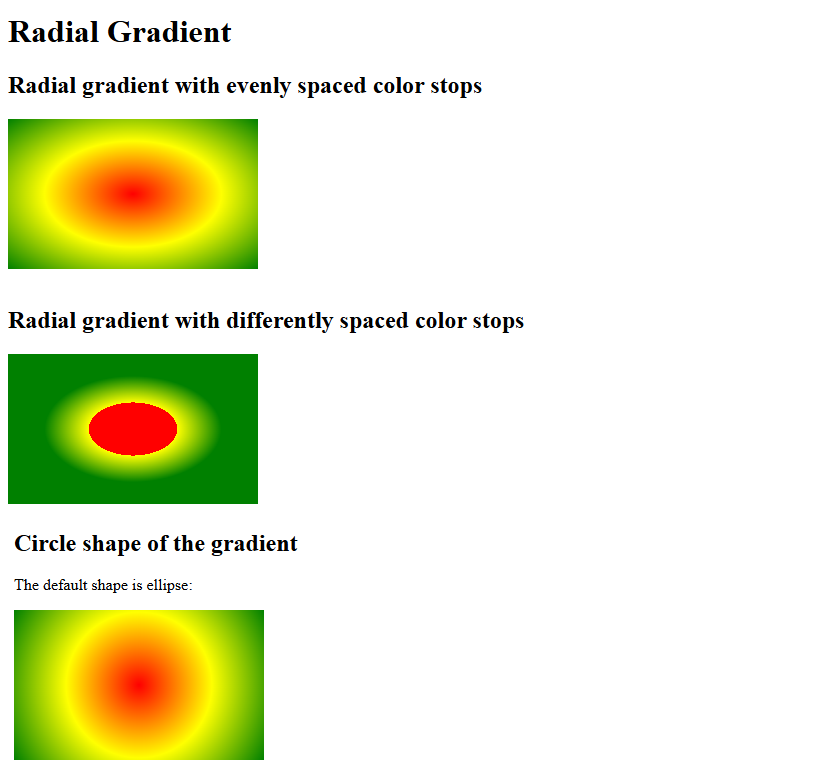
In this example, we have three gradients illustrating different radial styles:
- The first blends smoothly from red at the center to yellow and green at the edges in an elliptical shape.
- The second uses percentage stops, showing how colors can spread unevenly across the radius.
- The third forces a circular gradient, ensuring a perfectly round transition from red to yellow to green.
Let us see the example:
<!DOCTYPE html>
<html>
<head>
<style>
div {
  height: 150px;
  width: 250px;
}
#gradient1 {
  background-image: radial-gradient(red, yellow, green);
}
#gradient2 {
  background-image: radial-gradient(red 25%, yellow 5%, green 50%);
}
#gradient3 {
  background-image: radial-gradient(circle, red, yellow, green);
}
</style>
</head>
<body>

<h1>Radial Gradient</h1>
<h2>Radial gradient with evenly spaced color stops</h2>
<div id="gradient1"></div><br>
<h2>Radial gradient with differently spaced color stops</h2>
<div id="gradient2"></div><br>
<h2>Circle shape of the gradient</h2>
<p>The default shape is ellipse:</p>
<div id="gradient3"></div><br>
</body>
</html>
Output
Example 2: Set the radial gradient with the size
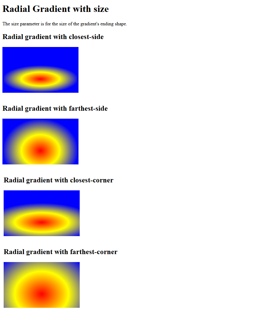
In this example, we have four radial gradients. These four gradients all use the same colors but differ in how far the gradient extends from the center point at 50% 70%. The closest-side and farthest-side options make the gradient stop at the nearest or farthest edge of the box, while the closest-corner and farthest-corner extend it to the nearest or farthest corner. Together, they demonstrate how size keywords control the spread and reach of radial gradients.
Let us see an example:
<!DOCTYPE html>
<html>
<head>
<style>
div {
  height: 150px;
  width: 250px;
}
#gradient1 {
  background-image: radial-gradient(closest-side at 50% 70%, red, yellow, blue);
}
#gradient2 {
  background-image: radial-gradient(farthest-side at 50% 70%, red, yellow, blue);
}
#gradient3 {
  background-image: radial-gradient(closest-corner at 50% 70%, red, yellow, blue);
}
#gradient4 {
  background-image: radial-gradient(farthest-corner at 50% 70%, red, yellow, blue);
}
</style>
</head>
<body>

<h1>Radial Gradient with size</h1>
<p>The size parameter is for the size of the gradient's ending shape.<p>
<h2>Radial gradient with closest-side</h2>
<div id="gradient1"></div><br>
<h2>Radial gradient with farthest-side</h2>
<div id="gradient2"></div><br>
<h2>Radial gradient with closest-corner</h2>
<div id="gradient3"></div><br>
<h2>Radial gradient with farthest-corner</h2>
<div id="gradient4"></div><br>

</body>
</html>
Output
If you liked the tutorial, spread the word and share the link and our website, Studyopedia, with others.
Read More:
No Comments