03 Apr CSS Media Queries
CSS Media Queries enable responsive design by applying styles based on the device’s characteristics or environment. They are essential for building layouts that adapt to different screen sizes and resolutions.
CSS media queries are a fundamental tool in responsive web design, allowing you to apply specific styles based on a device’s characteristics, such as screen size, resolution, or orientation.
Note: The @media rule is used to define these queries within your stylesheet.
Syntax
A media query uses the @media at-rule followed by an optional media type and one or more media features:
@media media-type and (media-feature) {
  /* CSS rules go here */
}
Here,
- Media Types: Common types include all (default), screen (standard devices), and print (printers).
- Media Features: These describe the environment, most commonly width, height, and orientation.
Common Media Features
- Viewport Dimensions: Use min-width and max-width to target specific screen sizes (e.g., mobile vs. desktop).
- Orientation: Targets portrait or landscape modes.
- Resolution: Checks pixel density (DPI) for high-resolution displays.
- User Preferences: Detects settings like prefers-color-scheme (dark mode) or prefers-reduced-motion.
Logical Operators
You can combine multiple conditions using logical operators:
- and: Joins multiple features; all must be true.
- not: Negates the entire query.
- , (comma): Acts as an OR operator; the styles apply if any of the queries are true.
- only: Prevents older browsers from applying styles they don’t understand.
Modern Range Syntax (Level 4)
Newer browsers support a more intuitive mathematical syntax for ranges.
- Traditional: @media (min-width: 600px) and (max-width: 1000px) { … }
- Modern: @media (600px <= width <= 1000px) { … }
Let us see the modern syntax:
There is a newer, shorter syntax called Media Query Level 4. It’s widely supported now and looks more like math:
/* Instead of (min-width: 768px) */
@media (width >= 768px) {
  /* Your code here */
}

/* Instead of (max-width: 600px) */
@media (width <= 600px) {
  /* Your code here */
}
Note: Just make sure you include the <meta name=”viewport” content=”width=device-width, initial-scale=1.0″> tag in your HTML <head>, otherwise these media queries might not trigger correctly on actual mobile devices!
Media Query for Devices based on the width of the viewport
Let us see some media query examples based on the viewport width.
Medium Devices: For devices with a width of 768px or more:
@media screen and (min-width: 768px) {

}
Large Devices: For devices with a width of 992px or more:
@media screen and (min-width: 992px) {

}
Small devices: For devices with a width of 600px or less:
@media screen and (max-width: 600px) {

}
On devices with a width of 992px or less:
@media screen and (max-width: 992px) {

}
For screen orientation in landscape mode:
@media only screen and (orientation: landscape) {

}
Here is what we discussed above:

Example
In a mobile-first approach using min-width, ensure your styles scale from the smallest screen to the largest.
Let us see an example to implement CSS Media Queries. It follows the “mobile-first” approach, where base styles for the smallest screens are used, and min-width is used to layer on changes as the screen gets wider:
<!DOCTYPE html>
<html>
<head>
<meta name="viewport" content="width=device-width, initial-scale=1">
<style>
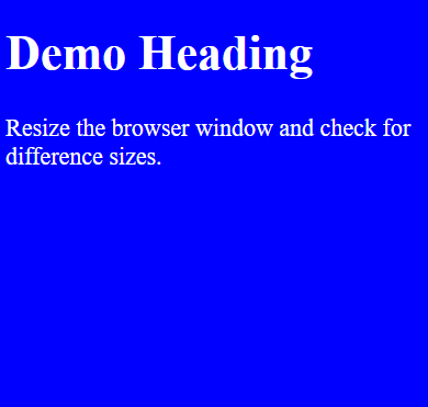
body {
background-color: blue; /* Default for mobile */
color: white;
font-size: 22px;
}
/* Small devices (480px and up) */
@media screen and (min-width: 480px) {
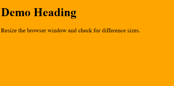
body {
background-color: orange;
color: black;
font-size: 20px;
}
}
/* Medium devices (768px and up) */
@media screen and (min-width: 768px) {
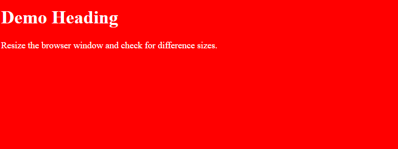
body {
background-color: red;
color: white;
font-size: 18px;
}
}
/* Large devices (992px and up) */
@media screen and (min-width: 992px) {
body {
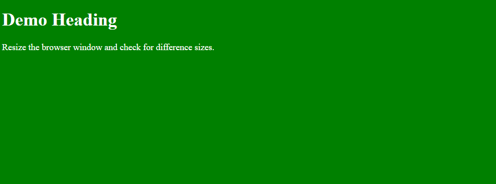
background-color: green;
color: white;
font-size: 18px;
}
}
</style>
</head>
<body>
<h1>Demo Heading</h1>
<p>Resize the browser window and check for difference sizes.</p>
</body>
</html>
Output
Screen Size: 1000px
Screen Size: 800px
Screen Size: 600px
Screen Size: 400px
If you liked the tutorial, spread the word and share the link and our website, Studyopedia, with others.
Read More:
No Comments