02 Apr CSS Flexbox align-content Property
The CSS align-content property controls how multiple flex lines are distributed along the cross-axis of a flexbox. It only applies when items wrap into multiple lines (i.e., flex-wrap: wrap).
Note: Without flex-wrap: wrap, align-content has no visible effect.
Difference from align-items:
- align-items: aligns flex items within a line.
- align-content: aligns flex lines within the container.
The following are the values of the align-content property:
- flex-start: Flex Lines packed at the start of the cross-axis.
- flex-end: Flex Lines packed at the end of the cross-axis.
- center: Flex Lines packed toward the center.
- space-between: Equal space between Flex lines, no space at edges.
- space-around: Equal space around each Flex line (half-space at edges).
- space-evenly: Equal space between all Flex lines including edges.
- stretch: Flex Lines stretch to fill the container.
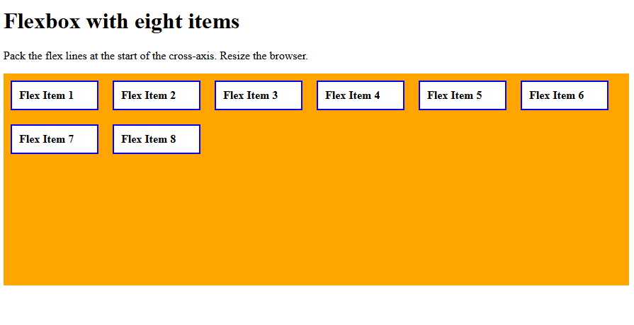
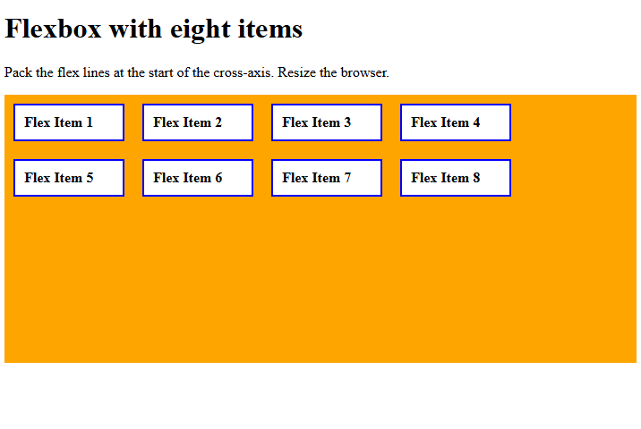
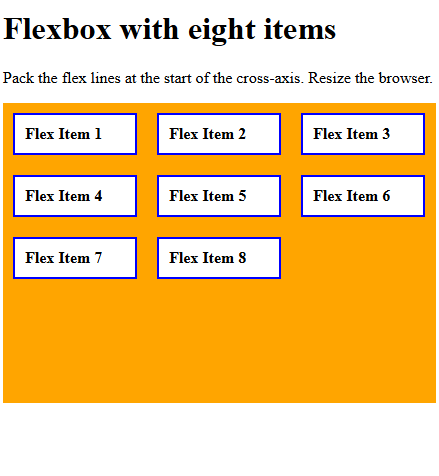
align-content: flex-start
Use the align-content property with the value flex-start to pack the flex lines at the start of the cross-axis. Let us see an example:
<!DOCTYPE html>
<html>
<head>
<style>
.container {
  display: flex;
  align-content: flex-start;
  height: 300px;
  flex-wrap: wrap;
  background-color: orange;
}

.container div {
  width: 100px;
  background-color: white;
  border: 2px solid blue;
  margin: 10px;
  padding: 10px;
  font-weight: bold;
}
</style>
</head>
<body>
<h1>Flexbox with eight items</h1>
<p>Pack the flex lines at the start of the cross-axis. Resize the browser.</p>
<div class="container">
  <div>Flex Item 1</div>
  <div>Flex Item 2</div>
  <div>Flex Item 3</div>
  <div>Flex Item 4</div>
  <div>Flex Item 5</div>
  <div>Flex Item 6</div>
  <div>Flex Item 7</div>
  <div>Flex Item 8</div>
</div>
</body>
</html>
Output
Let us now resize the window:
Let us now resize the window again:
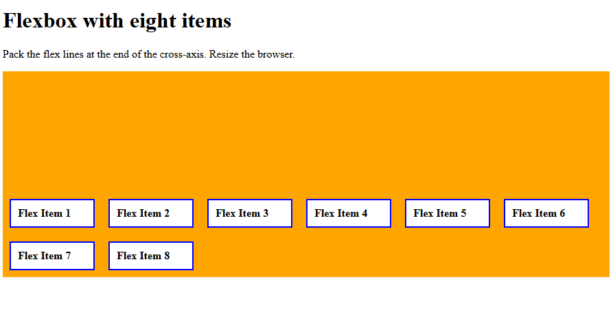
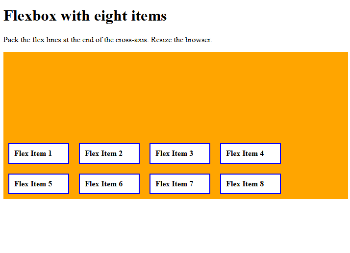
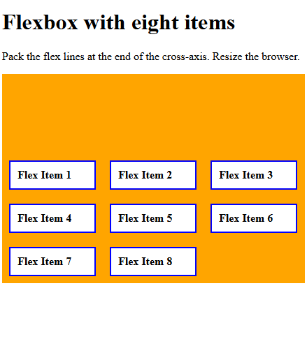
align-content: flex-end
Use the align-content property with the value flex-end to pack the flex lines at the end of the cross-axis. Let us see an example:
<!DOCTYPE html>
<html>
<head>
<style>
.container {
  display: flex;
  align-content: flex-end;
  height: 300px;
  flex-wrap: wrap;
  background-color: orange;
}

.container div {
  width: 100px;
  background-color: white;
  border: 2px solid blue;
  margin: 10px;
  padding: 10px;
  font-weight: bold;
}
</style>
</head>
<body>
<h1>Flexbox with eight items</h1>
<p>Pack the flex lines at the end of the cross-axis. Resize the browser.</p>
<div class="container">
  <div>Flex Item 1</div>
  <div>Flex Item 2</div>
  <div>Flex Item 3</div>
  <div>Flex Item 4</div>
  <div>Flex Item 5</div>
  <div>Flex Item 6</div>
  <div>Flex Item 7</div>
  <div>Flex Item 8</div>
</div>
</body>
</html>
Output
Let us now resize the window:
Let us now resize the window again:
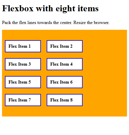
align-content: center
Use the align-content property with the value center to pack the flex lines towards the center. Let us see an example:
<!DOCTYPE html>
<html>
<head>
<style>
.container {
  display: flex;
  align-content: center;
  height: 300px;
  flex-wrap: wrap;
  background-color: orange;
}

.container div {
  width: 100px;
  background-color: white;
  border: 2px solid blue;
  margin: 10px;
  padding: 10px;
  font-weight: bold;
}
</style>
</head>
<body>
<h1>Flexbox with eight items</h1>
<p>Pack the flex lines towards the center. Resize the browser.</p>
<div class="container">
  <div>Flex Item 1</div>
  <div>Flex Item 2</div>
  <div>Flex Item 3</div>
  <div>Flex Item 4</div>
  <div>Flex Item 5</div>
  <div>Flex Item 6</div>
  <div>Flex Item 7</div>
  <div>Flex Item 8</div>
</div>
</body>
</html>
Output
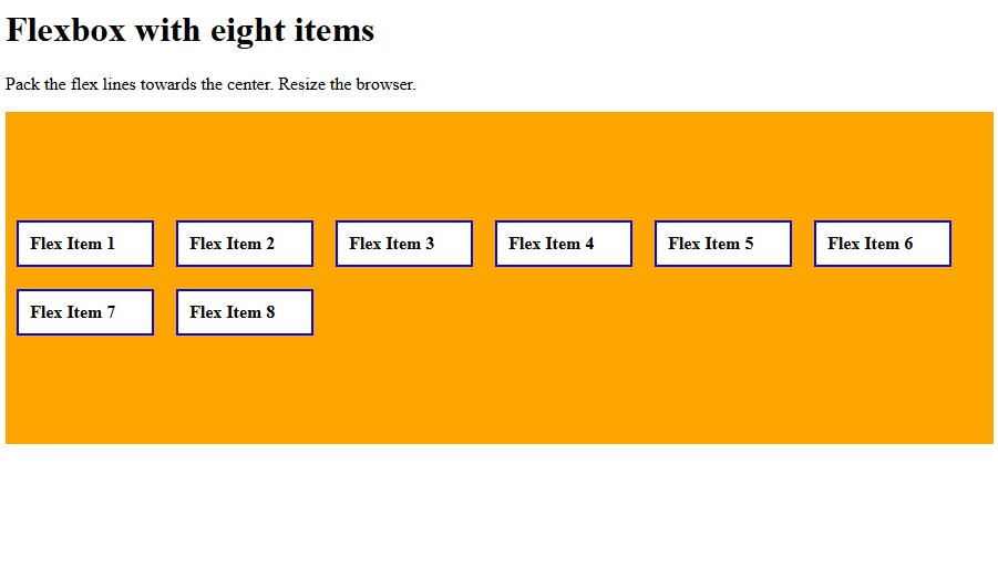
Let us now resize the window:
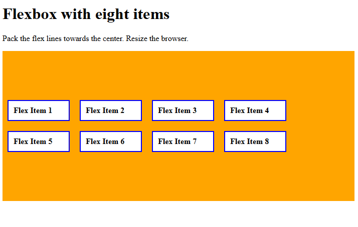
Let us now resize the window again:
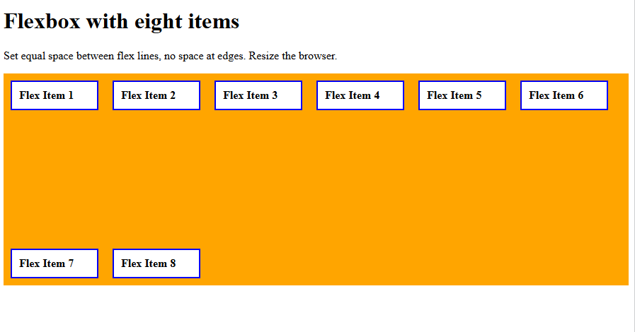
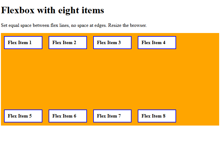
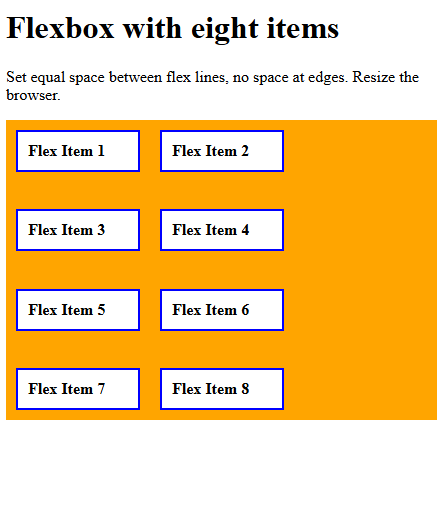
align-content: space-between
Use the align-content property with the value space-between to set equal space between flex lines, no space at the edges.
Let us see an example:
<!DOCTYPE html>
<html>
<head>
<style>
.container {
  display: flex;
  align-content: space-between;
  height: 300px;
  flex-wrap: wrap;
  background-color: orange;
}

.container div {
  width: 100px;
  background-color: white;
  border: 2px solid blue;
  margin: 10px;
  padding: 10px;
  font-weight: bold;
}
</style>
</head>
<body>
<h1>Flexbox with eight items</h1>
<p>Set equal space between flex lines, no space at edges. Resize the browser.</p>
<div class="container">
  <div>Flex Item 1</div>
  <div>Flex Item 2</div>
  <div>Flex Item 3</div>
  <div>Flex Item 4</div>
  <div>Flex Item 5</div>
  <div>Flex Item 6</div>
  <div>Flex Item 7</div>
  <div>Flex Item 8</div>
</div>
</body>
</html>
Output
Let us now resize the window:
Let us now resize the window again:
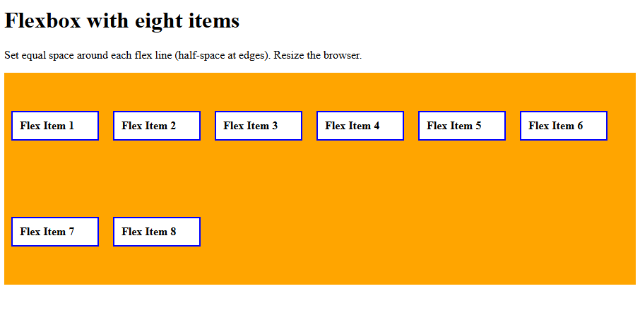
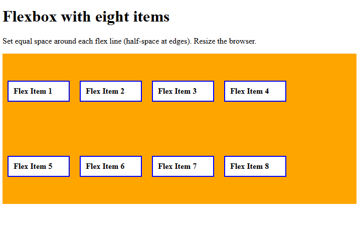
align-content: space-around
Use the align-content property with the value space-around to set equal space around each flex line (half-space at edges).
Let us see an example:
<!DOCTYPE html>
<html>
<head>
<style>
.container {
  display: flex;
  align-content: space-around;
  height: 300px;
  flex-wrap: wrap;
  background-color: orange;
}

.container div {
  width: 100px;
  background-color: white;
  border: 2px solid blue;
  margin: 10px;
  padding: 10px;
  font-weight: bold;
}
</style>
</head>
<body>
<h1>Flexbox with eight items</h1>
<p>Set equal space around each flex line (half-space at edges). Resize the browser.</p>
<div class="container">
  <div>Flex Item 1</div>
  <div>Flex Item 2</div>
  <div>Flex Item 3</div>
  <div>Flex Item 4</div>
  <div>Flex Item 5</div>
  <div>Flex Item 6</div>
  <div>Flex Item 7</div>
  <div>Flex Item 8</div>
</div>
</body>
</html>
Output
Here, notice the half-space at the edges in comparison with double the space between items 1 and 7, 2 and 8, etc.
Let us now resize the window. Notice the half-space at the edges in comparison with double the space between items 1 and 7, 2 and 8, 3 and 7, 4 and 8.
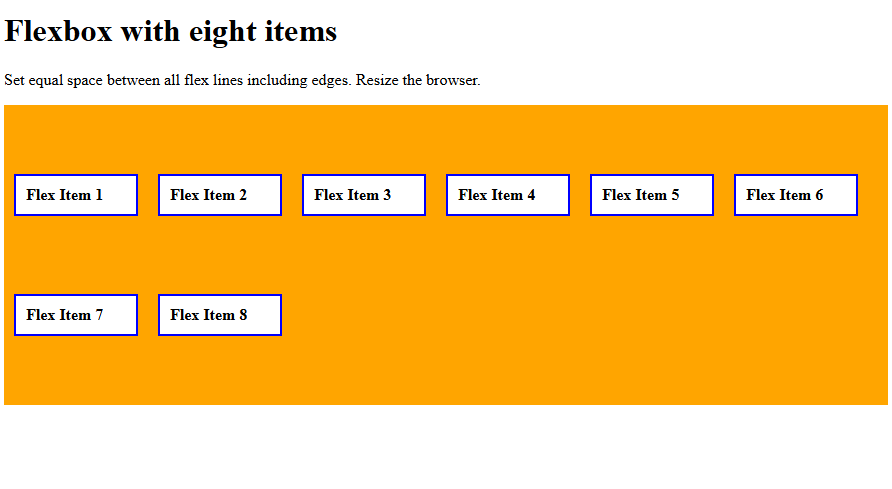
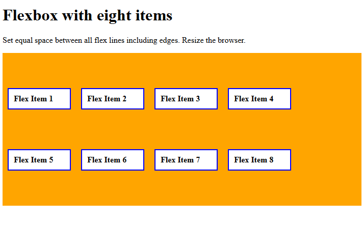
align-content: space-evenly
Use the align-content property with the value space-evenly to set equal space between all flex lines, including edges. Let us see an example:
<!DOCTYPE html>
<html>
<head>
<style>
.container {
  display: flex;
  align-content: space-evenly;
  height: 300px;
  flex-wrap: wrap;
  background-color: orange;
}

.container div {
  width: 100px;
  background-color: white;
  border: 2px solid blue;
  margin: 10px;
  padding: 10px;
  font-weight: bold;
}
</style>
</head>
<body>
<h1>Flexbox with eight items</h1>
<p>Set equal space between all flex lines including edges. Resize the browser.</p>
<div class="container">
  <div>Flex Item 1</div>
  <div>Flex Item 2</div>
  <div>Flex Item 3</div>
  <div>Flex Item 4</div>
  <div>Flex Item 5</div>
  <div>Flex Item 6</div>
  <div>Flex Item 7</div>
  <div>Flex Item 8</div>
</div>
</body>
</html>
Output
Here, notice the space at the edges is equal to the space between items 1, 7, and 2, and 8:
Let us now resize the window. Notice the space at the edges is equal to the space between items 1 and 5, 2 and 6, 3 and 7, 4 and 8.
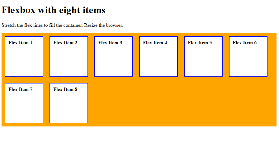
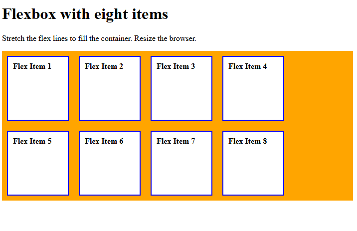
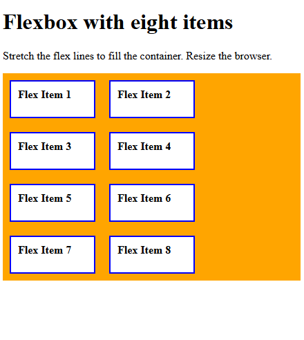
align-content: stretch
Use the align-content property with the value stretch to stretch the flex lines to fill the container. Let us see an example:
<!DOCTYPE html>
<html>
<head>
<style>
.container {
  display: flex;
  align-content: stretch;
  height: 300px;
  flex-wrap: wrap;
  background-color: orange;
}

.container div {
  width: 100px;
  background-color: white;
  border: 2px solid blue;
  margin: 10px;
  padding: 10px;
  font-weight: bold;
}
</style>
</head>
<body>
<h1>Flexbox with eight items</h1>
<p>Stretch the flex lines to fill the container. Resize the browser.</p>
<div class="container">
  <div>Flex Item 1</div>
  <div>Flex Item 2</div>
  <div>Flex Item 3</div>
  <div>Flex Item 4</div>
  <div>Flex Item 5</div>
  <div>Flex Item 6</div>
  <div>Flex Item 7</div>
  <div>Flex Item 8</div>
</div>
</body>
</html>
Output
Let us now resize the window:
Let us now resize the window again:
If you liked the tutorial, spread the word and share the link and our website, Studyopedia, with others.
Read More:
No Comments