22 Apr CSS Display Property
In CSS, the display property defines how an element is rendered and how it interacts with surrounding elements. The most common values are inline, block, inline-block, flex, and grid, each serving distinct layout purposes.
In this lesson, we will discuss:
- The display: inline property
- The display: block property
- The display: inline-block property
- The display: flex property
- The display: grid property
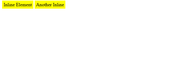
The display: inline property
When the display property is set to inline, the elements do not start on a new line; they only take up as much width as needed. It is used for styling text spans, links, or icons inside text.
Let us see an example. The elements appear side by side, like words in a sentence:
<!DOCTYPE html>
<html>
<head>
  <style>
    .inline {
      display: inline;
      background: yellow;
      padding: 5px;
    }
  </style>
</head>
<body>
  <span class="inline">Inline Element</span>
  <span class="inline">Another Inline</span>
</body>
</html>
Output
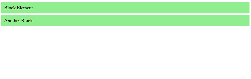
The display: block property
When the display property is set to block, the elements start on a new line and take up the full width available. It is used for paragraphs, divs, headings, etc.
Let us see an example. Here, each block stacks vertically, filling the container’s width:
<!DOCTYPE html>
<html>
<head>
  <style>
    .block {
      display: block;
      background: lightgreen;
      padding: 10px;
      margin: 5px 0;
    }
  </style>
</head>
<body>
  <div class="block">Block Element</div>
  <div class="block">Another Block</div>
</body>
</html>
Output
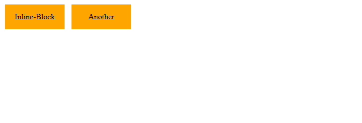
The display: inline-block property
When the display property is set to inline-block, it behaves like inline elements but allows setting width and height. It’ is used for buttons, navigation menus, etc.
Let us see an example. Here, the elements appear side by side, but dimensions are respected:
<!DOCTYPE html>
<html>
<head>
  <style>
    .inline-block {
      display: inline-block;
      width: 120px;
      height: 50px;
      background: orange;
      margin: 5px;
      text-align: center;
      line-height: 50px;
    }
  </style>
</head>
<body>
  <div class="inline-block">Inline-Block</div>
  <div class="inline-block">Another</div>
</body>
</html>
Output
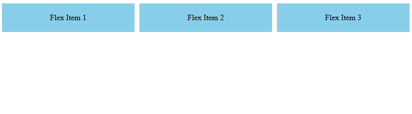
The display: flex property
When the display property is set to flex, it turns the container into a flexbox, aligning children horizontally or vertically with powerful alignment options. It is used for responsive layouts, navigation bars, card layouts, etc.
Let us see an example. Here, flex items distribute space evenly in one row. The display: flex turns the container into a Flexbox container, enabling flexible layout behavior for its children. The gap: 10px adds 10px spacing between each flex item (instead of using margins). The flex: 1 is a shorthand property that makes a flex item grow to fill all available space in its container:
<!DOCTYPE html>
<html>
<head>
  <style>
    .flex-container {
      display: flex;
      gap: 10px;
    }
    .flex-item {
      flex: 1;
      background: skyblue;
      padding: 20px;
      text-align: center;
    }
  </style>
</head>
<body>
  <div class="flex-container">
    <div class="flex-item">Flex Item 1</div>
    <div class="flex-item">Flex Item 2</div>
    <div class="flex-item">Flex Item 3</div>
  </div>
</body>
</html>
Output
Note: Refer to our guide on CSS Flexbox
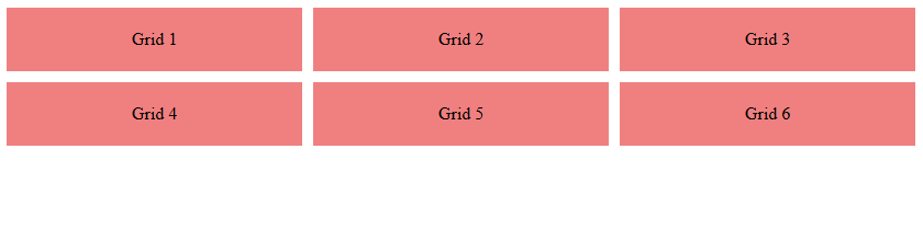
The display: grid property
When the display property is set to grid, it turns the container into a grid layout, allowing precise row/column placement. It is used for complex page layouts and dashboards.
Flex vs Grid: Use flex for one-dimensional layouts (row or column), and grid for two-dimensional layouts (rows + columns).
Let us see an example. Here, flex items align into a structured grid. The display: grid turns this div into a grid container. The grid-template-columns: 1fr 1fr 1fr; creates 3 equal-width columns. The gap:10px; adds spacing between grid items:
<!DOCTYPE html>
<html>
<head>
  <style>
    .grid-container {
      display: grid;
      grid-template-columns: 1fr 1fr 1fr;
      gap: 10px;
    }
    .grid-item {
      background: lightcoral;
      padding: 20px;
      text-align: center;
    }
  </style>
</head>
<body>
  <div class="grid-container">
    <div class="grid-item">Grid 1</div>
    <div class="grid-item">Grid 2</div>
    <div class="grid-item">Grid 3</div>
    <div class="grid-item">Grid 4</div>
    <div class="grid-item">Grid 5</div>
    <div class="grid-item">Grid 6</div>
  </div>
</body>
</html>
Output
If you liked the tutorial, spread the word and share the link and our website, Studyopedia, with others.
Read More:
No Comments