22 Apr CSS Grid Template – Rows
The grid-template-rows property specifies both the number of rows in a grid and their heights. Its value is written as a space‑separated list, where each entry defines the height of a corresponding row.
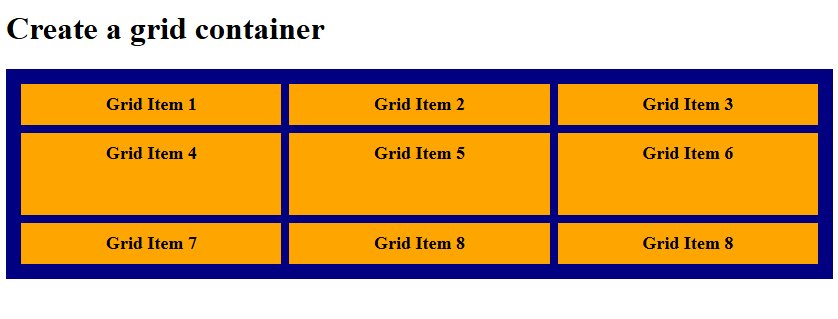
Grid Template Rows with fr value
The fr unit in CSS Grid represents a fraction of the available space in a grid container. It’s used to distribute leftover space proportionally among columns or rows.
- Definition: fr stands for fractional unit.
- Usage: Applied in grid-template-columns or grid-template-rows.
- Behavior: Divides the remaining free space after fixed sizes (like px, %, or auto) are allocated.
- Proportional sizing:
- 1fr = one share of the available space.
- 2fr = two shares, meaning twice as much as 1fr.
Let us see an example:
<!DOCTYPE html>
<html>
<head>
<style>
.container {
  display: grid;
  grid-template-columns: auto auto auto;
  grid-template-rows: 1fr 2fr 1fr;
  background-color: navy;
  padding: 15px;
  gap: 8px;
}

.container div {
  background-color: orange;
  padding: 10px;
  font-size: 18px;
  font-weight: bold;
  text-align: center;
}
</style>
</head>
<body>

<h1>Create a grid container</h1>

<div class="container">
  <div>Grid Item 1</div>
  <div>Grid Item 2</div>
  <div>Grid Item 3</div>
  <div>Grid Item 4</div>
  <div>Grid Item 5</div>
  <div>Grid Item 6</div>
  <div>Grid Item 7</div>
  <div>Grid Item 8</div>
  <div>Grid Item 8</div>
</div>

</body>
</html>
Output
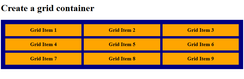
Grid Template Rows with auto value
Using the auto value in the grid-template-rows CSS property creates a row track that adjusts its height based on the content inside it. Let us see an example:
<!DOCTYPE html>
<html>
<head>
<style>
.container {
  display: grid;
  grid-template-columns: auto auto auto;
  grid-template-rows: auto;
  background-color: navy;
  padding: 15px;
  gap: 8px;
}

.container div {
  background-color: orange;
  padding: 10px;
  font-size: 18px;
  font-weight: bold;
  text-align: center;
}
</style>
</head>
<body>

<h1>Create a grid container</h1>

<div class="container">
  <div>Grid Item 1</div>
  <div>Grid Item 2</div>
  <div>Grid Item 3</div>
  <div>Grid Item 4</div>
  <div>Grid Item 5</div>
  <div>Grid Item 6</div>
  <div>Grid Item 7</div>
  <div>Grid Item 8</div>
  <div>Grid Item 9</div>
</div>

</body>
</html>
Output
If you liked the tutorial, spread the word and share the link and our website, Studyopedia, with others.
Read More:
No Comments