22 Apr CSS Grid justify-content property
The justify-content property aligns grid tracks along the inline axis (horizontal in left-to-right languages).
- Usage: Determines how extra space is distributed when the grid width is smaller than the container.
- Values: Common options include start, end, center, space-between, space-around, and space-evenly.
Let us see some examples:
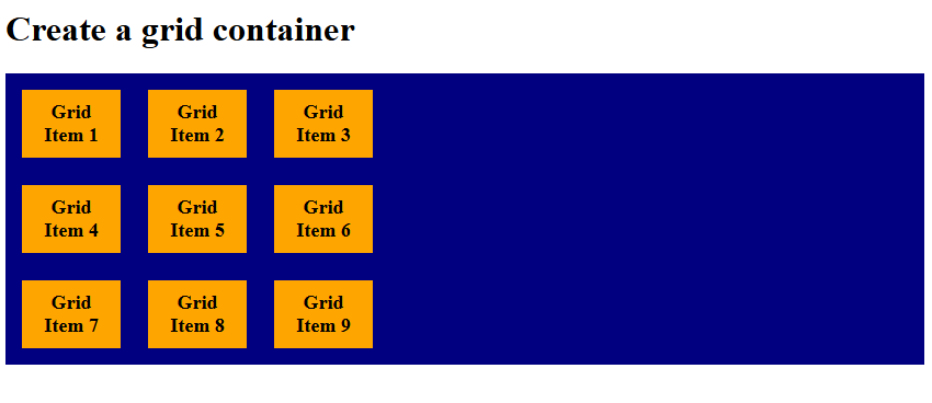
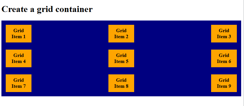
justify-content: start
In CSS Grid, justify-content: start aligns the entire grid container’s columns to the left (start) of the grid container. All extra space is pushed to the right side. Let us see an example:
<!DOCTYPE html>
<html>
<head>
<style>
.container {
  display: grid;
  grid-template-columns: 90px 90px 90px;
    justify-content: start;
  background-color: navy;
  padding: 15px;
  gap: 25px;
}

.container div {
  background-color: orange;
  padding: 10px;
  font-size: 18px;
  font-weight: bold;
  text-align: center;
}
</style>
</head>
<body>

<h1>Create a grid container</h1>

<div class="container">
  <div>Grid Item 1</div>
  <div>Grid Item 2</div>
  <div>Grid Item 3</div>
  <div>Grid Item 4</div>
  <div>Grid Item 5</div>
  <div>Grid Item 6</div>
  <div>Grid Item 7</div>
  <div>Grid Item 8</div>
  <div>Grid Item 9</div>
</div>

</body>
</html>
Output
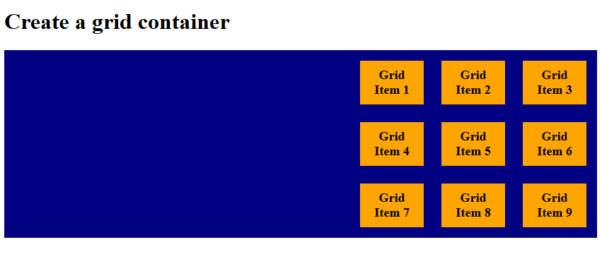
justify-content: end
In CSS Grid, justify-content: end aligns the entire grid container’s columns to the right (end) of the grid container. All extra space is pushed to the left side. Let us see an example:
<!DOCTYPE html>
<html>
<head>
<style>
.container {
  display: grid;
  grid-template-columns: 90px 90px 90px;
    justify-content: end;
  background-color: navy;
  padding: 15px;
  gap: 25px;
}

.container div {
  background-color: orange;
  padding: 10px;
  font-size: 18px;
  font-weight: bold;
  text-align: center;
}
</style>
</head>
<body>

<h1>Create a grid container</h1>

<div class="container">
  <div>Grid Item 1</div>
  <div>Grid Item 2</div>
  <div>Grid Item 3</div>
  <div>Grid Item 4</div>
  <div>Grid Item 5</div>
  <div>Grid Item 6</div>
  <div>Grid Item 7</div>
  <div>Grid Item 8</div>
  <div>Grid Item 9</div>
</div>

</body>
</html>
Output
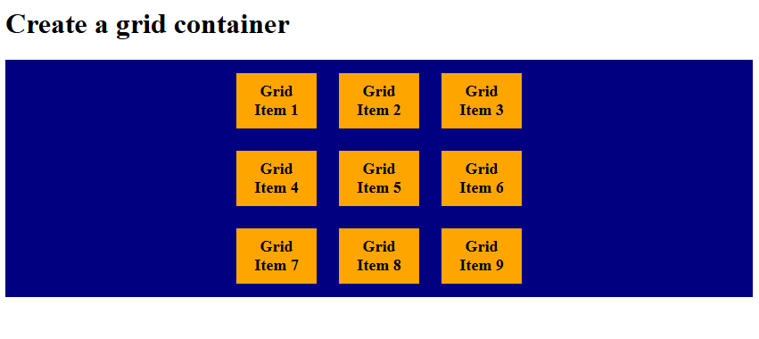
justify-content: center
In CSS Grid, justify-content: center aligns all grid items together in the middle of the container. Equal empty space remains on both sides. It horizontally centers the entire grid tracks within the container when the grid’s total width is smaller than its container. Let us see an example:
<!DOCTYPE html>
<html>
<head>
<style>
.container {
  display: grid;
  grid-template-columns: 90px 90px 90px;
    justify-content: center;
  background-color: navy;
  padding: 15px;
  gap: 25px;
}

.container div {
  background-color: orange;
  padding: 10px;
  font-size: 18px;
  font-weight: bold;
  text-align: center;
}
</style>
</head>
<body>

<h1>Create a grid container</h1>

<div class="container">
  <div>Grid Item 1</div>
  <div>Grid Item 2</div>
  <div>Grid Item 3</div>
  <div>Grid Item 4</div>
  <div>Grid Item 5</div>
  <div>Grid Item 6</div>
  <div>Grid Item 7</div>
  <div>Grid Item 8</div>
  <div>Grid Item 9</div>
</div>

</body>
</html>
Output
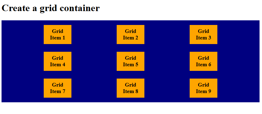
justify-content: space-evenly
In CSS, the justify-content: space-evenly property distributes items with equal spacing between them and equal padding at the edges. Every gap, including the container edges, is the same size.
Let us see an example:
<!DOCTYPE html>
<html>
<head>
<style>
.container {
  display: grid;
  grid-template-columns: 90px 90px 90px;
    justify-content: space-evenly;
  background-color: navy;
  padding: 15px;
  gap: 25px;
}

.container div {
  background-color: orange;
  padding: 10px;
  font-size: 18px;
  font-weight: bold;
  text-align: center;
}
</style>
</head>
<body>

<h1>Create a grid container</h1>

<div class="container">
  <div>Grid Item 1</div>
  <div>Grid Item 2</div>
  <div>Grid Item 3</div>
  <div>Grid Item 4</div>
  <div>Grid Item 5</div>
  <div>Grid Item 6</div>
  <div>Grid Item 7</div>
  <div>Grid Item 8</div>
  <div>Grid Item 9</div>
</div>

</body>
</html>
Output
justify-content: space-around
The justify-content: space around property places equal space around each item, meaning edges get half the gap size. Items appear with larger gaps between them than at the container edges. Let us see an example:
<!DOCTYPE html>
<html>
<head>
<style>
.container {
  display: grid;
  grid-template-columns: 90px 90px 90px;
    justify-content: space-around;
  background-color: navy;
  padding: 15px;
  gap: 25px;
}

.container div {
  background-color: orange;
  padding: 10px;
  font-size: 18px;
  font-weight: bold;
  text-align: center;
}
</style>
</head>
<body>

<h1>Create a grid container</h1>

<div class="container">
  <div>Grid Item 1</div>
  <div>Grid Item 2</div>
  <div>Grid Item 3</div>
  <div>Grid Item 4</div>
  <div>Grid Item 5</div>
  <div>Grid Item 6</div>
  <div>Grid Item 7</div>
  <div>Grid Item 8</div>
  <div>Grid Item 9</div>
</div>

</body>
</html>
Output
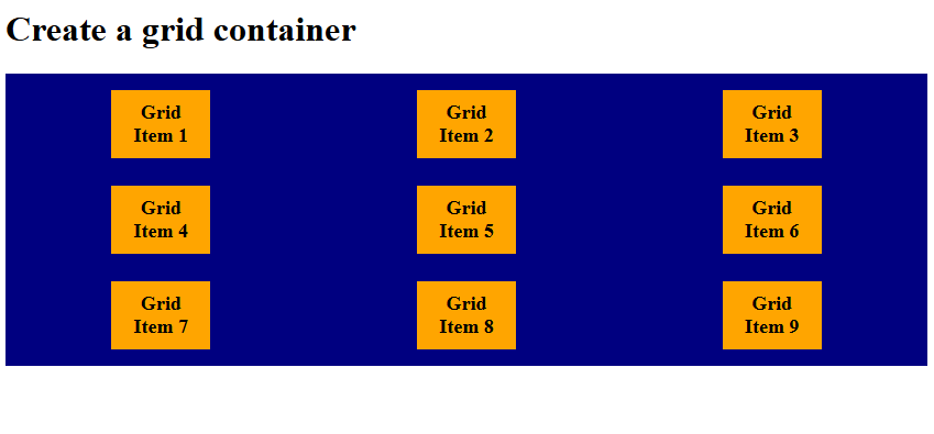
justify-content: space-between
The justify-content: space-between distributes items evenly, but only between them; no extra space at edges. First item aligns to the start; last item aligns to the end.
Let us see an example:
<!DOCTYPE html>
<html>
<head>
<style>
.container {
  display: grid;
  grid-template-columns: 90px 90px 90px;
    justify-content: space-between;
  background-color: navy;
  padding: 15px;
  gap: 25px;
}

.container div {
  background-color: orange;
  padding: 10px;
  font-size: 18px;
  font-weight: bold;
  text-align: center;
}
</style>
</head>
<body>

<h1>Create a grid container</h1>

<div class="container">
  <div>Grid Item 1</div>
  <div>Grid Item 2</div>
  <div>Grid Item 3</div>
  <div>Grid Item 4</div>
  <div>Grid Item 5</div>
  <div>Grid Item 6</div>
  <div>Grid Item 7</div>
  <div>Grid Item 8</div>
  <div>Grid Item 9</div>
</div>

</body>
</html>
Output
If you liked the tutorial, spread the word and share the link and our website, Studyopedia, with others.
Read More:
No Comments