22 Apr CSS – Grid Gaps
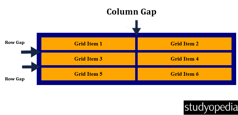
In a grid layout, the space between rows and columns is called a gap (also known as a gutter). You can adjust the spacing using the following properties:
- column-gap: Sets the gap between grid columns.
- row-gap: Sets the gap between grid rows.
- gap: Shorthand for setting both row and column gaps at once.
Here is the representation:
Let us start with the column-gap property:
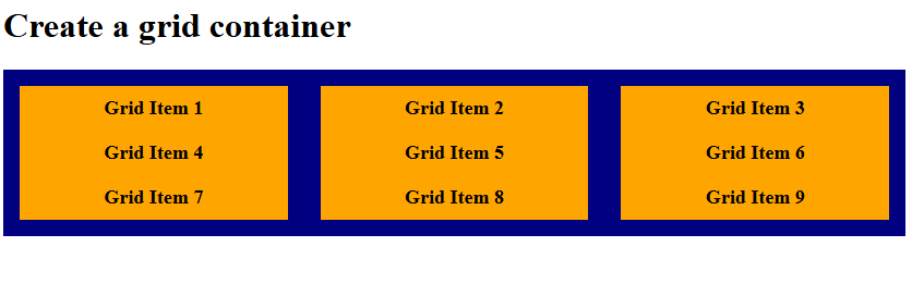
The column-gap Property
In CSS grid, the column-gap defines the space between columns in a grid.
Let us see an example:
<!DOCTYPE html>
<html>
<head>
<style>
.container {
  display: grid;
  grid-template-columns: 1fr 1fr 1fr;
  background-color: navy;
  padding: 15px;
  column-gap: 30px;
}

.container div {
  background-color: orange;
  padding: 10px;
  font-size: 18px;
  font-weight: bold;
  text-align: center;
}
</style>
</head>
<body>

<h1>Create a grid container</h1>

<div class="container">
  <div>Grid Item 1</div>
  <div>Grid Item 2</div>
  <div>Grid Item 3</div>
  <div>Grid Item 4</div>
  <div>Grid Item 5</div>
  <div>Grid Item 6</div>
  <div>Grid Item 7</div>
  <div>Grid Item 8</div>
  <div>Grid Item 9</div>
</div>

</body>
</html>
Output
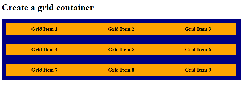
The row-gap Property
In CSS grid, the row-gap defines the space between rows in a grid.
Let us see an example:
<!DOCTYPE html>
<html>
<head>
<style>
.container {
  display: grid;
  grid-template-columns: 1fr 1fr 1fr;
  background-color: navy;
  padding: 15px;
  row-gap: 30px;
}

.container div {
  background-color: orange;
  padding: 10px;
  font-size: 18px;
  font-weight: bold;
  text-align: center;
}
</style>
</head>
<body>

<h1>Create a grid container</h1>

<div class="container">
  <div>Grid Item 1</div>
  <div>Grid Item 2</div>
  <div>Grid Item 3</div>
  <div>Grid Item 4</div>
  <div>Grid Item 5</div>
  <div>Grid Item 6</div>
  <div>Grid Item 7</div>
  <div>Grid Item 8</div>
  <div>Grid Item 9</div>
</div>

</body>
</html>
Output
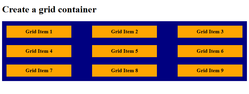
The gap Shorthand Property
The gap property is a shorthand for setting both row-gap and column-gap:
- If you provide a single value, it applies the same spacing to both rows and columns.
- If you provide two values, the first sets the row gap and the second sets the column gap.
Let us see an example:
<!DOCTYPE html>
<html>
<head>
<style>
.container {
  display: grid;
  grid-template-columns: 1fr 1fr 1fr;
  background-color: navy;
  padding: 15px;
  gap: 25px 70px;
}

.container div {
  background-color: orange;
  padding: 10px;
  font-size: 18px;
  font-weight: bold;
  text-align: center;
}
</style>
</head>
<body>

<h1>Create a grid container</h1>

<div class="container">
  <div>Grid Item 1</div>
  <div>Grid Item 2</div>
  <div>Grid Item 3</div>
  <div>Grid Item 4</div>
  <div>Grid Item 5</div>
  <div>Grid Item 6</div>
  <div>Grid Item 7</div>
  <div>Grid Item 8</div>
  <div>Grid Item 9</div>
</div>

</body>
</html>
Output
If you liked the tutorial, spread the word and share the link and our website, Studyopedia, with others.
Read More:
No Comments