22 Apr CSS Grid align-content property
The align-content property aligns grid tracks along the block axis (vertical in most languages).
- Usage: Controls vertical spacing when the grid height is smaller than the container.
- Values: Options include start, end, center, space-between, space-around, space-evenly, and stretch.
Let us see some examples:
Note: Since the align-content control vertical spacing, we will set the height for our container.
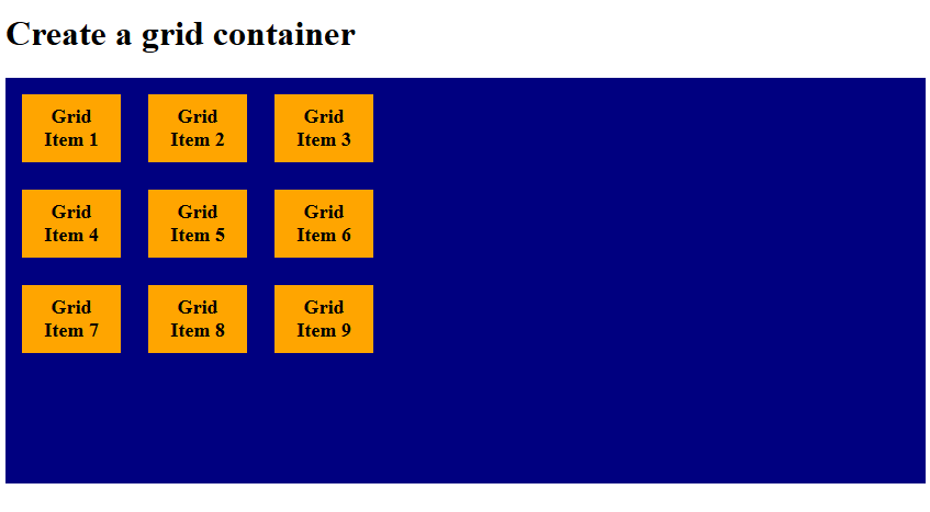
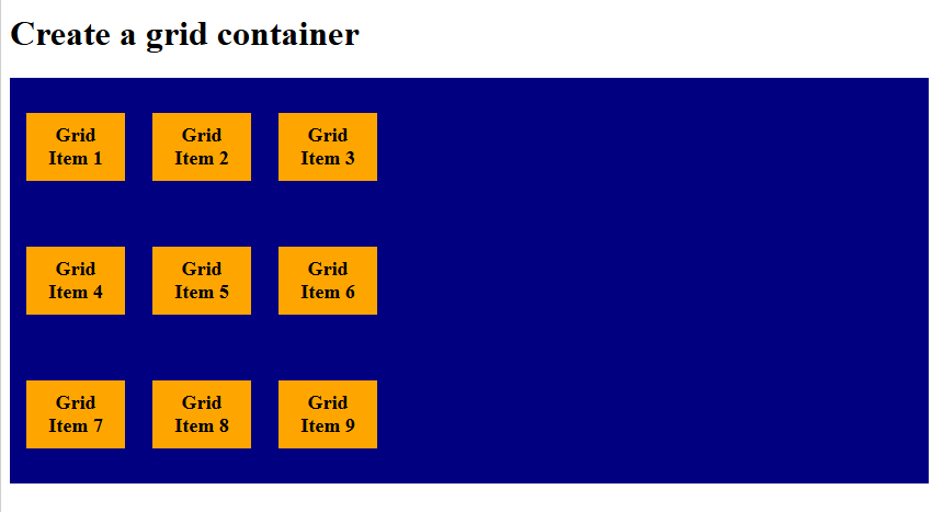
align-content: start
The align-content: start property aligns all grid tracks to the top (start) of the container. The remaining space stays at the bottom. Let us see an example:
<!DOCTYPE html>
<html>
<head>
<style>
.container {
  display: grid;
  height: 340px;
  grid-template-columns: 90px 90px 90px;
 align-content: start;
  background-color: navy;
  padding: 15px;
  gap: 25px;
}

.container div {
  background-color: orange;
  padding: 10px;
  font-size: 18px;
  font-weight: bold;
  text-align: center;
}
</style>
</head>
<body>

<h1>Create a grid container</h1>

<div class="container">
  <div>Grid Item 1</div>
  <div>Grid Item 2</div>
  <div>Grid Item 3</div>
  <div>Grid Item 4</div>
  <div>Grid Item 5</div>
  <div>Grid Item 6</div>
  <div>Grid Item 7</div>
  <div>Grid Item 8</div>
  <div>Grid Item 9</div>
</div>

</body>
</html>
Output
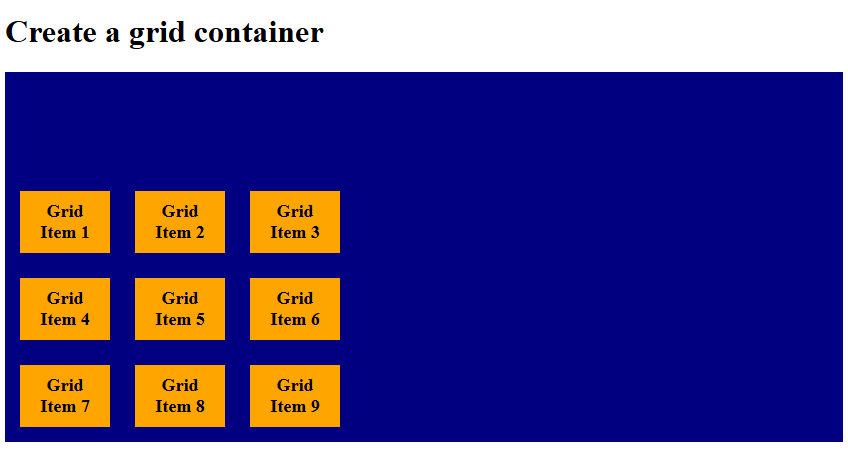
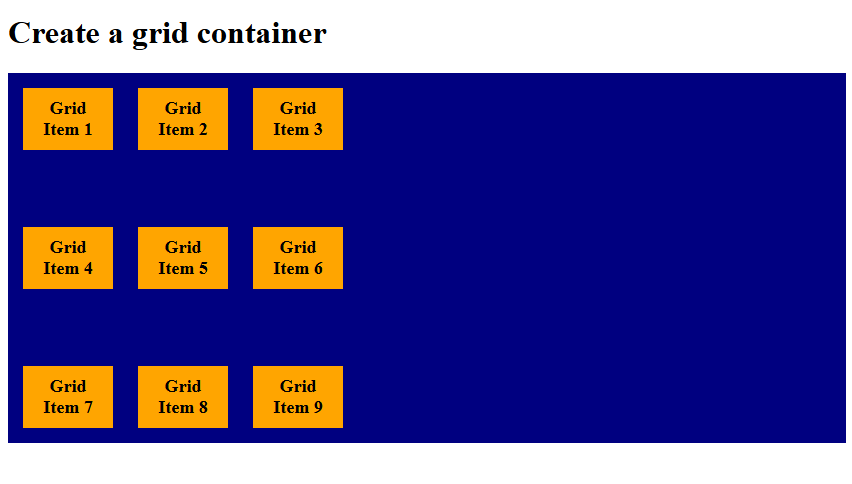
align-content: end
The align-content: end property aligns all grid tracks to the bottom (end) of the container. The remaining space stays at the top. Let us see an example:
<!DOCTYPE html>
<html>
<head>
<style>
.container {
  display: grid;
  height: 340px;
  grid-template-columns: 90px 90px 90px;
 align-content: end;
  background-color: navy;
  padding: 15px;
  gap: 25px;
}

.container div {
  background-color: orange;
  padding: 10px;
  font-size: 18px;
  font-weight: bold;
  text-align: center;
}
</style>
</head>
<body>

<h1>Create a grid container</h1>

<div class="container">
  <div>Grid Item 1</div>
  <div>Grid Item 2</div>
  <div>Grid Item 3</div>
  <div>Grid Item 4</div>
  <div>Grid Item 5</div>
  <div>Grid Item 6</div>
  <div>Grid Item 7</div>
  <div>Grid Item 8</div>
  <div>Grid Item 9</div>
</div>

</body>
</html>
Output
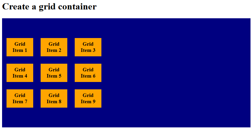
align-content: center
The align-content: center property packs all grid tracks together in the middle of the container. Equal empty space remains above and below the tracks. Let us see an example:
<!DOCTYPE html>
<html>
<head>
<style>
.container {
  display: grid;
  height: 340px;
  grid-template-columns: 90px 90px 90px;
 align-content: center;
  background-color: navy;
  padding: 15px;
  gap: 25px;
}

.container div {
  background-color: orange;
  padding: 10px;
  font-size: 18px;
  font-weight: bold;
  text-align: center;
}
</style>
</head>
<body>

<h1>Create a grid container</h1>

<div class="container">
  <div>Grid Item 1</div>
  <div>Grid Item 2</div>
  <div>Grid Item 3</div>
  <div>Grid Item 4</div>
  <div>Grid Item 5</div>
  <div>Grid Item 6</div>
  <div>Grid Item 7</div>
  <div>Grid Item 8</div>
  <div>Grid Item 9</div>
</div>

</body>
</html>
Output
align-content: space-evenly
The align-content: space-evenly property distributes grid tracks with equal spacing between them and at the edges. Every gap, including the outer edges, is the same size. Let us see an example:
<!DOCTYPE html>
<html>
<head>
<style>
.container {
  display: grid;
  height: 340px;
  grid-template-columns: 90px 90px 90px;
 align-content: space-evenly;
  background-color: navy;
  padding: 15px;
  gap: 25px;
}

.container div {
  background-color: orange;
  padding: 10px;
  font-size: 18px;
  font-weight: bold;
  text-align: center;
}
</style>
</head>
<body>

<h1>Create a grid container</h1>

<div class="container">
  <div>Grid Item 1</div>
  <div>Grid Item 2</div>
  <div>Grid Item 3</div>
  <div>Grid Item 4</div>
  <div>Grid Item 5</div>
  <div>Grid Item 6</div>
  <div>Grid Item 7</div>
  <div>Grid Item 8</div>
  <div>Grid Item 9</div>
</div>

</body>
</html>
Output
align-content: space-around
The align-content: space-around property places equal space around each track, meaning outer edges get half the gap size. Tracks are evenly spaced, but edges look slightly narrower. Let us see an example:
<!DOCTYPE html>
<html>
<head>
<style>
.container {
  display: grid;
  height: 340px;
  grid-template-columns: 90px 90px 90px;
 align-content: space-around;
  background-color: navy;
  padding: 15px;
  gap: 25px;
}

.container div {
  background-color: orange;
  padding: 10px;
  font-size: 18px;
  font-weight: bold;
  text-align: center;
}
</style>
</head>
<body>

<h1>Create a grid container</h1>

<div class="container">
  <div>Grid Item 1</div>
  <div>Grid Item 2</div>
  <div>Grid Item 3</div>
  <div>Grid Item 4</div>
  <div>Grid Item 5</div>
  <div>Grid Item 6</div>
  <div>Grid Item 7</div>
  <div>Grid Item 8</div>
  <div>Grid Item 9</div>
</div>

</body>
</html>
Output
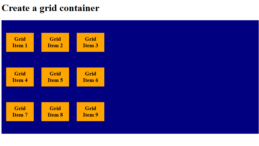
align-content: space-between
The align-content: space-between property distributes tracks with equal gaps only between them, no extra space at the edges. First and last tracks touch the container edges. Let us see an example:
<!DOCTYPE html>
<html>
<head>
<style>
.container {
  display: grid;
  height: 340px;
  grid-template-columns: 90px 90px 90px;
 align-content: space-between;
  background-color: navy;
  padding: 15px;
  gap: 25px;
}

.container div {
  background-color: orange;
  padding: 10px;
  font-size: 18px;
  font-weight: bold;
  text-align: center;
}
</style>
</head>
<body>

<h1>Create a grid container</h1>

<div class="container">
  <div>Grid Item 1</div>
  <div>Grid Item 2</div>
  <div>Grid Item 3</div>
  <div>Grid Item 4</div>
  <div>Grid Item 5</div>
  <div>Grid Item 6</div>
  <div>Grid Item 7</div>
  <div>Grid Item 8</div>
  <div>Grid Item 9</div>
</div>

</body>
</html>
Output
If you liked the tutorial, spread the word and share the link and our website, Studyopedia, with others.
Read More:
No Comments