02 Apr CSS flex-wrap Property
The flex-wrap property is used to set whether the flex items should wrap or not. The following are the values of the flex-wrap property:
- flex-wrap: no-wrap
- flex-wrap: wrap
- flex-wrap: wrap-reverse
Let us understand them one by one:
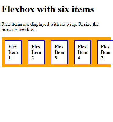
flex-wrap: nowrap;
Set the flex items to no wrap using the nowrap value of the flex-wrap property. This is the default value. Let us see an example:
<!DOCTYPE html>
<html>
<head>
<style>
.container {
  display: flex;
  flex-wrap: nowrap;
  background-color: orange;
}

.container div {
  width: 100px;
  background-color: white;
  border: 2px solid blue;
  margin: 10px;
  padding: 10px;
  font-weight: bold;
}
</style>
</head>
<body>
<h1>Flexbox with six items</h1>
<p>Flex items are displayed with no wrap. Resize the browser window.</p>
<div class="container">
  <div>Flex Item 1</div>
  <div>Flex Item 2</div>
  <div>Flex Item 3</div>
  <div>Flex Item 4</div>
  <div>Flex Item 5</div>
  <div>Flex Item 6</div>
</div>
</body>
</html>
Output
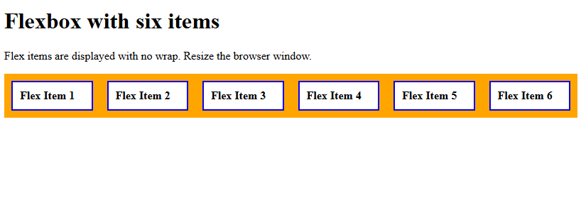
Let us now resize the window. The flex items won’t wrap:
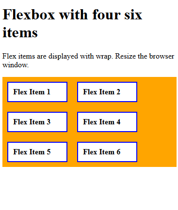
flex-wrap: wrap;
Set the flex items to wrap using the wrap value of the flex-wrap property. Let us see an example:
<!DOCTYPE html>
<html>
<head>
<style>
.container {
  display: flex;
  flex-wrap: wrap;
  background-color: orange;
}

.container div {
  width: 100px;
  background-color: white;
  border: 2px solid blue;
  margin: 10px;
  padding: 10px;
  font-weight: bold;
}
</style>
</head>
<body>
<h1>Flexbox with six items</h1>
<p>Flex items are displayed with wrap. Resize the browser window.</p>
<div class="container">
  <div>Flex Item 1</div>
  <div>Flex Item 2</div>
  <div>Flex Item 3</div>
  <div>Flex Item 4</div>
  <div>Flex Item 5</div>
  <div>Flex Item 6</div>
</div>
</body>
</html>
Output
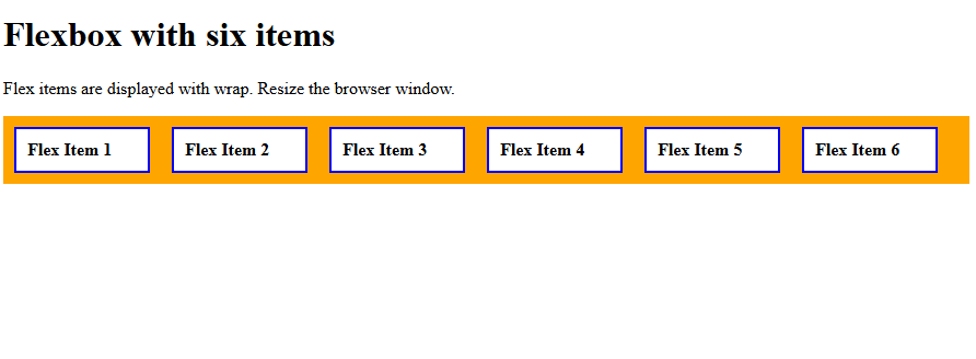
Let us now resize the window. The flex items will wrap:
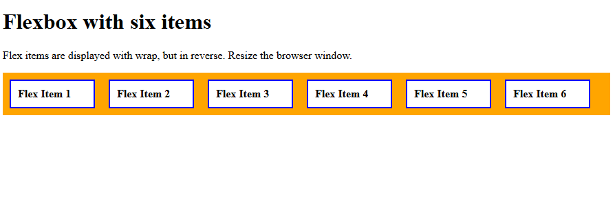
flex-wrap: wrap-reverse;
Set the flex items to wrap in reverse using the wrap-reverse value of the flex-wrap property. Let us see an example:
<!DOCTYPE html>
<html>
<head>
<style>
.container {
  display: flex;
  flex-wrap: wrap-reverse;
  background-color: orange;
}

.container div {
  width: 100px;
  background-color: white;
  border: 2px solid blue;
  margin: 10px;
  padding: 10px;
  font-weight: bold;
}
</style>
</head>
<body>
<h1>Flexbox with six items</h1>
<p>Flex items are displayed with wrap, but in reverse. Resize the browser window.</p>
<div class="container">
  <div>Flex Item 1</div>
  <div>Flex Item 2</div>
  <div>Flex Item 3</div>
  <div>Flex Item 4</div>
  <div>Flex Item 5</div>
  <div>Flex Item 6</div>
</div>
</body>
</html>
Output
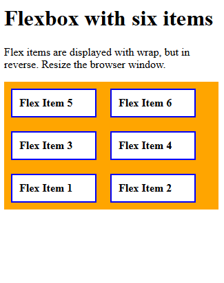
Let us now resize the window. The flex items will wrap, but in reverse:
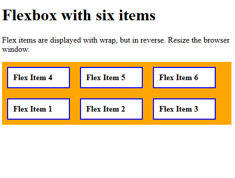
Resize the browser window again:
If you liked the tutorial, spread the word and share the link and our website, Studyopedia, with others.
Read More:
No Comments