15 Feb Matplotlib – Scatter Plot
To draw a scatter plot in Matplotlib, use the scatter() method. Before moving further, we’ve prepared a video tutorial to draw a scatter plot in Matplotlib:
Example
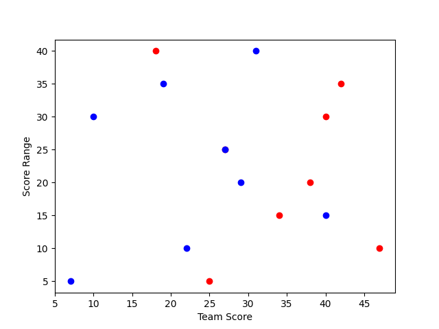
Let us see an example wherein we will use the data of the scores of two cricket teams. The range set is the score range of lower order batsman:
import matplotlib.pyplot as plt

# Data to plot
# Score of two Teams
team1_Score = [25, 47, 34, 38, 27, 40, 42, 18]
team2_Score = [7, 22, 40, 29, 27, 10, 19, 31]

# Score Range of tailenders (lower order batsman) in Cricket
scoreRange = [5, 10, 15, 20, 25, 30, 35, 40]

# Plot a Scatter Plot using pyplot.scatter() method
plt.scatter(team1_Score, scoreRange, color='r')
plt.scatter(team2_Score, scoreRange, color='b')

# The labels for x-coordinate and y-coordinate
plt.xlabel("Team Score")
plt.ylabel("Score Range")

# Display the figure
plt.show()
Output
If you liked the tutorial, spread the word and share the link and our website Studyopedia with others.
For Videos, Join Our YouTube Channel: Join Now
Read More:
No Comments