15 Feb Matplotlib – Scatter Plot
To draw a scatter plot in Matplotlib, use the scatter() method. Before moving further, we’ve prepared a video tutorial to draw a scatter plot in Matplotlib:
Examples
In this lesson, we will see the following examples:
- Create a Scatter Plot in Matplotlib
- Create a Scatter Plot in Matplotlib and show the comparison (Team 1 and Team 2)
- Create a Scatter Plot in Matplotlib with a real-life example
- Create a Scatter Plot in Matplotlib and set your own color for the markers
- Create a Scatter Plot in Matplotlib and set a specific color for each dot
- Create a Scatter Plot in Matplotlib and set the dot sizes
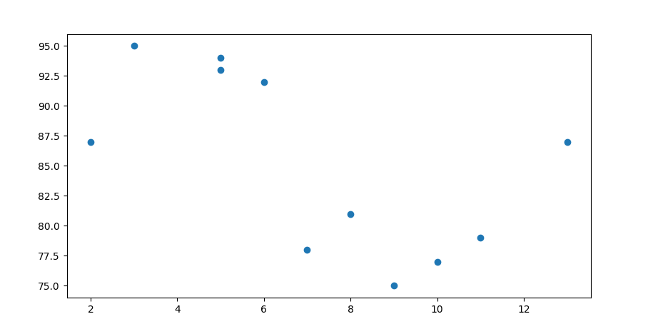
Create a Scatter Plot in Matplotlib
To create a scatter plot in Matplotlib, use the scatter() function from the pyplot module. This function plots individual data points as markers on a Cartesian plane.
Let us see an example:
# Create a Scatter Plot in Matplotlib

import matplotlib.pyplot as plt
import numpy as np

xpts = np.array([2, 5, 7, 3, 8, 6, 9, 10, 13, 5, 11])
ypts = np.array([87, 93, 78, 95, 81, 92, 75, 77, 87, 94, 79])

plt.scatter(xpts, ypts)

plt.show()
Output
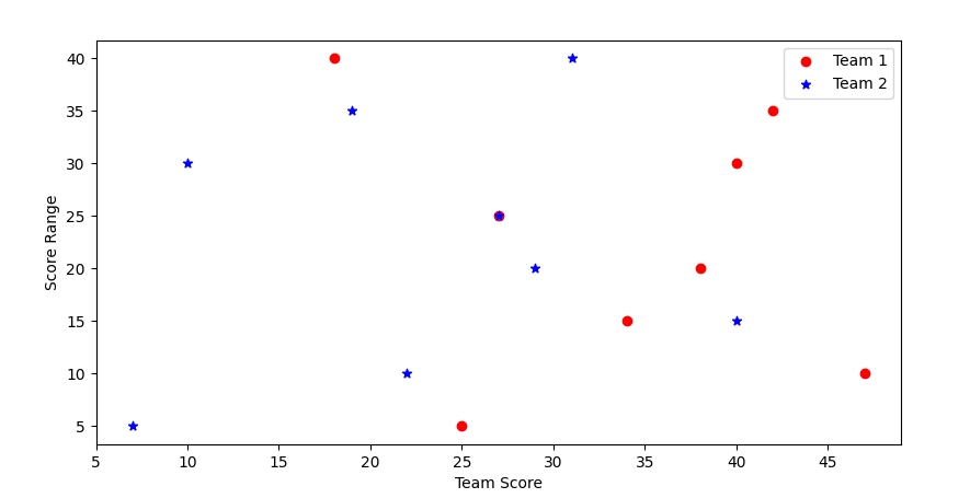
Create a Scatter Plot in Matplotlib and show the comparison (Team 1 and Team 2)
Let us see an example:
# Create a Scatter Plot in Matplotlib and show the comparison (Team 1 and Team 2)

import matplotlib.pyplot as plt

# Data to Plot
# Score of two teams
team1_Score = [25, 47, 34, 38, 27, 40, 42, 18]
team2_Score = [7, 22, 40, 29, 27, 10, 19, 31]

# Score range
scoreRange = [5, 10, 15, 20, 25, 30, 35, 40]

# Plot
plt.scatter(team1_Score, scoreRange, c = 'red', marker = 'o', label = 'Team 1')
plt.scatter(team2_Score, scoreRange, c = 'blue', marker = '*', label = 'Team 2')

plt.xlabel('Team Score')
plt.ylabel('Score Range')

plt.legend()

plt.show()
Output
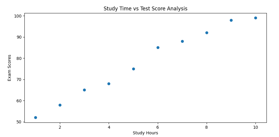
Create a Scatter Plot in Matplotlib with a real-life example
Let us see an example:
# Create a Scatter Plot in Matplotlib with a real-life example

import matplotlib.pyplot as plt
import numpy as np

study_hours = np.array([1, 2, 3, 4, 5, 6, 7, 8, 9, 10])
exam_scores = np.array([52, 58, 65, 68, 75, 85, 88, 92, 98, 99])

plt.scatter(study_hours, exam_scores)

plt.xlabel('Study Hours')
plt.ylabel('Exam Scores')
plt.title('Study Time vs Test Score Analysis')

plt.show()
Output
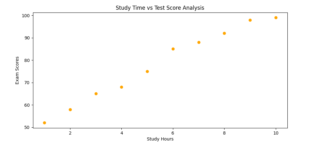
Create a Scatter Plot in Matplotlib and set your own color for the markers
Use the color property of the scatter() function to set the marker color. Let us see an example:
# Create a Scatter Plot in Matplotlib and set your own color for the markers

import matplotlib.pyplot as plt
import numpy as np

study_hours = np.array([1, 2, 3, 4, 5, 6, 7, 8, 9, 10])
exam_scores = np.array([52, 58, 65, 68, 75, 85, 88, 92, 98, 99])

plt.scatter(study_hours, exam_scores, color = 'orange')

plt.xlabel('Study Hours')
plt.ylabel('Exam Scores')
plt.title('Study Time vs Test Score Analysis')

plt.show()
Output
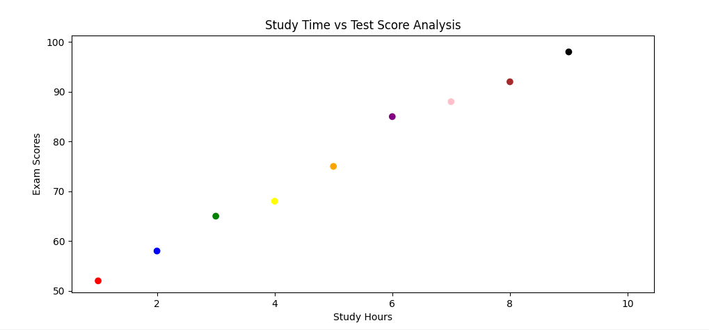
Create a Scatter Plot in Matplotlib and set a specific color for each dot
To set a specific color for each dot, create an array of the colors you want for each dot, and set it as a parameter of the scatter() function. Let us see an example:
# Create a Scatter Plot in Matplotlib and set a specific color for each dot

import matplotlib.pyplot as plt
import numpy as np

study_hours = np.array([1, 2, 3, 4, 5, 6, 7, 8, 9, 10])
exam_scores = np.array([52, 58, 65, 68, 75, 85, 88, 92, 98, 99])

colors = np.array([
    "Red", "Blue", "Green", "Yellow", "Orange","Purple", "Pink", "Brown", "Black", "White"])

plt.scatter(study_hours, exam_scores, c = colors)

plt.xlabel('Study Hours')
plt.ylabel('Exam Scores')
plt.title('Study Time vs Test Score Analysis')

plt.show()
Output
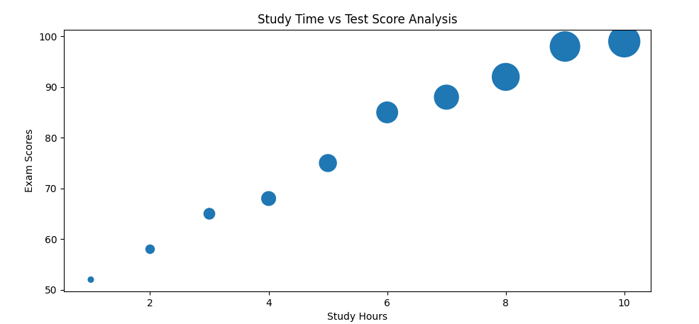
Create a Scatter Plot in Matplotlib and set the dot sizes
To set the dot sizes, create an array of the sizes, and set it as a parameter of the scatter() function. Let us see an example:
# Create a Scatter Plot in Matplotlib and set the dot sizes

import matplotlib.pyplot as plt
import numpy as np

study_hours = np.array([1, 2, 3, 4, 5, 6, 7, 8, 9, 10])
exam_scores = np.array([52, 58, 65, 68, 75, 85, 88, 92, 98, 99])

sizes = np.array([30, 75, 120, 200, 300, 450, 600, 750, 900, 1000])

plt.scatter(study_hours, exam_scores, s = sizes)

plt.xlabel('Study Hours')
plt.ylabel('Exam Scores')
plt.title('Study Time vs Test Score Analysis')

plt.show()
Output
If you liked the tutorial, spread the word and share the link and our website, Studyopedia, with others.
For Videos, Join Our YouTube Channel: Join Now
Read More:
No Comments