14 Feb Matplotlib – Pie Chart
To plot a pie chart in Matplotlib, use the pie() method. The pyplot.pie() method has the following parameters:
- The 1st parameter is x, the wedge sizes are set here
- The labels parameter is the sequence of strings providing the labels for each wedge
- The third parameter is autopct, a string that labels the wedges with their numeric value. The label will be placed inside the wedge. If autopct is a format string, the label will be fmt % pct
Before moving further, we’ve prepared a video tutorial to plot a Pie Chart in Matplotlib:
Example
We will see the following examples:
- Create a Pie Chart in Matplotlib
- Create a Pie Chart in Matplotlib and set a shadow for slices using the shadow parameter
- Create a Pie Chart in Matplotlib and set the start angle using the startangle parameter
- Create a Pie Chart in Matplotlib with the explode parameter
- Create a Pie Chart in Matplotlib and set the color for each wedge using the colors parameter
- Create a Pie Chart in Matplotlib and set a legend
- Create a Pie Chart in Matplotlib and add a header to the legend
- Create a Pie Chart in Matplotlib and let it automatically optimize spacing
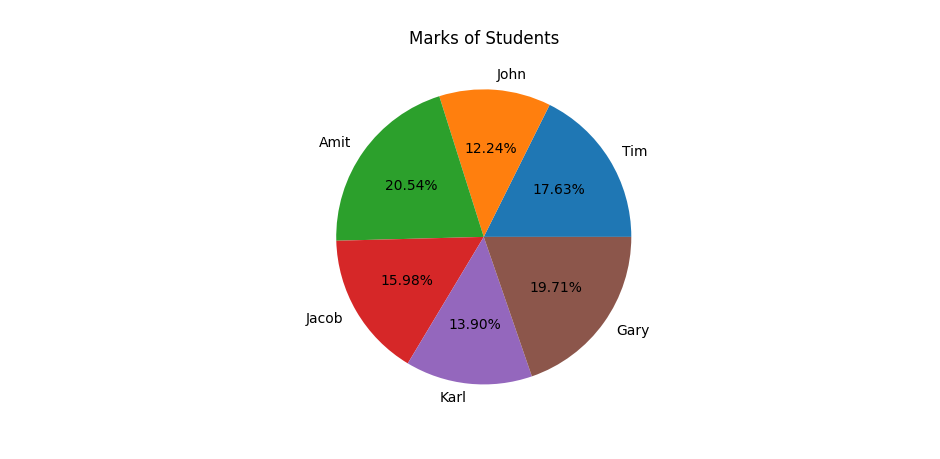
Create a Pie Chart in Matplotlib
Let us see an example wherein we will plot a pie chart for students’ marks:
# Create a Pie Chart in Matplotlib

import matplotlib.pyplot as plt
import numpy as np

# Data
student = np.array(["Tim", "John", "Amit", "Jacob", "Karl", "Gary"])
marks = np.array([85, 59, 99, 77, 67, 95])

# Plot a pie chart
# autopct adds numerical percentage labels to slices
val_explode = [0, 0, 0.4, 0, 0, 0.2]
plt.pie(marks, labels = student, autopct = '%1.2f%%')

plt.title("Marks of Students")
plt.show()
Output
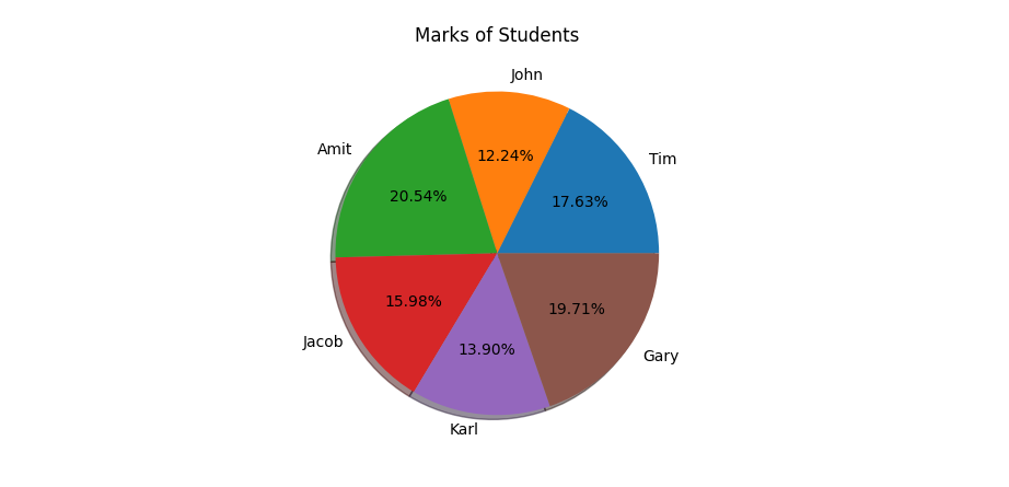
Create a Pie Chart in Matplotlib and set a shadow for slices using the shadow parameter
Let us see an example:
# Create a Pie Chart in Matplotlib and set a shadow for slices using the shadow parameter

import matplotlib.pyplot as plt
import numpy as np

# Data
student = np.array(["Tim", "John", "Amit", "Jacob", "Karl", "Gary"])
marks = np.array([85, 59, 99, 77, 67, 95])

# Plot a pie chart
# autopct adds numerical percentage labels to slices
plt.pie(marks, labels = student, autopct = '%1.2f%%', shadow = True)

plt.title("Marks of Students")
plt.show()
Output
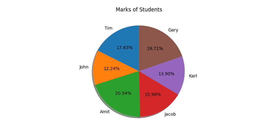
Create a Pie Chart in Matplotlib and set the start angle using the startangle parameter
To create a pie chart in Matplotlib with a specific start angle, use the plt.pie() function from the matplotlib.pyplot module and include the startangle parameter. Let us see an example:
# Create a Pie Chart in Matplotlib and set the start angle using the startangle paramter

import matplotlib.pyplot as plt
import numpy as np

# Data
student = np.array(["Tim", "John", "Amit", "Jacob", "Karl", "Gary"])
marks = np.array([85, 59, 99, 77, 67, 95])

# Plot a pie chart
# autopct adds numerical percentage labels to slices
plt.pie(marks, labels = student, autopct = '%1.2f%%', shadow = True, startangle = 90)

plt.title("Marks of Students")
plt.show()
Output
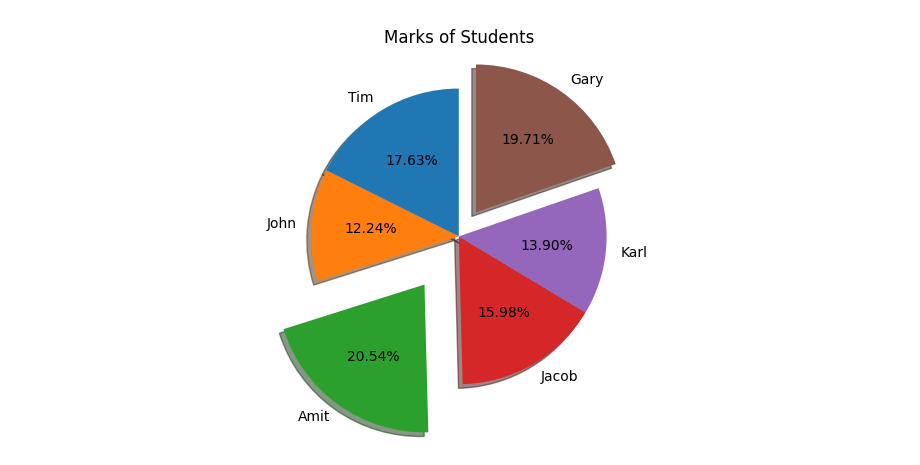
Create a Pie Chart in Matplotlib with the explode parameter
The explode parameter in pie charts in Matplotlib separates specific slices from the main pie to emphasize certain data points. Let us see an example:
# Create a Pie Chart in Matplotlib with the explode parameter

import matplotlib.pyplot as plt
import numpy as np

# Data
student = np.array(["Tim", "John", "Amit", "Jacob", "Karl", "Gary"])
marks = np.array([85, 59, 99, 77, 67, 95])

# Plot a pie chart
# autopct adds numerical percentage labels to slices
# a list for explode
val_explode = [0, 0, 0.4, 0, 0, 0.2]
plt.pie(marks, labels = student, autopct = '%1.2f%%', shadow = True, startangle = 90, explode = val_explode)

plt.title("Marks of Students")
plt.show()
Output
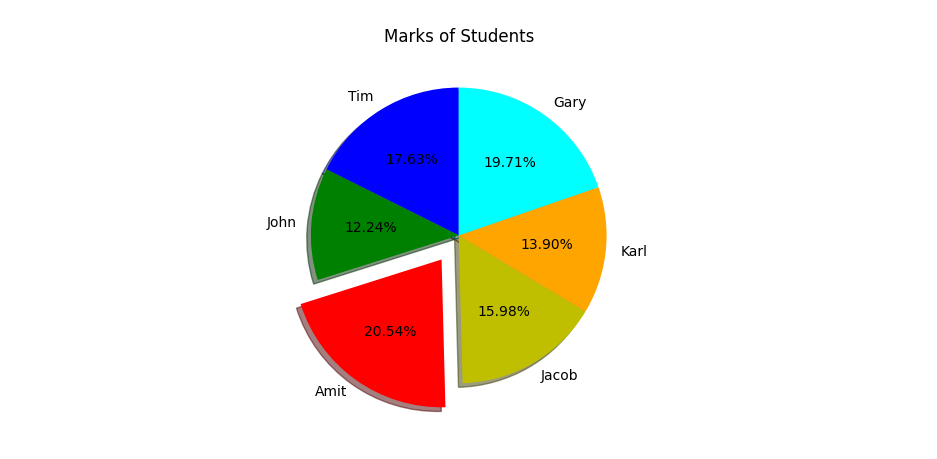
Create a Pie Chart in Matplotlib and set the color for each wedge using the colors parameter
To create a pie chart in Matplotlib with a color for each wedge, use the plt.pie() function from the matplotlib.pyplot module and include the colors parameter. Let us see an example:
# Create a Pie Chart in Matplotlib and set the color for each wedge using the colors parameters

import matplotlib.pyplot as plt
import numpy as np

# Data
student = np.array(["Tim", "John", "Amit", "Jacob", "Karl", "Gary"])
marks = np.array([85, 59, 99, 77, 67, 95])

# Plot a pie chart
# autopct adds numerical percentage labels to slices

# a list for explode
val_explode = [0, 0, 0.2, 0, 0, 0]

# a list for colors
val_colors = ["b", "g", "r", "y", "orange", "cyan"]
plt.pie(marks, labels = student, autopct = '%1.2f%%', shadow = True, startangle = 90, explode = val_explode, colors = val_colors)

plt.title("Marks of Students")
plt.show()
Output
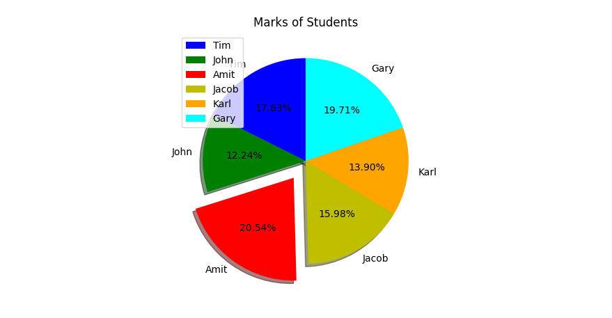
Create a Pie Chart in Matplotlib and set the legend
To set the legend of a Pie Chart, use the legend() function. Let us see an example:
# Create a Pie Chart in Matplotlib and set the legend

import matplotlib.pyplot as plt
import numpy as np

# Data
student = np.array(["Tim", "John", "Amit", "Jacob", "Karl", "Gary"])
marks = np.array([85, 59, 99, 77, 67, 95])

# Plot a pie chart
# autopct adds numerical percentage labels to slices

# a list for explode
val_explode = [0, 0, 0.2, 0, 0, 0]

# a list for colors
val_colors = ["b", "g", "r", "y", "orange", "cyan"]
plt.pie(marks, labels = student, autopct = '%1.2f%%', shadow = True, startangle = 90, explode = val_explode, colors = val_colors)

plt.legend(loc = 'upper left')
plt.title("Marks of Students")
plt.show()
Output
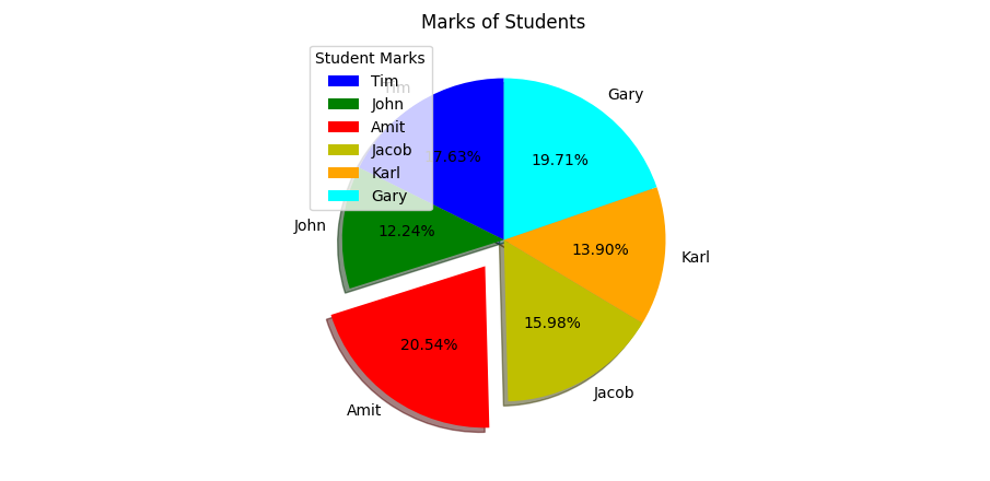
Create a Pie Chart in Matplotlib and add a header to the legend
To set the legend of a Pie Chart, we used the legend() function. For the header, set the title parameter of the legend(). Let us see an example:
# Create a Pie Chart in Matplotlib and add a header to the legend

import matplotlib.pyplot as plt
import numpy as np

# Data
student = np.array(["Tim", "John", "Amit", "Jacob", "Karl", "Gary"])
marks = np.array([85, 59, 99, 77, 67, 95])

# Plot a pie chart
# autopct adds numerical percentage labels to slices

# a list for explode
val_explode = [0, 0, 0.2, 0, 0, 0]

# a list for colors
val_colors = ["b", "g", "r", "y", "orange", "cyan"]
plt.pie(marks, labels = student, autopct = '%1.2f%%', shadow = True, startangle = 90, explode = val_explode, colors = val_colors)

plt.legend(loc = 'upper left', title="Student Marks")

plt.title("Marks of Students")
plt.show()
Output
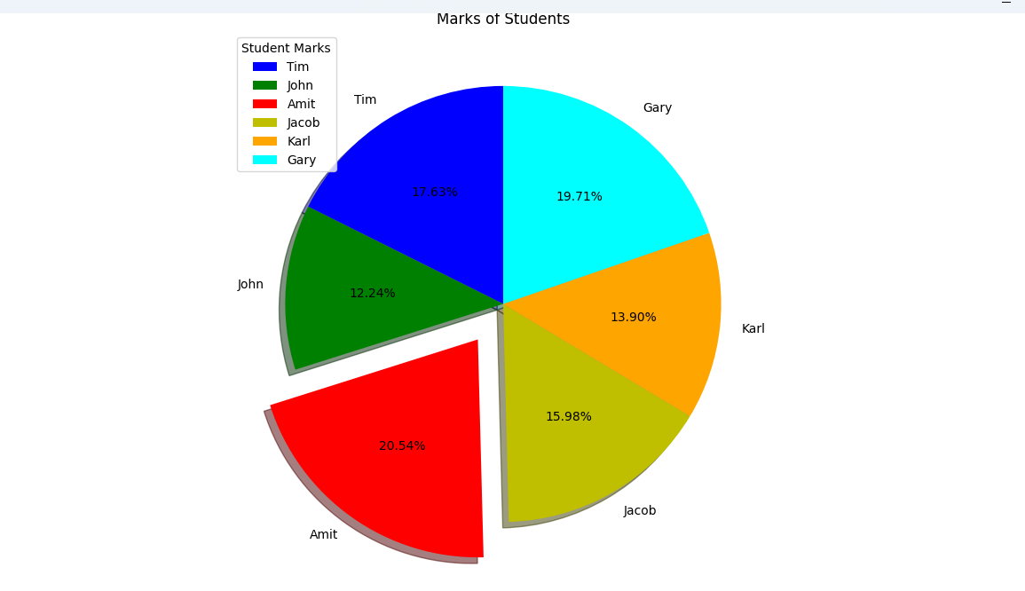
Create a Pie Chart in Matplotlib and let it automatically optimize spacing
The plt.tight_layout() in Matplotlib automatically adjusts subplot parameters (padding between plots, axis labels, titles) to fit within the figure area, ensuring elements do not overlap. It is commonly used before plt.show() or plt.savefig() to ensure labels are not cropped. It is highly effective for, but not limited to, multi-plot layouts. Let us see an example:
# Create a Pie Chart in Matplotlib and let it automatically optimize spacing

import matplotlib.pyplot as plt
import numpy as np

# Data
student = np.array(["Tim", "John", "Amit", "Jacob", "Karl", "Gary"])
marks = np.array([85, 59, 99, 77, 67, 95])

# Plot a pie chart
# autopct adds numerical percentage labels to slices

# a list for explode
val_explode = [0, 0, 0.2, 0, 0, 0]

# a list for colors
val_colors = ["b", "g", "r", "y", "orange", "cyan"]
plt.pie(marks, labels = student, autopct = '%1.2f%%', shadow = True, startangle = 90, explode = val_explode, colors = val_colors)

plt.legend(loc = 'upper left', title="Student Marks")

# optimize space
plt.tight_layout()

plt.title("Marks of Students")
plt.show()
Output
If you liked the tutorial, spread the word and share the link and our website, Studyopedia, with others.
For Videos, Join Our YouTube Channel: Join Now
Read More:
No Comments