

05 Oct Bootstrap Tutorial
Learn how to create a responsive website with Bootstrap concepts and take your website development skills to the next level. Bootstrap is a must today for responsive web development on different screen sizes. The course covers Bootstrap components with the live running of code. With that, every lesson is thoroughly explained with a lot of examples displaying the screen size to give a thorough understanding.
Bootstrap Video Tutorial
Before moving to the Bootstrap Text Tutorial, refer to our Complete Bootstrap Video Course:
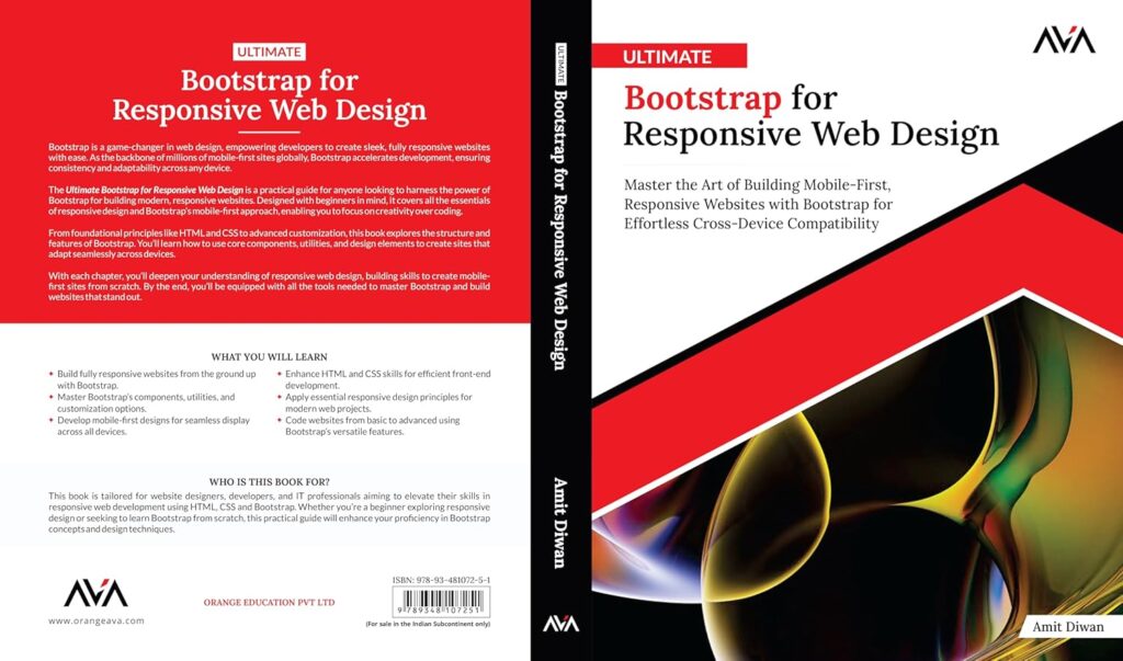
Buy Bootstrap Book
Get your copy now:
- Amazon International: https://shorturl.at/YMq1F
- Amazon India: https://shorturl.at/1BsJZ
- Flipkart: https://lnkd.in/gkxSNqEP
Run Bootstrap Online
<!doctype html>
<html lang="en">
  <head>
    <meta charset="utf-8">
    <meta name="viewport" content="width=device-width, initial-scale=1, shrink-to-fit=no">
    <link rel="stylesheet" href="https://stackpath.bootstrapcdn.com/bootstrap/4.4.1/css/bootstrap.min.css" crossorigin="anonymous">
    <link rel="stylesheet" href="styles.css">
    <title>Hello, world!</title>
  </head>
  <body>
    <h1>Hello, world!</h1>
    <button type="button" class="btn btn-primary" id="hi">Say Hi !</button>

    <div class="alert alert-success" role="alert" id="alert-div" style="display:none;">
      Hello there!
    </div>

    <!-- Optional JavaScript -->
    <!-- jQuery first, then Popper.js, then Bootstrap JS -->
    <script src="https://cdnjs.cloudflare.com/ajax/libs/jquery/3.4.1/jquery.slim.min.js" crossorigin="anonymous"></script>
    <script src="https://cdn.jsdelivr.net/npm/popper.js@1.16.0/dist/umd/popper.min.js" crossorigin="anonymous"></script>
    <script src="https://stackpath.bootstrapcdn.com/bootstrap/4.4.1/js/bootstrap.min.js" crossorigin="anonymous"></script>
    <script src="script.js"></script>
  </body>
</html>
FAQs
Q1: What is Bootstrap and why is it used in web development?
Ans: Bootstrap is a free, open-source front-end CSS framework designed to simplify responsive, mobile-first web design. It provides pre-built CSS styling, HTML templates, and JavaScript components—such as navigation bars, modals, carousels, buttons, and forms—enabling developers to build clean, modern web layouts quickly without writing custom CSS from scratch.
Q2: How does the Bootstrap Grid System work?
Ans: The Bootstrap Grid System is a responsive 12-column flexbox-based layout system. It uses container, row, and column classes to align content across different screen dimensions. Grid classes automatically scale layout elements based on responsive breakpoints:
- col- (Extra small devices, <576px)
- col-sm- (Small devices, ≥576px)
- col-md- (Medium devices, ≥768px)
- col-lg- (Large devices, ≥992px)
- col-xl- (Extra large devices, ≥1200px)
- col-xxl- (Extra extra large devices, ≥1400px)
Q3: How do you include Bootstrap in an HTML document?
Ans: You can include Bootstrap in your web project using two common approaches:
- Via CDN (Content Delivery Network): Add the compiled Bootstrap CSS <link> tag inside your HTML <head> and the Bootstrap JavaScript <script> bundle before the closing </body> tag.
- Local Installation: Download the compiled Bootstrap CSS and JS production files, or install them via package managers like npm install bootstrap, and host them locally on your web server.
Q4: What is the difference between .container and .container-fluid in Bootstrap?
Ans: Both classes act as top-level layout wrappers, but they handle width differently:
- .container: Creates a fixed-width container that changes its max-width dynamically at each responsive screen breakpoint, leaving auto-margins on large viewports.
- .container-fluid: Creates a full-width container that spans 100% of the viewport width across all device sizes.
Q5: What core components and styling utilities are covered in Studyopedia’s Bootstrap tutorial?
Ans: Studyopedia’s Bootstrap tutorial covers installation and CDN integration, layout containers, the 12-column grid system, typography, tables, buttons and button groups, navigation bars (navbar), cards, modals, dropdowns, forms and input controls, carousels, badges, tooltips, and utility helper classes for spacing, colors, and flexbox alignment.
Bootstrap Tutorial Index
- Bootstrap Introduction
- Setup Bootstrap
- First Bootstrap Example
- Grids in Bootstrap
- Buttons in Bootstrap
- ButtonGroups in Bootstrap
- Tables in Bootstrap
- Bootstrap Responsive Table
- Change Text Background Color
- Change Text Color
- Alert in Bootstrap
- Badges in Bootstrap
- Progress Bars in Bootstrap
- Navbar in Bootstrap
- Navigation Tabs and Pills
- Pagination in Bootstrap
- Images in Bootstrap
- Tooltips in Bootstrap
- Cards in Bootstrap
- Collapse in Bootstrap
- DropDown in Bootstrap
- Forms in Bootstrap
- Form Input Controls in Bootstrap
- List Groups in Bootstrap
- Modal in Bootstrap
Let’s begin with Bootstrap Introduction.

No Comments