07 Oct Bootstrap Modal
The Modal is a component in Bootstrap. It is a dialog box appearing on the top of the web page. Learn how to implement Modal in Bootstrap. With this lesson, you can learn how to:
- Create a Modal
- Create a Modal Dialog
- Set Modal Content i.e. header, title, body, footer, etc.
- How to fade Modal
- How to resize a Modal in Bootstrap
To create a Modal in Bootstrap, use the:
- .modal class
To create a Modal Dialog:
- .modal-dialog: Create a modal on the web page
- .modal-dialog-centered: Center modal on the web page
Set Modal Content:
- .modal-content: For the modal header, body, and footer
- .modal-header: Header of the modal
- .modal-title: Title of the modal
- .modal-body: Body of the modal
- .modal-footer: Footer of the modal
Fade Modal:
- .fade class
Resize Modal:
- .modal-sm: Create small modals
- .modal-lg: Create large modals
Example – Bootstrap Modal
Let us now see an example to create a Modal in Bootstrap:
<!DOCTYPE html>
<html lang="en">
<head>
<title>Bootstrap Modal Example</title>
<meta charset="utf-8">
<meta name="viewport" content="width=device-width, initial-scale=1">
<link href="https://cdn.jsdelivr.net/npm/bootstrap@5.1.3/dist/css/bootstrap.min.css" rel="stylesheet">
<script src="https://cdn.jsdelivr.net/npm/bootstrap@5.1.3/dist/js/bootstrap.bundle.min.js"></script>
</head>
<body>
<div class= "container">
<button type="button" class="btn btn-info" data-bs-toggle="modal" data-bs-target="#demoModal">
Warning
</button>
<div class="modal" id="demoModal">
<div class="modal-dialog">
<div class="modal-content">
<div class="modal-header">
<h4 class="modal-title">Warning</h4>
<button type="button" class="close" data-bs-dismiss="modal">×</button>
</div>
<div class= "modal-body">
Restart the system to avoid any failed updates!
</div>
<div class= "modal-footer">
<button type="button" class="btn btn-danger" data-bs-dismiss="modal">Update
failed!</button>
</div>
</div>
</div>
</div>
</div>
</body>
</html>
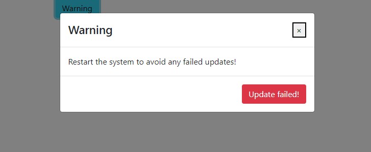
Output

Click on the button Warning:
Video Tutorial – Bootstrap Modal
The following is the complete video tutorial to learn how to work with Modal in Bootstrap:
If you liked the tutorial, spread the word and share the link and our website Studyopedia with others.
Read More:
No Comments