06 Oct Bootstrap Buttons
Learn how to add a new button with Bootstrap. With that, resize a button, disable a button, learn what are block-level buttons, etc. The following bootstrap classes are used to create different types of buttons:
- .btn: Create a new button
- .btn-default: Default Button
- .btn-primary: Blue colored
- .btn-success: Success action on a button
- .btn-info: set info messages on a button
- .btn-warning: sets warning action on a button
- .btn-danger: sets danger action on a button
- .btn-link: make a button look like a link
The following bootstrap classes are used to create different sizes of buttons:
- .btn-lg: Large Button
- .btn-md: Medium Button
- .btn-sm: Small Button
- .btn-xs: Extra Small Button
Example – Bootstrap Buttons
Let us now see an example to create buttons in Bootstrap:
<!DOCTYPE html>
<html lang="en">

<head>
    <title>Bootstrap Buttons Example</title>
    <meta charset="utf-8">
    <meta name="viewport" content="width=device-width, initial-scale=1">
    <link href="https://cdn.jsdelivr.net/npm/bootstrap@5.1.3/dist/css/bootstrap.min.css" rel="stylesheet">
    <script src="https://cdn.jsdelivr.net/npm/bootstrap@5.1.3/dist/js/bootstrap.bundle.min.js"></script>
</head>

<body>
    <div class="container">
        <h1>Bootstrap Buttons</h1>
        <button type="button" class="btn">My Button</button>
    </div>
</body>

</html>
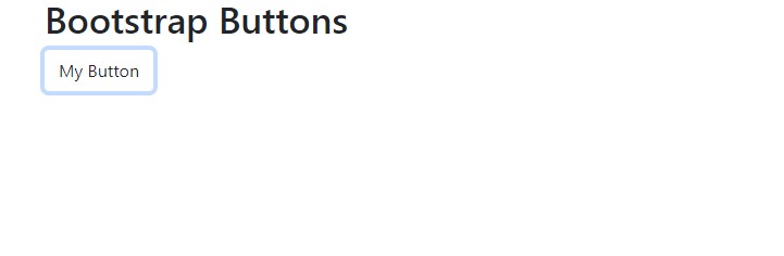
Output
Video Tutorial – Bootstrap Buttons
The following is the complete video tutorial to learn how to work with buttons in Bootstrap:
If you liked the tutorial, spread the word and share the link and our website Studyopedia with others:
Read More:
No Comments