07 Oct Bootstrap Responsive Tables
Learn how to create a responsive table in Bootstrap. With live running example, get thorough knowledge about designing a responsive table on small, medium, large and extra-large devices.
Use the .table-responsive class. It adds a scrollbar to the table when required. The following is the screen width for a responsive table. This is when the table gets a scrollbar, depending on the screen width:
- .table-responsive-sm for < 576px
- .table-responsive-md for < 768px
- .table-responsive-lg for < 992px
- .table-responsive-xl for < 1200px
Example – Bootstrap Responsive Tables
Let us now see an example to create responsive tables in Bootstrap:
<!DOCTYPE html>
<html lang="en">

<head>
    <title>Bootstrap Responsive Table</title>
    <meta charset="utf-8">
    <meta name="viewport" content="width=device-width, initial-scale=1">
    <link href="https://cdn.jsdelivr.net/npm/bootstrap@5.1.3/dist/css/bootstrap.min.css" rel="stylesheet">
    <script src="https://cdn.jsdelivr.net/npm/bootstrap@5.1.3/dist/js/bootstrap.bundle.min.js"></script>
</head>

<body>
    <div class="container">
        <h3>Selections</h3>
        <div class="table-responsive table-responsive-sm">
            <table class="table">
                <thead>
                    <tr>
                        <th>Player Name</th>
                        <th>Player Age</th>
                        <th>Player Sports</th>
                        <th>Player Country</th>
                        <th>Player Rank</th>
                        <th>Player Points</th>
                        <th>Demo</th>
                        <th>Demo</th>
                        <th>Demo</th>
                        <th>Demo</th>
                    </tr>
                </thead>
                <tbody>
                    <tr>
                        <td>Amit</td>
                        <td>25</td>
                        <td>Cricket</td>
                        <td>India</td>
                        <td>2</td>
                        <td>200</td>
                        <td>Demo</td>
                        <td>Demo</td>
                        <td>Demo</td>
                        <td>Demo</td>
                    </tr>
                </tbody>
            </table>
        </div>
    </div>
</body>

</html>
Output
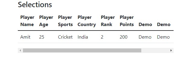
In the above output, the screen size is 650×450.
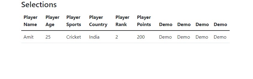
Now, let us increase the screen size to check the responsiveness of the table. Screen size 860×450:
Video Tutorial – Bootstrap Responsive Tables
The following is the complete video tutorial to learn how to work with Responsive Tables in Bootstrap:
If you liked the tutorial, spread the word and share the link and our website Studyopedia with others:
Read More:
No Comments