06 Oct Bootstrap Grids
In this lesson, understand the Grid Structure of Bootstrap, and how to create a responsive grid for extra small, small, medium-sized, large, and extra-large devices. Live running of code to make it easier for newbies to understand the different sizes of a screen and how to design them with Bootstrap.
What is Bootstrap Grids
The Grids define 12 columns on a web page i.e. the responsive grid. If you want to create a group of columns, then use the rows class. It supports five classes in Bootstrap:
.col-
- Device: <576px i.e. Extra Small Devices
- Example: <div class=”col-3″>One</div>
.col-sm-
- Device: >=576px i.e. Small Devices
- Example: <div class=”col-sm-1″>One</div>
.col-md-
- Device: >=768px i.e. Medium Devices like iPad
- Example: <div class=”col-md-1″>One</div>
.col-lg-
- Device: >=992px i.e. Large Devices
- Example: <div class=”col-lg-1″>One</div>
.col-xl-
- Device: >=1200px i.e. Extra Large Devices
- Example: <div class=”col-xl-1″>One</div>
Example: For four equal columns, use four “.col-sm-3”
Bootstrap Grids – Example
The following is the code to create and run a web page with Grids in Bootstrap:
<!DOCTYPE html>
<html lang="en">
<head>
<title>Bootstrap Grids</title>
<meta charset="utf-8">
<meta name="viewport" content="width=device-width, initial-scale=1">
<link href="https://cdn.jsdelivr.net/npm/bootstrap@5.1.3/dist/css/bootstrap.min.css" rel="stylesheet">
<script src="https://cdn.jsdelivr.net/npm/bootstrap@5.1.3/dist/js/bootstrap.bundle.min.js">
</script>
</head>
<body>
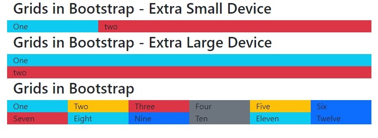
<div class="container">
<h2>Grids in Bootstrap - Extra Small Device</h2>
<div class="row">
<div class="col-3 bg-info">One</div>
<div class="col-9 bg-danger">two</div>
</div>
<h2>Grids in Bootstrap - Extra Large Device</h2>
<div class="row">
<div class="col-xl-3 bg-info">One</div>
<div class="col-xl-9 bg-danger">two</div>
</div>
<h2>Grids in Bootstrap</h2>
<div class="row">
<div class="col-lg-1 col-md-2 col-sm-4 bg-info">One</div>
<div class="col-lg-1 col-md-2 col-sm-4 bg-warning">Two</div>
<div class="col-lg-1 col-md-2 col-sm-4 bg-danger">Three</div>
<div class="col-lg-1 col-md-2 col-sm-4 bg-secondary">Four</div>
<div class="col-lg-1 col-md-2 col-sm-4 bg-warning">Five</div>
<div class="col-lg-1 col-md-2 col-sm-4 bg-primary">Six</div>
<div class="col-lg-1 col-md-2 col-sm-4 bg-danger">Seven</div>
<div class="col-lg-1 col-md-2 col-sm-4 bg-info">Eight</div>
<div class="col-lg-1 col-md-2 col-sm-4 bg-primary">Nine</div>
<div class="col-lg-1 col-md-2 col-sm-4 bg-secondary">Ten</div>
<div class="col-lg-1 col-md-2 col-sm-4 bg-info">Eleven</div>
<div class="col-lg-1 col-md-2 col-sm-4 bg-primary">Twelve</div>
</div>
</div>
</body>
</html>
Output
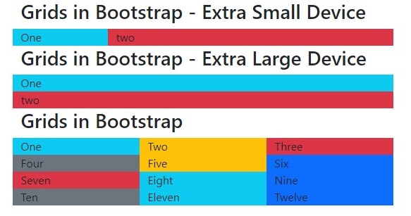
The above is visible for a screen size of 580×300.
Now, the output with a screen size of 750×270:
Video Tutorial – Bootstrap Grids
The following is the complete video tutorial to learn how to work with Grids in Bootstrap:
If you liked the tutorial, spread the word and share the link and our website Studyopedia with others:
Read More:
No Comments