07 Oct Bootstrap Alerts
Learn how to work with the alert component in Bootstrap and set predefined alert messages. Use different classes to create different types of alert boxes:
- Add a close (x) symbol to the right of the alert to close it
- While closing an alert box, add a fading effect to it.
- The fade and show classes
- Add a link in the alert box
Set different types of Alert boxes using the contextual Classes:
- .alert-success: Success alert box
- .alert-info: Info alert box
- .alert-warning: Warning alert box – Orange
- .alert-danger: Danger alert box – Red
- .alert-primary: Key info – Blue
- .alert-secondary: Less important info
- .alert-light: Light colored alert
- .alert-dark: Dark colored alert
The alerts can have a closing symbol, fade effect, link, etc:
- To add a close (x) symbol to the right of the alert to close it, use × HTML character code for (x) symbol.
- While closing an alert box, add a fading effect to it using the fade and show classes
- Add a link in the alert box with the alert-link class
Example – Bootstrap Alerts
Let us now see an example to create alerts in Bootstrap:
<!DOCTYPE html>
<html lang="en">
<head>
<title>Bootstrap Alerts Example</title>
<meta charset="utf-8">
<meta name="viewport" content="width=device-width, initial-scale=1">
<link href="https://cdn.jsdelivr.net/npm/bootstrap@5.1.3/dist/css/bootstrap.min.css" rel="stylesheet">
<script src="https://cdn.jsdelivr.net/npm/bootstrap@5.1.3/dist/js/bootstrap.bundle.min.js"></script>
</head>
<body>
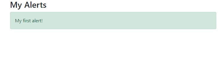
<div class="container">
<h2>My Alerts</h2>
<div class="alert alert-success">
My first alert!
</div>
</div>
</body>
</html>
Output
Video Tutorial – Bootstrap Alerts
The following is the complete video tutorial to learn how to work with Alerts in Bootstrap:
If you liked the tutorial, spread the word and share the link and our website Studyopedia with others.
Read More:
No Comments