24 Nov CSS – Buttons
With CSS, we can easily style buttons as well. The styling includes changing the button color, font size, and width, enabling hover, creating rounded buttons, etc. Let us see the examples one by one:
- Change the Button Color
- Change the Button Font Size
- Set Button Border
- Change the Button Width
- Create Rounded Buttons
- Set Disabled Button
- Set Shadows to a Button
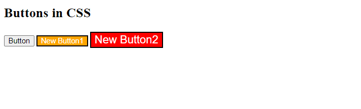
Change the Button Color
The background-color property is used to change the color of a button in CSS. Let us see an example:
<!DOCTYPE html>
<html>
<head>
<style>
.bt1 {
  background-color: orange;
  color: white;
}
.bt2 {
  background-color: red;
  color: white;
  font-size: 20px;
}
</style>
</head>
<body>

<h2>Buttons in CSS</h2>
<button>Button</button>
<button class="bt1">New Button1</button>
<button class="bt2">New Button2</button>
</body>
</html>
Output
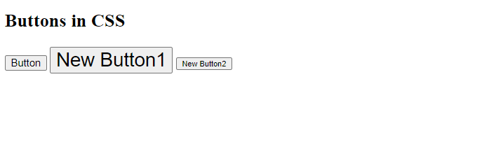
Change the Button Font Size
To change the font size of a button, use the font-size property in CSS. Let us see an example:
<!DOCTYPE html>
<html>
<head>
<style>
.bt1 {
   font-size: 25px;
 }
.bt2 {
   font-size: 10px;
}
</style>
</head>
<body>

<h2>Buttons in CSS</h2>
<button>Button</button>
<button class="bt1">New Button1</button>
<button class="bt2">New Button2</button>
</body>
</html>
Output
Set Button Border
The border property is used in CSS to set the border of a button. Let us see an example:
<!DOCTYPE html>
<html>
<head>
<style>
.bt1 {
   border: 3px orange solid;
 }
.bt2 {
   border: 4px red dashed;
   font-size: 20px;
}
.bt3 {
   border: 5px blue double;
   font-size: 25px;
}
</style>
</head>
<body>

<h2>Button Borders in CSS</h2>
<button>Button</button>
<button class="bt1">New Button1</button>
<button class="bt2">New Button2</button>
<button class="bt3">New Button3</button>
</body>
</html>
Output
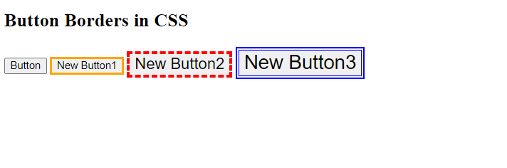
For more examples of borders in CSS, refer to Style Borders in CSS.
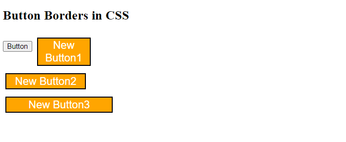
Change the Button Width
To change the width of a button in CSS, use the width property. Let us see an example:
<!DOCTYPE html>
<html>
<head>
<style>
.button {
   margin: 7px 5px;
   font-size: 20px;
   background-color: orange;
   color: white;
}
.bt1 {
   width: 100px;

 }
.bt2 {
   width: 150px;
}
.bt3 {
  width: 200px;
}
</style>
</head>
<body>

<h2>Button Borders in CSS</h2>
<button>Button</button>
<button class="button bt1">New Button1</button><br>
<button class="button bt2">New Button2</button><br>
<button class="button bt3">New Button3</button>
</body>
</html>
Output
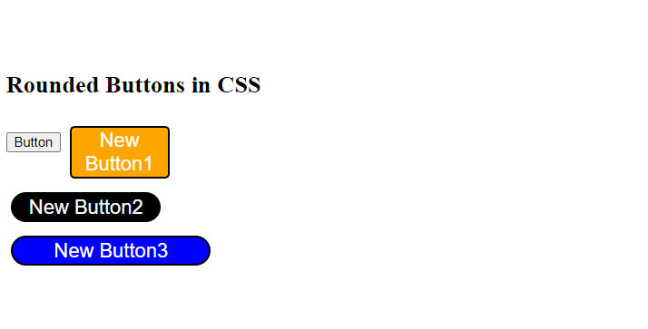
Create Rounded Buttons
The border-radius property is used to create rounded buttons in CSS. Let us see an example:
<!DOCTYPE html>
<html>
<head>
<style>
.button {
   margin: 7px 5px;
   font-size: 20px;
   color: white;
}
.bt1 {
   width: 100px;
   border-radius: 5px;
   background-color: orange;
 }
.bt2 {
   width: 150px;
   border-radius: 20px;
   background-color: black;
}
.bt3 {
  width: 200px;
  border-radius: 50px;
  background-color: blue;
}
</style>
</head>
<body>

<h2>Rounded Buttons in CSS</h2>
<button>Button</button>
<button class="button bt1">New Button1</button><br>
<button class="button bt2">New Button2</button><br>
<button class="button bt3">New Button3</button>
</body>
</html>
Output
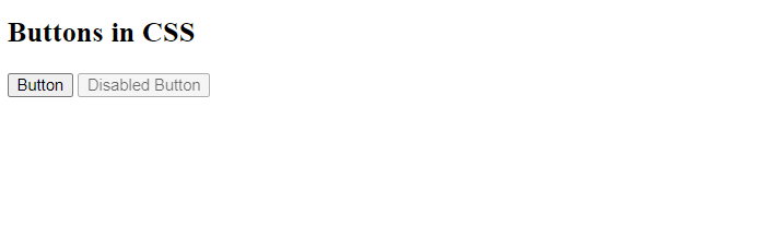
Set Disabled Button
Set a button to be disabled in CSS using the opacity property. Also, use the cursor property and set it to not-allowed i.e. the requested action will not be executed. Let us see an example:
<!DOCTYPE html>
<html>
<head>
<style>
.bt {
   opacity: 0.6;
   cursor: not-allowed;
}
</style>
</head>
<body>

<h2>Buttons in CSS</h2>
<button>Button</button>
<button class="button bt">Disabled Button</button><br>
</body>
</html>
Output
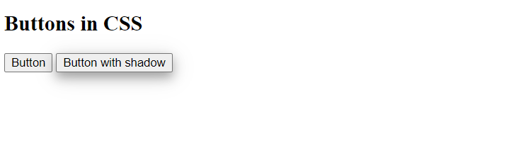
Set Shadows to a Button
The box-shadow property is used in CSS to set the shadows to a button. Let us see an example:
<!DOCTYPE html>
<html>
<head>
<style>
.bt {
     box-shadow: 0 6px 12px 0 rgba(0,0,0,0.3), 0 5px 24px 0 rgba(0,0,0,0.15);
}
</style>
</head>
<body>

<h2>Buttons in CSS</h2>
<button>Button</button>
<button class="button bt">Button with shadow</button><br>
</body>
</html>
Output
If you liked the tutorial, spread the word and share the link and our website Studyopedia with others.
Read More:
No Comments