04 Dec Create a Waterfall Chart in Tableau
A waterfall chart is a type of data visualization that shows how an initial value is affected by a series of positive or negative values. It is used to display the cumulative effect of multiple factors on a single metric, helping to identify the most significant contributors to the final result.
The waterfall chart would display:
- A series of bars, each representing a transaction
- The bars would be stacked on top of each other, showing the cumulative effect on the account balance
- The final bar would represent the ending balance
This visualization helps to:
- Understand how different transactions affect the account balance
- Identify areas where expenses can be reduced
- Make informed decisions about budgeting and financial planning
Before moving further, we’ve prepared a video tutorial on how to create a Waterfall Chart in Tableau:
How to create a Waterfall Chart in Tableau
Let us see an example of creating a Waterfall Chart in Tableau. Create a Waterfall Chart to find the profit for each Sub-Category of the product.
We have created a new sheet with the name Waterfall Chart in the same Tableau project Amit_Tableau.twb. We have already loaded the sample data as shown in the Get Data – Connect Data Source lesson.
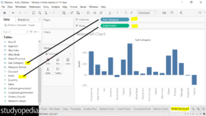
Drag the fields to the respective pane:
- Sub-Category Dimension: Drag to the Columns shelf.
- Profit Measure: Drag to the Rows shelf
The following is visible:
Calculated Field
In Tableau, a Calculated Field is a new field that you create by using a formula to derive values from existing data. These fields can be used to perform calculations, manipulate data, and create custom metrics to enhance your analysis.
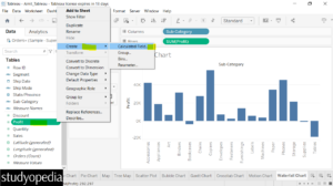
Now, right-click on the Profit field, click Create, and then Calculated Field:
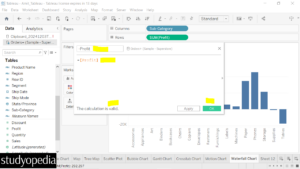
Now in place of Calculation1, mention -Profit for the calculation field.
The – [Profit] calculation is used to invert the values of the Profit measure. This is particularly useful in creating a Waterfall chart because it helps in visualizing both positive and negative contributions to the total profit. By using – [Profit], you invert the profit values. This helps in creating the visual effect of increases and decreases in the waterfall chart.
We have added the expression -Profit in the calculation as well. Below the message is also visible i.e.
The calculation is valid. Click OK:
The new field -Profit is now visible. Drag it to the Size shelf in the Marks card. After dragging, the following is visible:
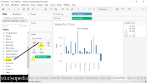
Now, right-click on the SUM(Profit) field in the Rows shelf. Click Quick Table Calculation, and select Running Total:
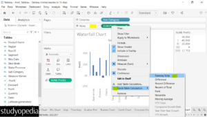
Now, the appearance of the chart changes again.
After that, under the Marks pane, click Gantt Bar:
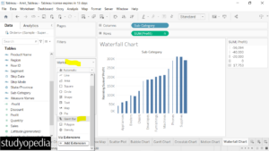
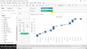
The Waterfall Chart is now visible. Also, under the SUM(Profit) in the Rows self, the symbol is visible for calculation:
If you liked the tutorial, spread the word and share the link and our website Studyopedia with others.
For Videos, Join Our YouTube Channel: Join Now
Read More:


No Comments