04 Dec Create a Tree Map in Tableau
A tree map is a type of data visualization that displays hierarchical data as a set of nested rectangles. Each rectangle represents a category or subcategory, and its size is proportional to the value or quantity it represents.
Before moving further, we’ve prepared a video tutorial on how to create a Tree Map in Tableau:
Suppose we want to visualize the sales data of an e-commerce company, categorized by product type and region:
- Product types: Electronics, Fashion, Home Goods
- Regions: North, South, East, West
The tree map would display a set of nested rectangles, with:
- The largest rectangles represent the product types (Electronics, Fashion, Home Goods)
- Smaller rectangles within each product type representing the regions (North, South, East, West)
- The size of each rectangle proportional to the sales value for that product type and region
How to create a Tree Map in Tableau
Let us see an example of creating a Tree Map in Tableau. To create a Tree Map, we need 1 or more Dimensions and 1 or 2 Measures. We have created a new sheet with the name Tree Map in the same Tableau project Amit_Tableau.twb. We have already loaded the sample data as shown in the Get Data – Connect Data Source lesson.
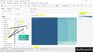
Drag the fields to the respective pane in the Marks card:
- Ship Mode dimension: Drag to the Label pane under Marks card
- Profit measure: Drag to the Size and Color pane under Marks card. This is the Sum of Profit.
After dragging, the Tree Map is created as shown below:

On the right, the color based on the Sum of Profit is visible with a dropdown. This displays the lighter color is for less profit and the darker for more profit.
You can also edit the colors as shown below by clicking Edit Colors. To change the color for the profit, the steps are discussed in the previous lesson Map.
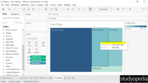
When you keep the mouse cursor on any of the Ship Modes, the sum of profit will be visible as shown below:

If you liked the tutorial, spread the word and share the link and our website Studyopedia with others.
For Videos, Join Our YouTube Channel: Join Now
Read More:


No Comments