04 Dec Create a Scatter Plot in Tableau
A scattered plot, also known as a scatter plot or scatter diagram, is a type of data visualization that displays the relationship between two continuous variables as a collection of points on a grid.
Each point represents a single observation or data point, with its x-coordinate corresponding to one variable and its y-coordinate corresponding to the other variable.
Before moving further, we’ve prepared a video tutorial on how to create a Scatter Plot in Tableau:
Suppose we want to investigate the relationship between the amount of time spent studying (in hours) and the exam scores (in percentage) of 10 students:
The scattered plot would display the data points on a grid, with:
- X-axis (horizontal): Study Time (in hours)
- Y-axis (vertical): Exam Score (in percentage)
- Points: Data points representing individual students’ study time and exam scores
How to create a Scatter Plot in Tableau
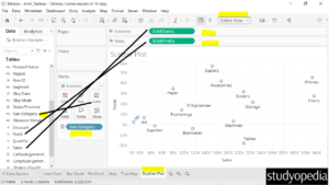
Let us see an example of creating a Scatter Plot in Tableau. We have created a new sheet with the name Scatter Plot in the same Tableau project Amit_Tableau.twb. We have already loaded the sample data as shown in the Get Data – Connect Data Source lesson.
To create a Scatter Plot, drag the fields to the respective sections:
- Columns Shelf: Sales
- Rows Shelf: Profit
- Labels pane of the Marks card: Sub-Category
After dragging, the Scatter Plot is created as shown below and displays the distribution of the um of sales and profit across the Sub-Category. We have set the view to Entire View:
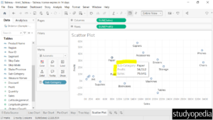
On keeping the mouse cursor, the sales and profits for each sub-category are visible as shown below:
If you liked the tutorial, spread the word and share the link and our website Studyopedia with others.
For Videos, Join Our YouTube Channel: Join Now
Read More:
No Comments