04 Dec Create a Pie Chart in Tableau
A pie chart, also known as a pie graph or circle graph, is a circular statistical graphic divided into slices to illustrate numerical proportions. Each slice represents a category and its size visually represents an item’s proportion to the total.
Before moving further, we’ve prepared a video tutorial on how to create a Pie Chart in Tableau:
Suppose we want to show the distribution of favorite sports among a group of 100 students:
- Cricket: 45 students
- Football: 25 students
- Hockey: 15 students
- Tennis: 15 students
The pie chart would have:
- A circle representing the total (100 students)
- Slices representing each sport, with sizes proportional to the number of students
How to create a Pie Chart in Tableau
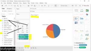
Let us see an example of creating a Pie Chart in Tableau. We have created a new sheet and named it Pie Chart in our Amit_Tableau.twb Tableau project. We have already loaded the sample data as shown in the Get Data – Connect Data Source lesson.
To create a pie chart in Tableau, let us use a Dimension and a Measure. Drag the fields to the respective pane in the Marks card:
- Segment dimension: Drag to the Color and Label pane under Marks card
- Profit measure: Drag to the Size under the Marks card
We created a pie chart:

If you liked the tutorial, spread the word and share the link and our website Studyopedia with others.
For Videos, Join Our YouTube Channel: Join Now
Read More:


No Comments