04 Dec Create a Map in Tableau
A map chart, also known as a geographic chart or cartogram, is a type of data visualization that uses maps to display data. It combines geographic information with statistical data to illustrate relationships, trends, or patterns.
Before moving further, we’ve prepared a video tutorial on how to create a Map in Tableau:
Suppose we want to show the population density of different states in India:
The map chart would display a map of India, with each state colored or shaded according to its population density.
The colors or shades would represent different ranges of population density, such as:
- Low density: 0-100 people per square kilometer (light blue)
- Medium density: 101-500 people per square kilometer (blue)
- High density: 501-1000 people per square kilometer (dark blue)
- Very high density: above 1000 people per square kilometer (red)
How to create a Map in Tableau
Let us see an example of creating a Map in Tableau. To create a Map based on our sample data, you need a geographical dimension so that we can plot it on the map. It can be state, latitude, longitude, pin code, etc.
We have created a new sheet Map in the same Tableau project Amit_Tableau.twb. We have already loaded the sample data as shown in the Get Data – Connect Data Source lesson.
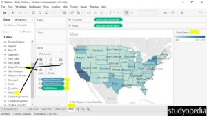
Let’s say our Dimension will be the State column. We will display the Sales based on State. Therefore, we will use the Measure Sales. This is the Sum of Sales:
Drag the fields to the respective pane in the Marks card:
- State dimension: Drag to the Detail and Label pane under Marks card
- Sales measure: Drag to the Color pane under the Marks card
We created a map of the US based on our data. On the right, the color based on the Sum of Sales is visible with a dropdown. This displays the lighter color is for less sales and the darker for more sales in a region:
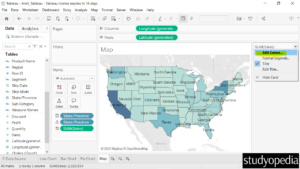
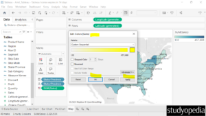
You can also edit the colors as shown below by clicking Edit Colors…:
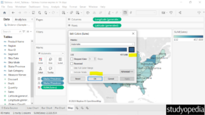
Now the Edit Colors dialog box is visible. Click on the current color to change the color as shown below:
Select the new color as shown below:
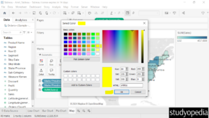
Click Apply and then OK:
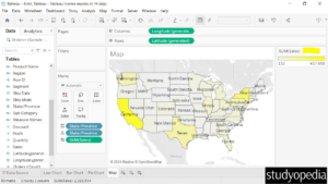
Now, the new color is visible for the sum of sales based on the states:
If you liked the tutorial, spread the word and share the link and our website Studyopedia with others.
For Videos, Join Our YouTube Channel: Join Now
Read More:


No Comments