04 Dec Create a Line Chart in Tableau
A line chart, also known as a line graph, is a type of chart used to display data trends over time. It consists of a series of data points connected by a line, showing the relationship between two variables.
Before moving further, we’ve prepared a video tutorial on how to create a Line Chart in Tableau:
Suppose we want to show the monthly sales of a company over a year. The line chart would have:
- X-axis (horizontal): Months (Jan, Feb, Mar, …, Dec)
- Y-axis (vertical): Sales (in thousands of rupees)
- Data points: Sales figures for each month, connected by a line
Line Chart in Tableau
Let us see another example and create a Line Chart in Tableau. We have already loaded the sample data as shown in the Get Data – Connect Data Source lesson.
Now, when you click on Sheet 1 at the bottom, the following will be visible, and our table Orders is on the left with the fields:
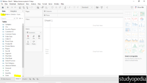
Above, on the right, the charts and graphs we can make on Tableau are visible.
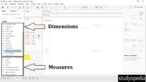
The Dimensions and Measures section on the left was previously visible before Tableau 2020.2. However, if you try to drag any of the fields, the same Dimensions and Measures text will be visible. The Dimensions section is at the top, and Measures is below it.
We tried dragging on the of fields and the Dimensions and Measures words are visible i.e. pointing to the sections:
What are the dimensions and measures in Tableau
In Tableau, dimensions and measures are fundamental concepts for structuring and analyzing data.
Dimensions
- Qualitative Data: These fields are usually qualitative, meaning they describe data rather than measure it (e.g., categories, names, or dates).
- Categories and Attributes: Examples include customer names, product categories, and geographic locations.
- Segmentation: Used to slice and dice your data; for example, viewing sales by region or by product.
Measures
- Quantitative Data: These fields are typically quantitative, meaning they contain numeric data that can be measured and aggregated (e.g., sums, averages).
- Metrics and Values: Examples include sales revenue, profit, and number of units sold.
- Analysis: Used to perform calculations and aggregations, such as total sales or average profit per product.
Now, that we understand the layout, therefore let us create a line chart.
Let us create a line chart:
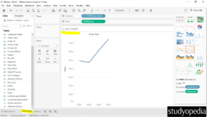
For a line chart, we need Dimensions and Measures. We will drag one of the Dimensions i.e. Order Date to the Columns shelf on the top and one of the Measures i.e. Sum of Sales to the Rows shelf:
- Columns Shelf: Order Date
- Rows Shelf: Sum of Sales
It would automatically create a Line Chart on Sheet 1 from the right. The area where the Line Chart is visible is called a view in Tableau.
Under the Show Me on the top-right, the charts you can create with your table are visible.
Just below the chart section, the suggestions to create a line chart are also visible i.e 0 or more Dimensions and 1 or more Measures:

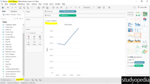
We created a line chart displaying the sum of sales date-wise.
After clicking Sheet 1 below, we have renamed it Line Chart. The Line Chart text is also visible on the canvas as shown below:
Go to the File menu, and click Save. Save it as Amit_Tableau.twb. The path is also visible where our Tableau workbook is saved i.e. under the My Tableau Repository folder:
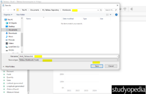
We have saved the Amit_Tableau.twb tableau workbook file above. We will add all our charts and graphs in this Amit_Tableau.twb workbook.
Within this, we have renamed our 1st sheet as Line Chart:
If you liked the tutorial, spread the word and share the link and our website Studyopedia with others.
For Videos, Join Our YouTube Channel: Join Now
Read More:


No Comments