05 Dec Create a Histogram in Tableau
A histogram is a type of data visualization that displays the distribution of a continuous variable by grouping the data into discrete intervals, called bins, and showing the frequency or density of data points within each bin.
Histograms are used to:
- Show the shape of the data distribution
- Identify patterns, such as skewness or outliers
- Compare the distribution of different datasets
Before moving further, we’ve prepared a video tutorial on how to create a Histogram in Tableau:
Suppose we want to visualize the distribution of daily rainfall in a city over a year. We collect the rainfall data and group it into bins of 1-mm ranges(e.g., 0-1 mm, 1-2 mm, …).
The histogram would display:
- A series of bars, each representing a bin
- The height of each bar represents the number of days with rainfall within that bin
- The x-axis represents the rainfall ranges, and the y-axis represents the number of days
This visualization helps to:
- Understand the pattern of rainfall in the city
- Identify the most common rainfall ranges
- Inform decisions about urban planning, water management, and flood control.
How to create a Histogram in Tableau
Let us see an example to create a Histogram in Tableau. We have created a new sheet named Histogram in the same Tableau project Amit_Tableau.twb. As shown in the Get Data – Connect Data Source lesson, we have already loaded the sample data.
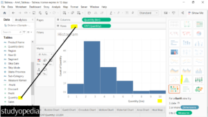
Drag the Measure Quantity to the Rows shelf as shown in the below screenshot.
After that, go to the right, click Show Me, and click the Histogram. After selecting Histogram, it will create a Histogram and automatically add Quantity (bin) to the Columns shelf.
The following Histogram will be visible. The CNT in the CNT(Quantity) is for the count. The bins are 10. In a histogram, a bin (short for “binomial”) is a range of values that is used to group data points. Bins are also known as “intervals” or “classes”:

Above, the quantity is displayed with values ranging from 0 to 4875 and divided into 10 bins.
Stacked Histogram
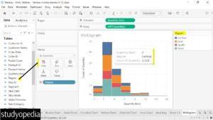
To create a stacked histogram, drag the Dimension Region to the Color under the Marks Card as shown below:

After dragging the stacked histogram is visible. The stack represents the values of the Dimension region. The legend is visible on the right.
On keeping the mouse cursor, the details are visible as shown above.
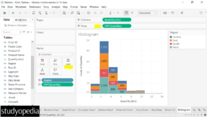
To display the count quantity of each region as a label, press the CTRL on the keyboard, and then drag the CNT(Quantity) from the Rows to the Label under the Marks pane:

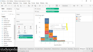
Now, keep the mouse cursor and the same Count of Quantity will be visible with other details:

If you liked the tutorial, spread the word and share the link and our website Studyopedia with others.
For Videos, Join Our YouTube Channel: Join Now
Read More:


No Comments