05 Dec Create a Heat Map in Tableau
A Heat Map is a type of data visualization that displays the relationship between two categorical variables using a two-dimensional representation. It is used to:
- Show the density or frequency of data points within a matrix
- Highlight patterns, trends, and correlations in the data
- Identify areas of high concentration or density
A Heat Map typically consists of:
- A matrix with rows and columns representing the two categorical variables
- Cells within the matrix are colored according to the frequency or density of data points
- A color legend to interpret the colors used in the heat map
Before moving further, we’ve prepared a video tutorial on how to create a Heat Map in Tableau:
Suppose we want to visualize the usage patterns of a mobile app. We create a heat map to show the frequency of user interactions (e.g., taps, swipes) across different screens and features.
The heat map displays:
- A matrix with app screens on one axis and features on the other
- Cells are colored according to the frequency of user interactions, with darker colors indicating higher usage
- A color legend to interpret the colors used in the heat map
This visualization helps to:
- Identify the most frequently used screens and features
- Understand how users navigate through the app
- Inform design decisions to improve user experience and engagement
How to create a Heat Map in Tableau
Let us see an example to create a Heat Map in Tableau. We have created a new sheet named Heat Map in the same Tableau project Amit_Tableau.twb. We have already loaded the sample data as shown in the Get Data – Connect Data Source lesson.
Press CTRL on the keyboard, and select the Dimension Sub-Category and the Measure Profit.
After that, go to the right, click Show Me, and click the Heat Map
The following Heat Map will be visible:
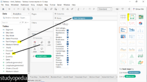
Drag the Measure Sales into the Colors in the Marks pane:
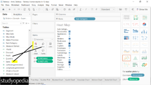
Now, drag the Measure Region to the Column shelf:
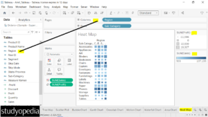
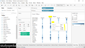
The Heat Map is now visible above. We have displayed the visualization of the Sales and Profit across different regions. On the right, you can easily understand the lighter color means less sales and the darker ones mean more sales.
However, the Heat Map is not quite visible because the view is Standard. Not a problem. Change the view to Entire View to let the Heat Map be visible completely as shown below:
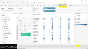
Keep the mouse cursor on the Heat Map to view all the details for a specific subcategory in a specific region. We have shown the Profit and Sales of the sub-category Art and Region East:
If you liked the tutorial, spread the word and share the link and our website Studyopedia with others.
For Videos, Join Our YouTube Channel: Join Now
Read More:


No Comments