04 Dec Create a Crosstab Chart in Tableau
A crosstab chart, also known as a contingency table or cross-tabulation, is a statistical tool used to analyze and visualize the relationship between two categorical variables. It is a table that displays the frequency distribution of two variables, showing how different categories of one variable relate to different categories of the other variable.
Before moving further, we’ve prepared a video tutorial on how to create a Crosstab Chart in Tableau:
Suppose we want to analyze the relationship between the level of education (High School, Bachelor’s, Master’s, Ph.D.) and the job type (Manager, Engineer, Sales, Marketing) of employees in a company.
A crosstab chart would display the frequency distribution of employees across different education levels and job types, helping us understand:
- Which education levels are most common among different job types
- Which job types are most common among employees with different education levels
- Any patterns or correlations between education level and job type
How to create a Crosstab Chart in Tableau
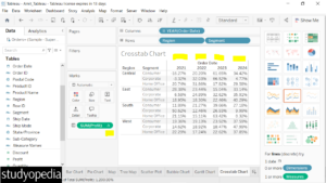
Let us see an example to create a Crosstab Chart in Tableau. To create a crosstab chart, we will get the profit for each segment in each region. This data will be displayed for each year using the Order Date.
We have created a new sheet with the name Crosstab Chart in the same Tableau project Amit_Tableau.twb. We have already loaded the sample data as shown in the Get Data – Connect Data Source lesson.
Drag the fields to the respective pane in the:
- Order Date dimension: Drag to the Columns shelf
- Region dimension: Drag to the Rows shelf
- Segment dimension: Drag to the Rows shelf
- Profit measure: Drag to the Text under the Marks card
After dragging, the following crosstab chart is visible:
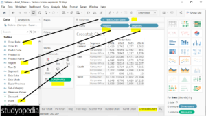
Edit Table Calculation
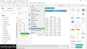
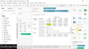
Right now, the rows display the profit figures for each region year-wise. Let us set the percentage total of profit in each row.
Right-click on SUM(Profit) and click Add Table Calculation:
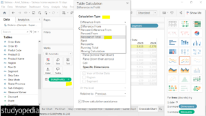
Under the Calculation Type, set the Percent of Total:
Set Table(across) under the Compute Using section:
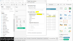
Now, the crosstab chart is created with profit percentage values. Also, a small symbol is visible on the right of SUM(Profit) for calculation:
Keep the mouse cursor on any of the records to get the complete information:
If you liked the tutorial, spread the word and share the link and our website Studyopedia with others.
For Videos, Join Our YouTube Channel: Join Now
Read More:
No Comments