04 Dec Create a Bubble Chart in Tableau
A bubble chart is a type of data visualization that displays three-dimensional data as a series of bubbles or circles on a two-dimensional grid. Each bubble represents a single data point, with:
- X-axis (horizontal): Representing one variable
- Y-axis (vertical): Representing another variable
- Bubble size: Representing a third variable (e.g., volume, value, or magnitude)
- Bubble color: Optionally representing a fourth variable (e.g., category, classification, or range)
Before moving further, we’ve prepared a video tutorial on how to create a Bubble Chart in Tableau:
Suppose we want to visualize the relationship between:
- The price of a house (x-axis)
- The size of the house (y-axis)
- The number of bedrooms (bubble size)
The bubble chart would display bubbles of different sizes and positions on the grid:
- A large bubble in the top-right corner might represent a spacious, expensive house with many bedrooms.
- A small bubble in the bottom-left corner might represent a compact, affordable house with fewer bedrooms.
How to create a Bubble Chart in Tableau
Let us see an example to create a Bubble Chart in Tableau. We have created a new sheet with the name Bubble Chart in the same Tableau project Amit_Tableau.twb. We have already loaded the sample data as shown in the Get Data – Connect Data Source lesson.
Drag the fields to the respective pane in the Marks card:
- Profit measure: Drag to the Size pane under Marks card.
- Ship Mode dimension: Drag to the Label pane under Marks card
- Ship Mode dimension: Drag to the Color pane under Marks card
Go to Show Me on the top-right and click on the Bubble Chart to form it. After dragging, the Bubble Chart is created as shown below. We have set the view to Entire View:
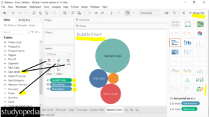
Bubble Chart with Measure Values
We can also set the Sales into the labels and display it on the circle. Drag the Sales into the Labels pane of the Marks card:
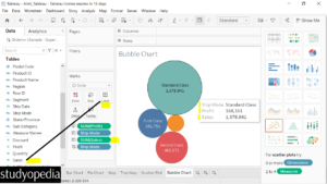
The sales are now visible. On keeping the mouse cursor on any of the circles, the profit and sales are visible.
Bubble Chart with Measure Color
Above, we saw different colors for each circle. We can also set the same color with different shades. Let us see how.
Drag the Sales into the Color pane of the Marks card:
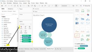
Change the Bubble Chart color
If you now want to set a different color with the shades, click on the Color, then Edit Colors. After that, the current color will be visible under the Edit Colors [Sales] dialog box:
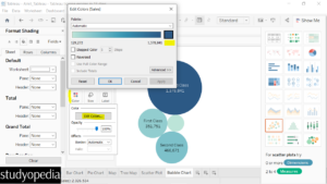
Click on the color and change it. Click OK after changing the color
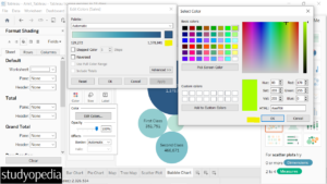
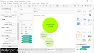
The color changed. After that, click Apply, and then OK: Now, the new color of the circles is visible:
Change the label font
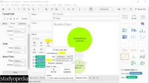
On the circle with the least size, the label is not visible. The reason is quite obvious i.e. the size of the circle is too small. For that, let us change the font size of the label.
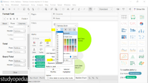
Click on the Label and then under Label Appearance, go to Font and change it:
Set a new font like this:
If you liked the tutorial, spread the word and share the link and our website Studyopedia with others.
For Videos, Join Our YouTube Channel: Join Now
Read More:


No Comments