04 Dec Create a Bar/ Column Chart in Tableau
In this lesson, we will learn how to create a bar or column chart in Tableau with examples. First, let us understand what is a bar and a column chart.
Before moving further, we’ve prepared a video tutorial on how to create a Bar and Column Chart in Tableau:
What is a Bar Chart
A bar chart, also known as a bar graph, is a type of chart that displays data using rectangular bars of different heights or lengths. The bars represent categorical data, and the height or length of each bar represents the value or frequency of each category.
Suppose we want to compare the sales of four different products (A, B, C, and D) in a month. The bar chart would have:
- X-axis (horizontal): Product names (A, B, C, D)
- Y-axis (vertical): Sales (in thousands of rupees)
- Bars: Sales figures for each product, represented by bars of different heights
What is a Column Chart
A column chart is a type of chart that displays data using vertical columns of different heights. The columns represent categorical data, and the height of each column represents the value or frequency of each category.
Suppose we want to compare the number of students enrolled in different courses (Math, Science, History, and English) at a university. The column chart would have:
- X-axis (horizontal): Course names (Math, Science, History, English)
- Y-axis (vertical): Number of students enrolled
- Columns: Number of students enrolled in each course, represented by columns of different heights
How to create a Bar/ Column Chart in Tableau
Let us see an example of creating a Bar/ Column Chart in Tableau. Create a new sheet under the same Tableau Workbook we saved before Amit_Tableau.twb. We have already loaded the sample data as shown in the Get Data – Connect Data Source lesson.
In vertical form, the bar chart is usually called a column chart. In the horizontal form, it is referred to as a bar chart.
For this, we need Dimensions and Measures. We will drag one of the Measures i.e. Sum of Profit to the Columns shelf on the top and one of the Dimensions i.e. Category to the rows shelf:
- Columns Shelf: Sum of Profit
- Rows Shelf: Category
It would automatically create a Bar Chart on Sheet 2 from the right. Under the Show Me on the top-right, the charts you can create with your table are visible.
Just below the chart section, the suggestions are also visible i.e 0 or more Dimensions and 1 or more Measures:
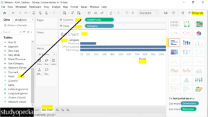
We created a Bar Chart above the Sum of Profit based on categories.
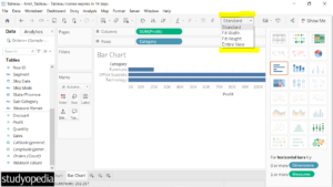
Above, we can see the view is Standard. We can easily change the view to the Entire View and others as shown below:
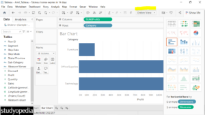
Let us change the view to Entire View as shown below:
Swap rows and columns
To swap rows and columns, click CTRL+W or the tab just below the Server menu as shown below. After clicking, the horizontal bars converted to vertical bars:
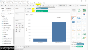
Click the Show Me on the top-right to hide it. The Column Chart is visible displaying the Technology category with maximum profits:
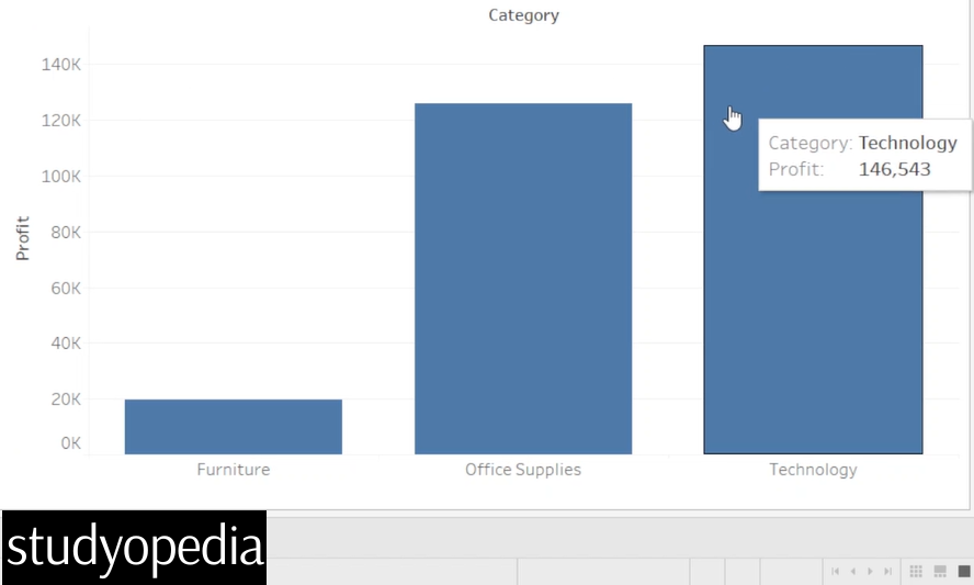
We created a column chart successfully.
If you liked the tutorial, spread the word and share the link and our website Studyopedia with others.
For Videos, Join Our YouTube Channel: Join Now
Read More:


No Comments