24 Jan Pandas – Plotting
To plot in Pandas, we need to use the plot() method and the Matplotlib library. The pyplot module from Matplotlib is also used for plotting in Pandas. The pyplot.show() is used to display the figure.
Before moving further, we’ve prepared a video tutorial to implement plotting in Pandas:
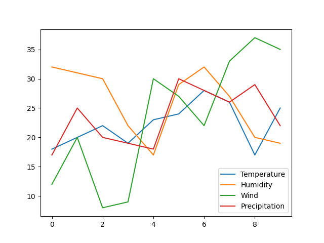
Let us see an example:
import pandas as pd
import matplotlib.pyplot as plt

# Dataset
data = {
    'Temperature': [18, 20, 22, 19, 23, 24, 28, 26, 17, 25],
    'Humidity': [32, 31, 30, 22, 17, 29, 32, 27, 20, 19],
    'Wind': [12, 20, 8, 9, 30, 27, 22, 33, 37, 35],
    'Precipitation':[17, 25, 20, 19, 18, 30, 28, 26, 29, 22]
}

df = pd.DataFrame(data)

df.plot()

plt.show()
Output
Let us now see how to plot:
- Histogram
- Pie Chart
- Scatter Plot
- Area Plot
Histogram
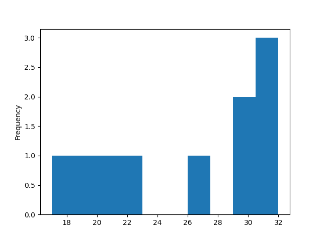
A histogram is a graphical representation to show frequency distributions.
We will create a Histogram here. Set the kind argument of the plot() method to hist. For this, we only need a single column. Let us see an example:
import pandas as pd
import matplotlib.pyplot as plt

# Dataset
data = {
    'Temperature': [18, 20, 22, 19, 23, 24, 28, 26, 17, 25],
    'Humidity': [32, 31, 30, 22, 17, 29, 32, 27, 20, 19],
    'Wind': [12, 20, 8, 9, 30, 27, 22, 33, 37, 35],
    'Precipitation':[17, 25, 20, 19, 18, 30, 28, 26, 29, 22]
}

df = pd.DataFrame(data)

df["Humidity"].plot(kind = 'hist')

plt.show()
Output
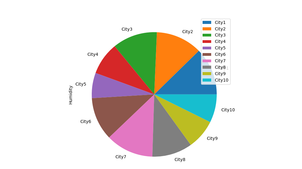
Pie Chart
Pie Chart displays data in a pictorial form, divided into slices.
We will create a Pie Chart here. Use the plot.pie() method to draw a Pie Chart. Let us see an example:
import pandas as pd
import matplotlib.pyplot as plt

# Dataset
data = {
    'Temperature': [18, 20, 22, 19, 23, 24, 28, 26, 17, 25],
    'Humidity': [32, 31, 30, 22, 17, 29, 32, 27, 20, 19],
    'Wind': [12, 20, 8, 9, 30, 27, 22, 33, 37, 35],
    'Precipitation':[17, 25, 20, 19, 18, 30, 28, 26, 29, 22]
}

df = pd.DataFrame(data,  index=['City1', 'City2', 'City3', 'City4', 'City5', 'City6','City7', 'City8', 'City9','City10' ])

df.plot.pie(y='Humidity')

plt.show()
Output
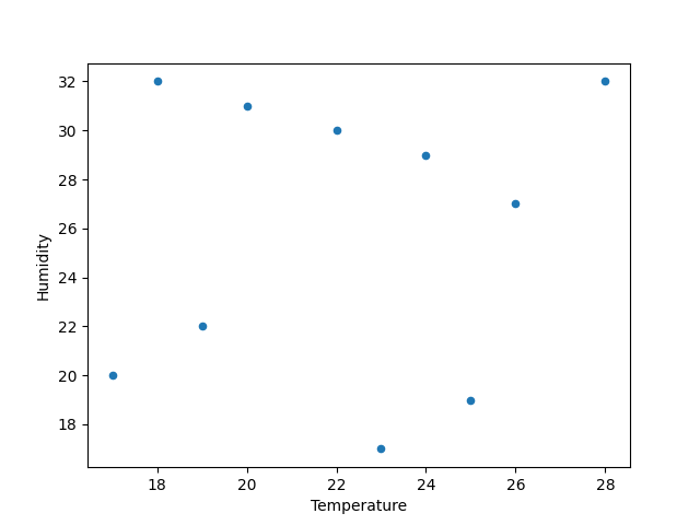
Scatter Plot
A Scatter Plot is a chart that displays the relationship between two variables. A dot represents each value in the data set.
We will create a Scatter Plot here. Set the kind argument of the plot() method to scatter. For this, we will also set the x-axis and y-axis. Let us see an example:
import pandas as pd
import matplotlib.pyplot as plt

# Dataset
data = {
    'Temperature': [18, 20, 22, 19, 23, 24, 28, 26, 17, 25],
    'Humidity': [32, 31, 30, 22, 17, 29, 32, 27, 20, 19],
    'Wind': [12, 20, 8, 9, 30, 27, 22, 33, 37, 35],
    'Precipitation':[17, 25, 20, 19, 18, 30, 28, 26, 29, 22]
}

df = pd.DataFrame(data)

df.plot(kind = 'scatter', x = 'Temperature', y = 'Humidity')

plt.show()
Output
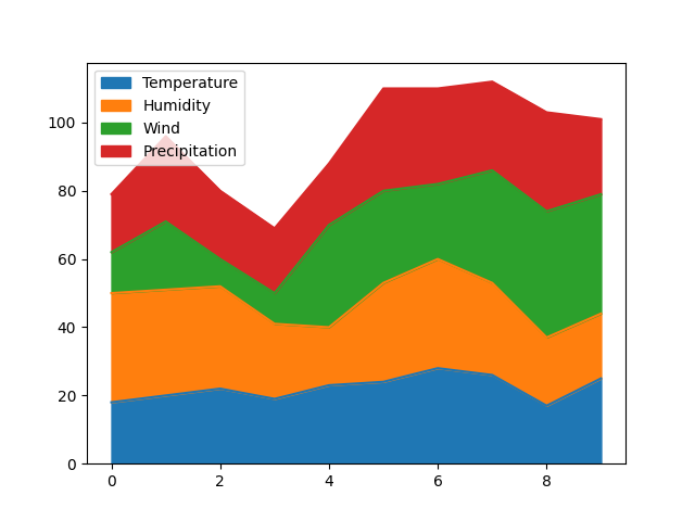
Area Plot
The area plot displays quantitative data visually. The area between the axis and the line is commonly filled with colors or textures.
We will create an Area Plot here. Use the plot.area() method to draw an Area Plot. Let us see an example. Let us see an example:
import pandas as pd
import matplotlib.pyplot as plt

# Dataset
data = {
    'Temperature': [18, 20, 22, 19, 23, 24, 28, 26, 17, 25],
    'Humidity': [32, 31, 30, 22, 17, 29, 32, 27, 20, 19],
    'Wind': [12, 20, 8, 9, 30, 27, 22, 33, 37, 35],
    'Precipitation':[17, 25, 20, 19, 18, 30, 28, 26, 29, 22]
}

df = pd.DataFrame(data)

df.plot.area()

plt.show()
Output
If you liked the tutorial, spread the word and share the link and our website Studyopedia with others.
For Videos, Join Our YouTube Channel: Join Now
Read More:
No Comments