11 Dec Create a Dashboard in Tableau
In this lesson, learn to create Dashboards from sheets in Tableau. In our dashboard, we will add 3 or 4 sheets. We have used various visualizations to present sales and profit data across different categories, states, and regions.
Before moving further, we’ve prepared a video tutorial on creating an interactive dashboard in Tableau:
What is a Dashboard in Tableau
A dashboard in Tableau is a visual representation of data that combines multiple views, charts, and tables to provide a comprehensive overview of the data. It is an interactive and dynamic way to display data insights, trends, and patterns.
Key Characteristics of a Tableau Dashboard
- Multiple Views: A dashboard can contain multiple views, such as charts, tables, maps, and more.
- Interactive: Dashboards are interactive, allowing users to filter, drill down, and explore the data in more detail.
- Customizable: Dashboards can be customized to meet specific needs, with options to add logos, images, and other visual elements.
- Real-time Data: Dashboards can be connected to live data sources, enabling real-time updates and insights.
Benefits of Using Tableau Dashboards
- Improved Decision-Making: Dashboards provide a clear and concise view of the data, enabling better decision-making.
- Increased Productivity: Dashboards save time by providing a centralized location for data analysis and exploration.
- Enhanced Collaboration: Dashboards can be shared with others, facilitating collaboration and communication.
- Data Storytelling: Dashboards enable users to tell a story with their data, highlighting key insights and trends.
Create Sheets
We will create a new Tableau Workbook. Open Tableau and follow the Connect Data Sources in Tableau lesson steps to import the Sample-Superstore.xls as a Data Source.
After importing, go to File, and click Save As to save the new workbook as Amit_Tableau_Dashboard.twb. Drag the Orders tables on the canvas.
Let us create four sheets, beginning with the sheet 1:
- Profits_Sales Sheet
- States_Sales Sheet
- Map Sheet
- Sales_Region Sheet
Sheet 1: Profits_Sales Sheet
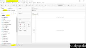
Click on Sheet 1 and now the Orders table can be seen on the left with the fields:
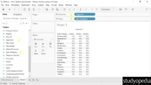
Now, drag the Dimension Segment to the Columns shelf and Sub-Category to the Rows:
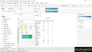
Drag the Measure Sales to the Color and Profit to the Size. This creates a Heat map:
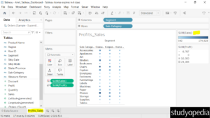
Let us now rename the Sheet 1 to Profits_Sales. On the right, it displays the lighter color means less sales than the darker color. That itself means more sales are reflected for the darker color:
Sheet 2: States_Sales Sheet
Now, let us click our 2nd sheet and set the sales across the different states.
We created a new sheet just on the right of the previous sheet Profits_Sales:
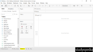
Drag the dimension State to the Rows and the measure Sales to the Columns:
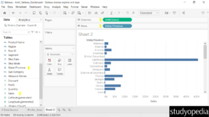
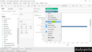
Click the State field and select Sort:
Now, under Sort By, click Field:
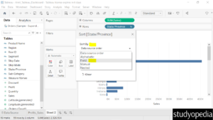
Set the Sort Order as Descending. Keep the field name and Aggregation as it is and click the cross symbol:
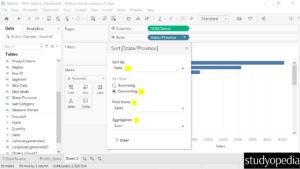
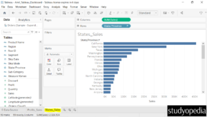
Now, the State field arranged the Sales in descending order.
Rename the Sheet 2 to States_Sales:
Sheet 3: Map Sheet
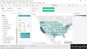
We will create a new sheet Map in the same Tableau project. Let’s say our Dimension will be the State column. We will display the Sales based on State. Therefore, we will use the Measure Sales. This is the Sum of Sales:
Drag the fields to the respective pane in the Marks card:
- State dimension: Drag to the Detail and Label pane under Marks card
- Sales measure: Drag to the Color pane under the Marks card
We created a map of the US based on our data. On the right, the color based on the Sum of Sales is visible with a dropdown. This displays the lighter color is for less sales and the darker for more sales in a region:
Sheet 4: Sales_Region Sheet
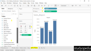
We will create a new sheet Sheet 4 and rename it as Sales_Region in the same Tableau project.
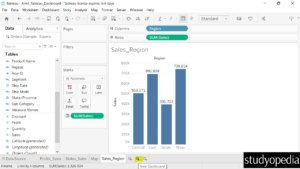
Drag the Region to Columns and Sales to Rows. Drag the Sales to the Label on the Marks shelf. This will create a column chart:
How to create a Dashboard
To create a Dashboard, click the button below whose tooltip is New Dashboard:
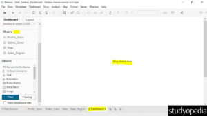
The Dashboard section is now visible. On the left, all four sheets are visible. You need to drag the sheets you want on the right:
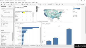
We have dragged all the four sheets now:
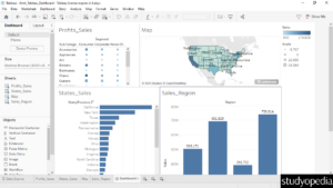
You can drag each sheet and place all four sheets accordingly.
For Profile_Sales, click the third option i.e., Use as Filter:
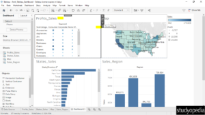
We clicked on Accessories in the Profit_Sales and all the sheets updated. This shows the interactivity:
We have renamed the Dashboard 1 in the bottom to ProfitSales Dashboard:
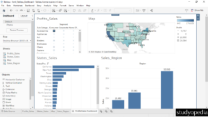
Therefore, we used various visualizations to present sales and profit data across different categories, states, and regions. The geographical map for displaying sales data by state is particularly useful for quickly identifying regional performance. The segmented profit data by sub-category and segment is detailed and insightful.
The dashboard effectively provides a comprehensive overview of sales and profit performance across different dimensions, allowing for quick and effective analysis.
Fix the Dashboard Size
Above, we can see that all four sheets aren’t aligned properly. This is an easy fix.
From the left, set the dashboard size as shown below. Under the Size, currently, it’s set to the Fixed size with the width: 1000px and height: 800px:
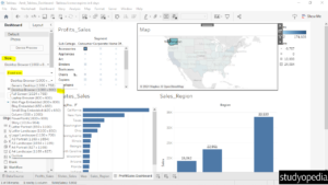
Change it to Automatic and fix the issue. Now, all the four sheets are properly aligned:
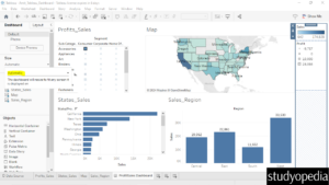
Format the Dashboard
Let us see how we can set the font, font size, color, titles, etc. for our dashboard.
Go to the Format menu and click Dashboard:
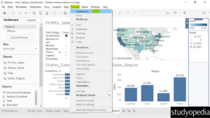
On the left, the Dashboard format options are visible. Easily change the Dashboard color, title, font, alignment, border, etc:
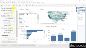
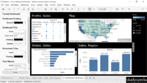
We made some changes above with the color, font, etc:
If you liked the tutorial, spread the word and share the link and our website Studyopedia with others.
For Videos, Join Our YouTube Channel: Join Now
Read More:


No Comments