06 Sep Power BI – Set a chart with a slicer
In the previous lessons, we saw how to create a slicer and select multiple values. Let us now set a chart like a Donut Chart with a slicer. A Donut Chart is also known as a doughnut chart.
What is a Donut Chart
We will create a Donut Chart. A Donut Chart is a pie chart that looks like a Donut.
A donut chart, also known as a doughnut chart, is a circular graphical representation of data that displays how different categories contribute to a whole.
Features of Donut Charts
- Circular shape with a hollow center (resembling a doughnut)
- Segments or slices represent categories
- The size of each slice proportional to its value
- The total of all slices equals 100% (or the whole)
Types of Donut Charts
- Simple Donut Chart: Displays a single series of data.
- Multi-level Donut Chart: Displays hierarchical data with nested categories.
- Interactive Donut Chart: Allows users to hover, click, or drill down for more information.
- 3D Donut Chart: Displays data in a three-dimensional format.
Set a Donet Chart with Slicer
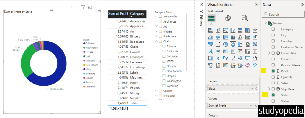
We will create a Donut Chart now with a slicer. Go to the Visualizations and drag a Donut Chart. Select the columns Sum of Profit and State. This will display the Sum of Profit by State:
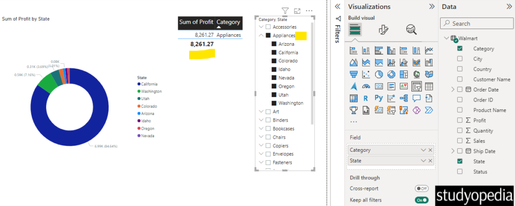
Let us now see the Sum of Profit by State for the category Appliances. Select the Appliances category from the Slicer and the Donut chart will also update based on your selection:
If you want for a specific state, then check and uncheck accordingly.
Video Tutorial
If you don’t want to follow written instructions, you can check out our video tutorial on how to set a chart with a slicer in Power BI:
If you liked the tutorial, spread the word and share the link and our website Studyopedia with others.
For Videos, Join Our YouTube Channel: Join Now
Read More:
No Comments