
10 Sep Power BI – DAX Measures
DAX Measures are used for Data Analysis in Power BI. Set sum, averages, minimum, maximum, etc. through the fields using the Measures. DAX i.e., Data Analysis Expressions measures are dynamic calculations used in Power BI to perform complex data analysis. Unlike calculated columns, which are computed row by row and stored in the data model, measures are calculated on the fly, based on the current context of the report.
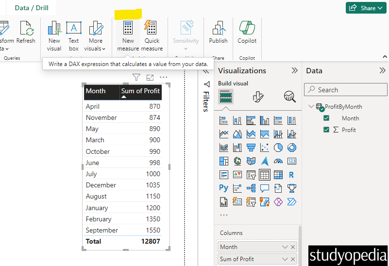
DAX Measure is represented by the following calculator sign (marked in yellow below):
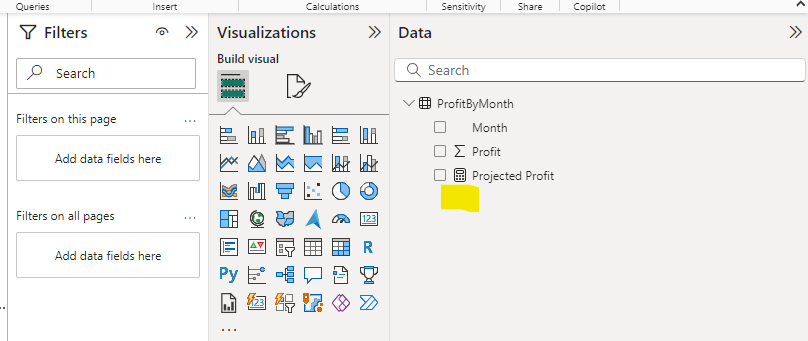
We will also display the above sign in the end the output column.
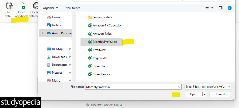
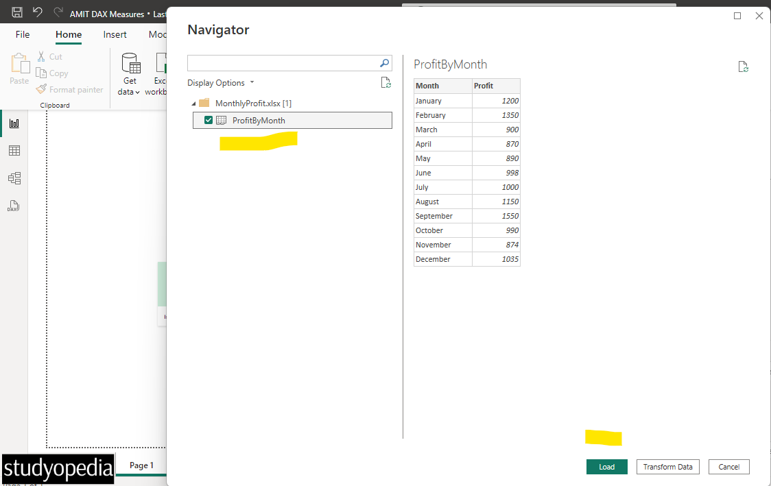
Input File: MonthlyProfit.xlsx
Output Saved as: AMIT DAX Measures.pbix
Calculate the value of the new measure using the DAX formula. The measures are created and displayed in Report View, Data View, or Model View.
Click Get data and then Excel workbook or directly click Excel Workbook. Select your Excel file MonthlyProfit.xlsx and click Open:
Now, click Load:
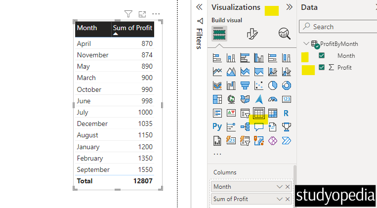
After loading the data, go to the Data and select both columns. Also, select the table from the Visualizations pane. This will create the table:
Let us now click New Measure:
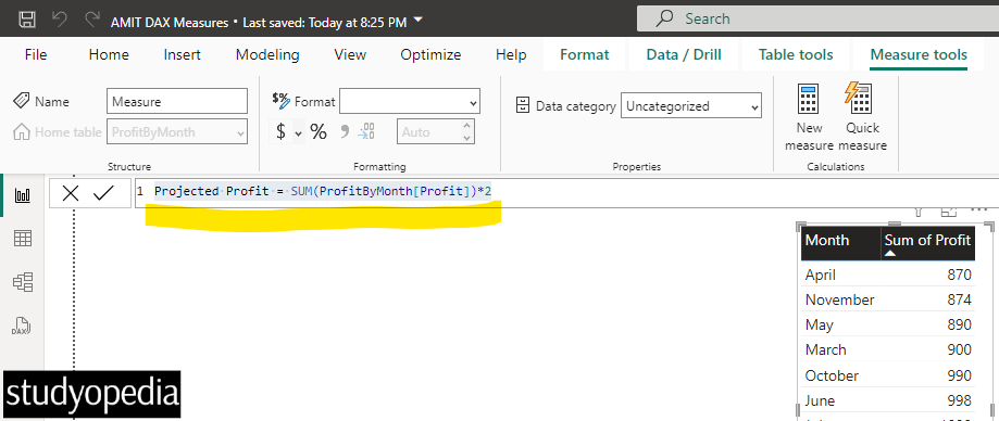
We added the following formula. The projected profit is set to twice the current profit. Here, Projected Profit is the name of our Measure. The ProfitByMonth[Profit] is the Profit column of the ProfitByMonth table:
Projected Profit = SUM(ProfitByMonth[Profit])*2
Above, the:
- SUM() is the DAX Function.
- The referenced table is ProfitByMonth.
- The referenced column is Profit in the ProfitByMonth
We have set the above formula:
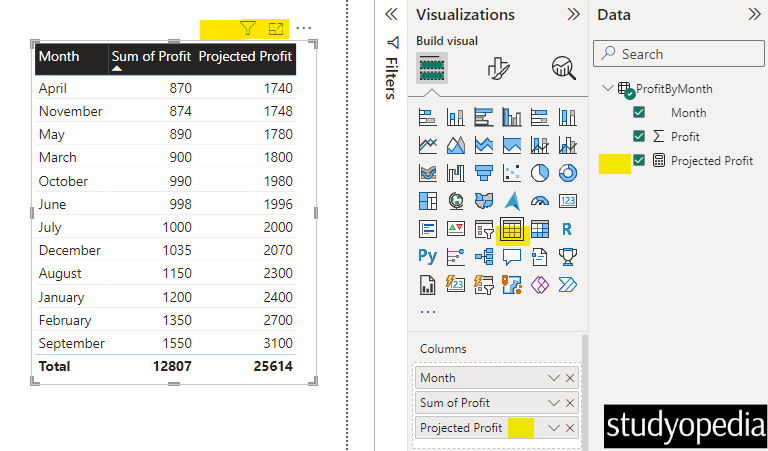
After pressing enter, the formula will execute. We have selected the columns and created a table with the Projected Profit column as well:
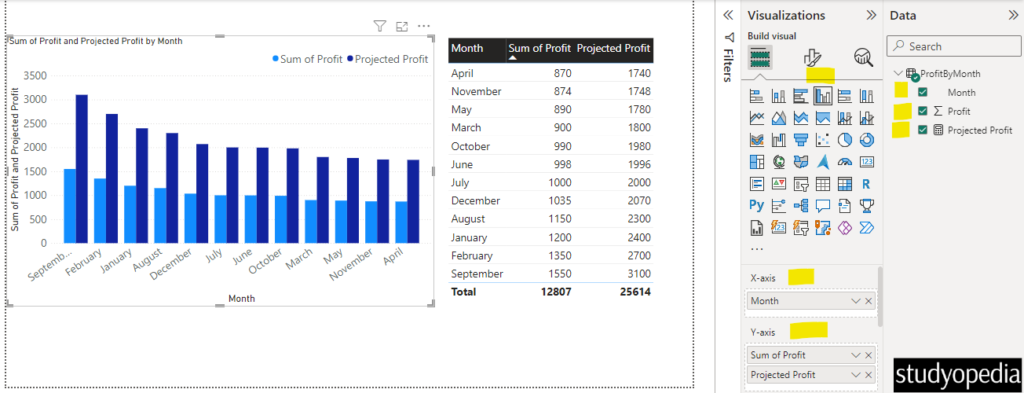
Using the same two columns as well as the new Projected Profit column, we will create a Clustered Column Chart:
Press CTRL+S and save it. We will name it AMIT DAX Measures.pbix. Click Save.
Video Tutorial
If you don’t want to follow written instructions, you can check out our video tutorial on how to understand DAX Measures in Power BI:
If you liked the tutorial, spread the word and share the link and our website Studyopedia with others.
For Videos, Join Our YouTube Channel: Join Now
Read More:


No Comments