
06 Sep Power BI – Create a Gauge Chart
Power BI has various default data visualization components. Let us see what is a Gauge Chart and how to create one.
What is a Gauge Chart
A gauge chart displays information on a radial scale. It is also known as a speedometer chart or dial chart. To understand, consider it as a speedometer in a car. It has a needle pointing to the current value within the predefined range. It can also show progress towards a goal, like a percentage of the sales target achieved.
Create a Gauge Chart in Power BI
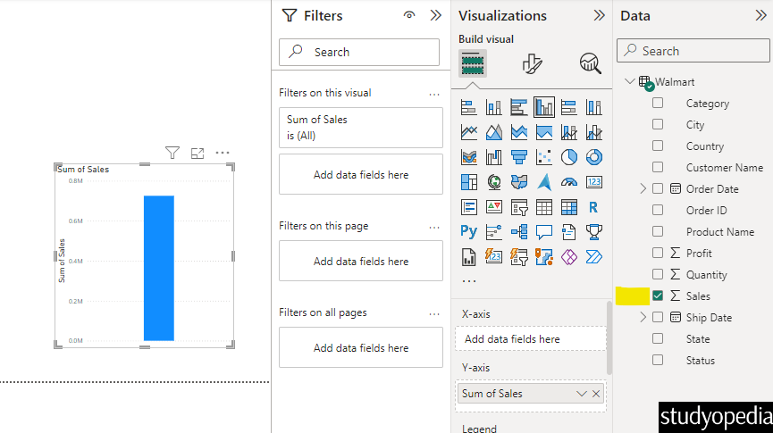
After opening Power BI and clicking Blank Report or opening your previous project, the Power BI layout will be visible.
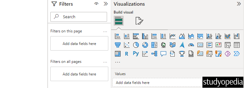
The Visualization tab is on the right and shows all charts and graphs you can create in Power BI:
To create a Gauge Chart, we selected the sum of Sales from the Data and it created a Clustered Column Chart:
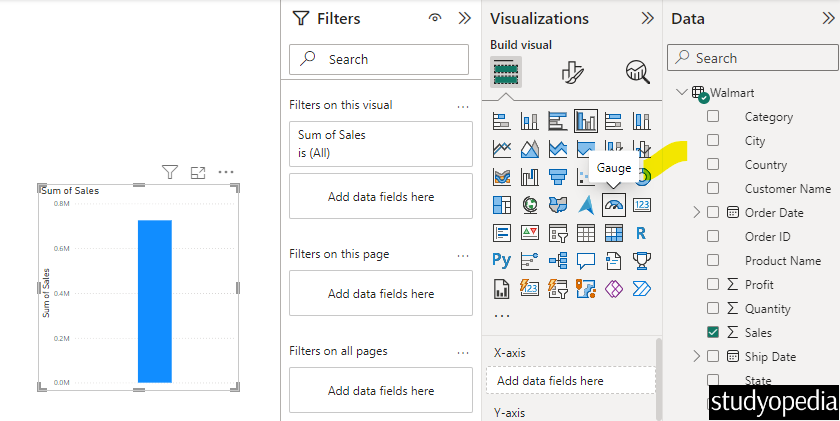
Go to the Visualizations pane and select the Gauge. Click on it and the Clustered Column Chart will convert to a Gauge Chart:
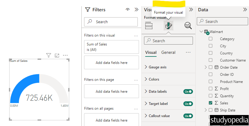
The Gauge Chart in Power BI is now visible:
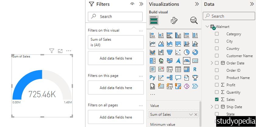
The above image shows a gauge chart displaying the “Sum of Sales“. The gauge has a scale ranging from 0.00M to 1.45M, with the current value indicated as 725.46K. The gauge is partially filled with blue, representing the current sales value relative to the maximum value on the scale.
Format Visualization in Power BI
To format any visualization, click Format your visual under the Visualization pane:
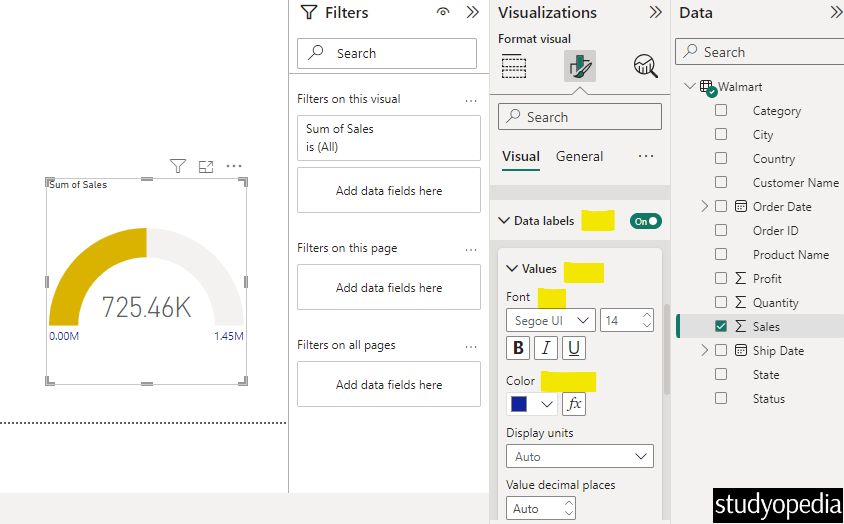
Change the color of the Gauge Chart
Under the Visual tab, click Colors and easily change the fill color like we have changed as shown below:

Data Labels in Gauge Chart
Enable the data labels of the Gauge Chart and change the font, font color, display units, etc., as we have changed as shown below:
Therefore, we successfully created a Gauge Chart in Power BI.
Video Tutorial
If you don’t want to follow written instructions, you can check out our video tutorial on how to create a gauge chart in Power BI:
If you liked the tutorial, spread the word and share the link and our website Studyopedia with others.
For Videos, Join Our YouTube Channel: Join Now
Read More:
No Comments