
06 Sep Power BI – Create a Column Chart for Visualization
Power BI has various default data visualization components. Let us see what is a Column Chart Chart and how to create a Gauge Chart.
What is a Column Chart
A column chart uses vertical bars to represent data. The height of each bar is proportional to the value it represents. It is also known as a vertical bar chart. For example, use it to show responses to survey questions.
Each category is represented by a vertical bar in a column chart. The horizontal axis i.e. the x-axis typically displays the categories, while the vertical axis i.e. the y-axis displays the values.
A basic column chart looks like the below image:

Types of Column Charts
The following are some of the types of column charts.
- Simple Column Chart: Displays a single series of data. This is a basic column chart.
- Stacked Column Chart: Displays multiple series stacked on top of each other.
- Clustered Column Chart: Displays multiple series side-by-side.
- 3D Column Chart: Displays data in a three-dimensional format.
- Interactive Column Chart: Allows users to hover, click, or drill down for more
information.
Create a Column Chart in Power BI
After opening Power BI and clicking Blank Report or opening your previous project, the Power BI layout will be visible. We will now create a basic column chart.
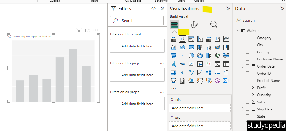
Go to the Visualizations pane on the right and click Stacked Column Chart. After clicking, the following is visible:
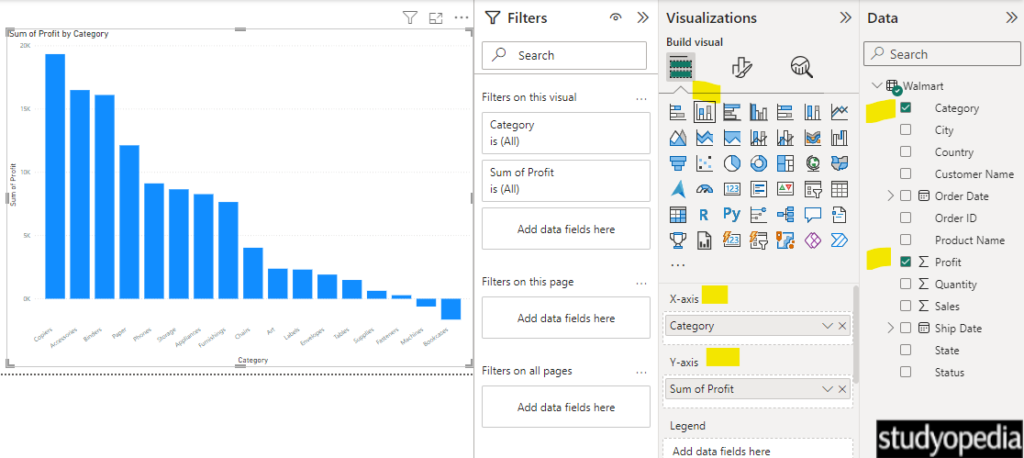
For the values, select the Category and Sum of Profit columns. Just select and it will automatically place the x-axis and y-axis. We have set the Sum of Profit by Category:
Format the Column Chart
Let us format the Column chart properly. To change the title, title position, title background color, increase the text size of the x and y axis, change the color, go to the Visualizations pane, and click Format your visual. We have changed the column color also:
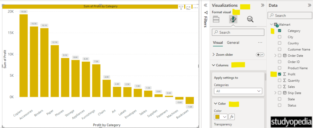
Above, we have also set the data labels visible just above every bar.
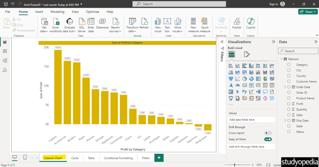
We renamed the page to Column Chart and saved it with Ctrl+S:
Video Tutorial
If you don’t want to follow written instructions, you can check out our video tutorial on how to create a column chart in Power BI:
If you liked the tutorial, spread the word and share the link and our website Studyopedia with others.
For Videos, Join Our YouTube Channel: Join Now
Read More:
No Comments